B Side Font
Free for personal useAbout
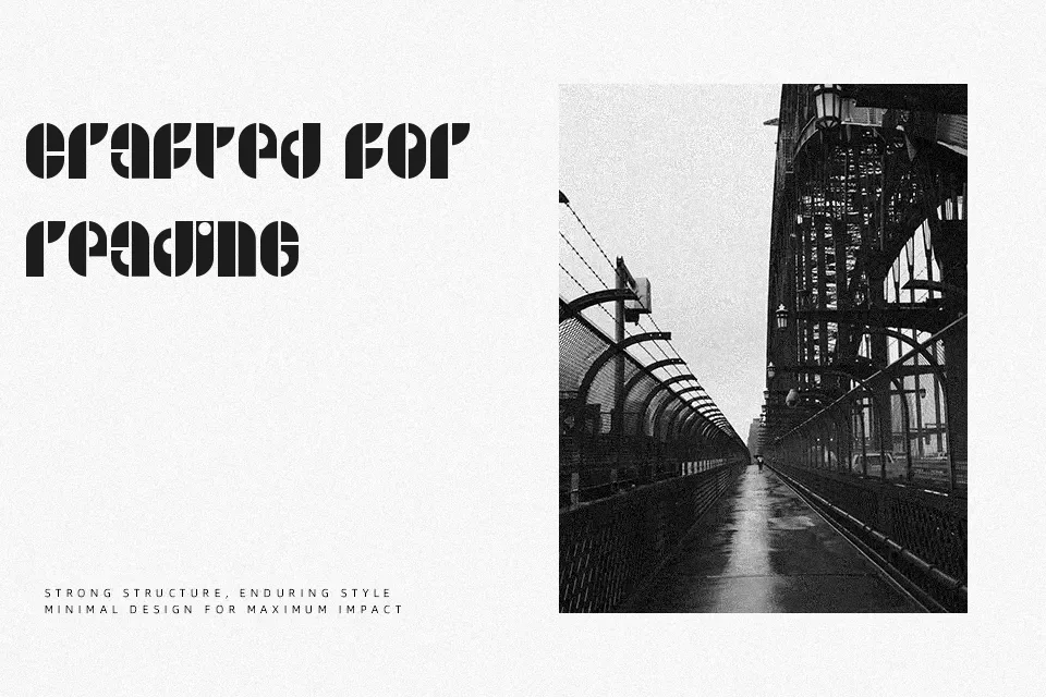
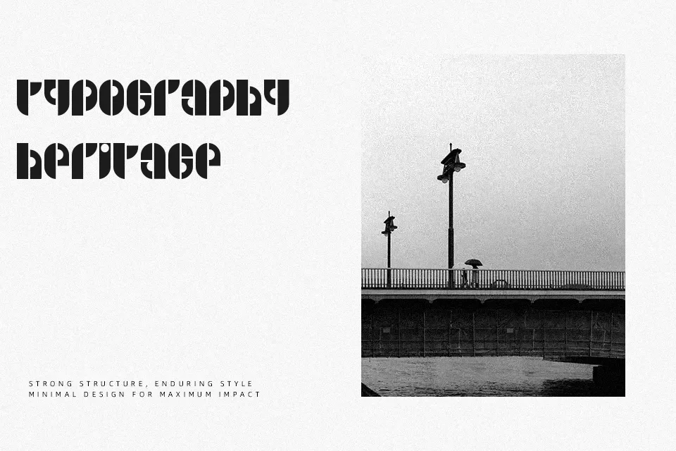
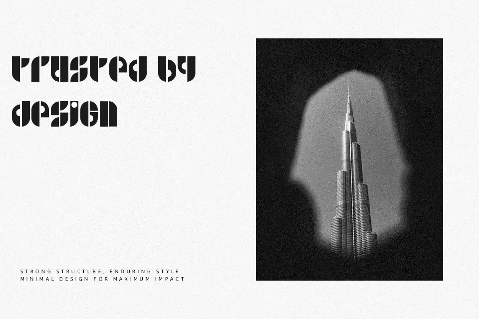
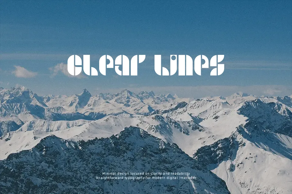
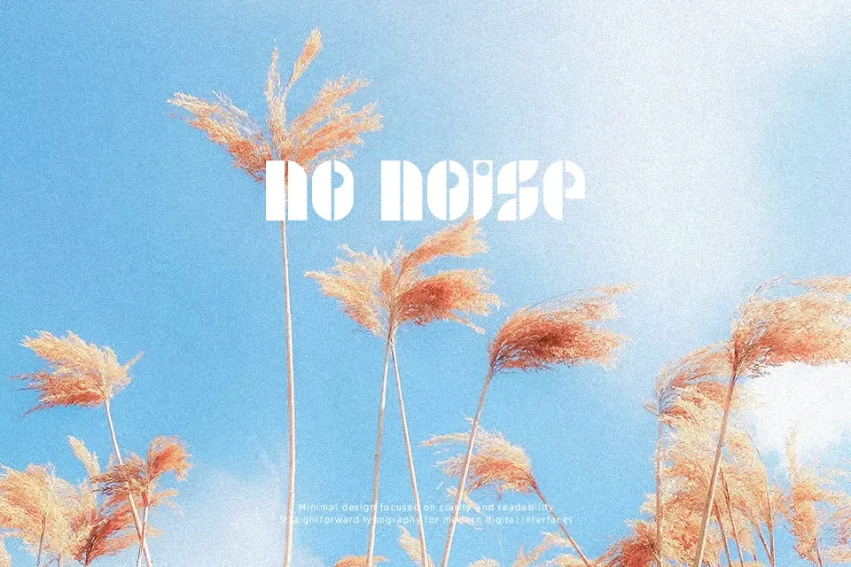
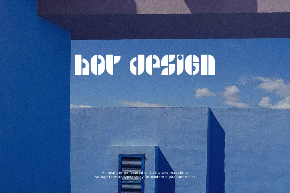
B Side leans into a fat, stenciled display look, with wide, rounded strokes and dot‑driven details that immediately read as retro and slightly sci‑fi. The spacing is fairly tight and the letters carry a heavy visual weight, so it grabs attention fast but can feel busy in dense layouts. It suits poster headlines, album artwork, or quirky social graphics where you only need a few words to shout. Used sparingly, it adds a funky, groovy accent to otherwise simple typography, but it struggles in long text blocks or small sizes where the dotted, stencil structure hurts legibility. Designers who enjoy bold, nostalgic display type will find it handy for themed projects, less so for everyday interface work.
Best For:
retro event posters
music or DJ flyer titles
funky branding wordmarks
sci‑fi themed social media graphics
Not Ideal For:
long paragraph text
formal corporate reports
small UI labels or captions
minimal, highly neutral branding systems
Perfect for branding, headline, and logo, with a artistic and display style.
License
Gallery