Average Font
Free for personal useAbout
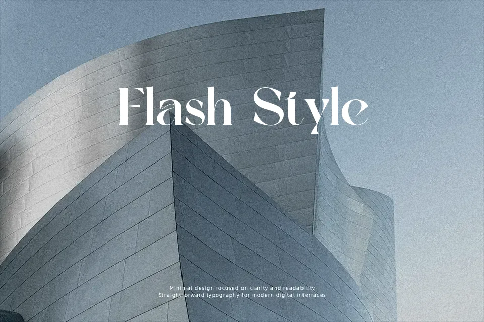
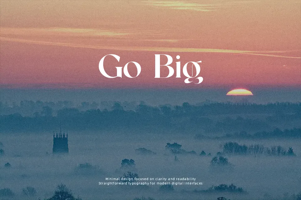
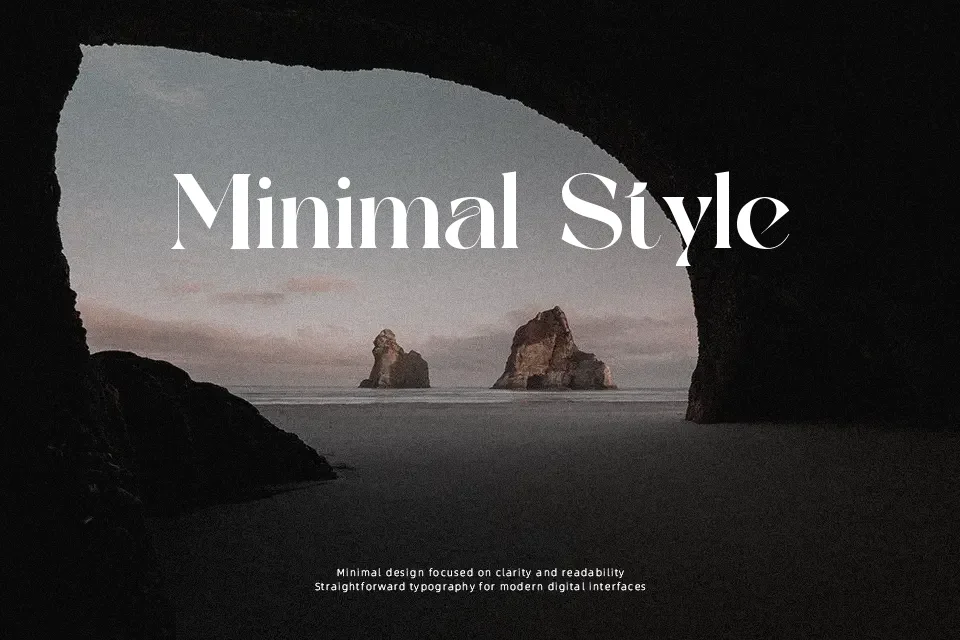
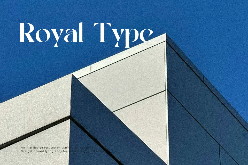
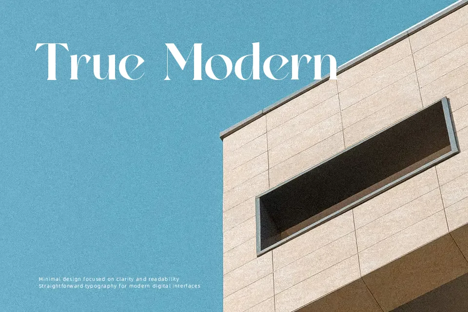
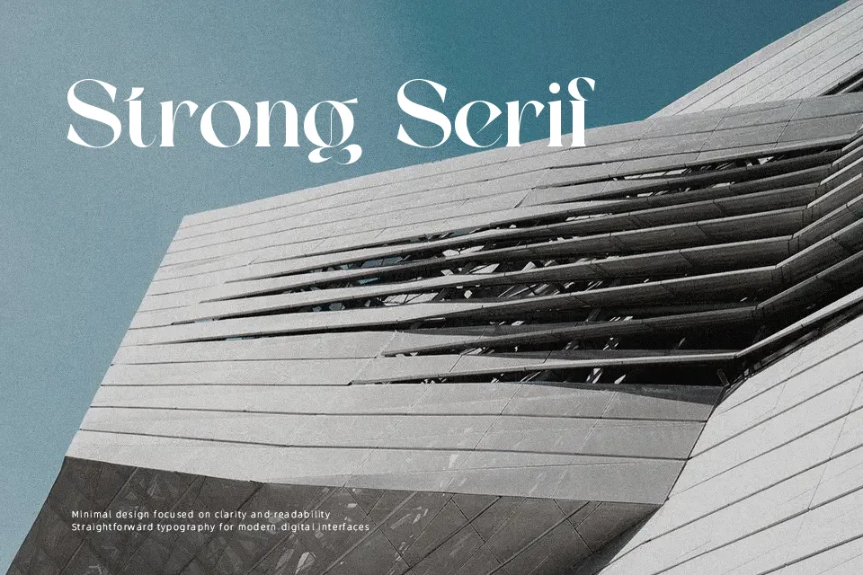
Average leans into tall, refined letterforms with crisp triangular serifs and a mix of thin hairlines and firmer main strokes, giving each word a sculpted, retro look. Spacing is moderately tight, so headlines feel cohesive without collapsing, while the internal curves stay clean enough for medium-size text on posters, covers, and hero banners. The overall impression is decorative and fashion-forward rather than neutral, making it strong for logos, tags, or editorial accents with a nostalgic twist. It struggles in long paragraphs or small UI labels, where the sharp details and contrast can tire the eye and hurt quick readability.
Best For:
boutique logo wordmarks
vintage-inspired poster titles
social media quote graphics
fashion or beauty packaging
Not Ideal For:
body text in long articles
dense corporate reports
small mobile UI labels
data-heavy presentations
Perfect for branding, logo, and packaging, with a artistic and decorative style.
License
Gallery