Army Watch Font
Free for personal useAbout
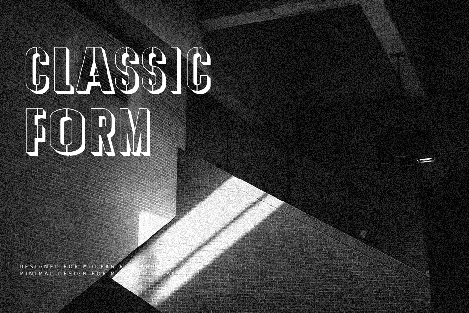
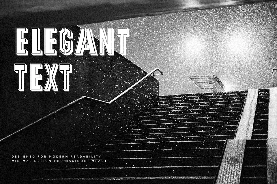
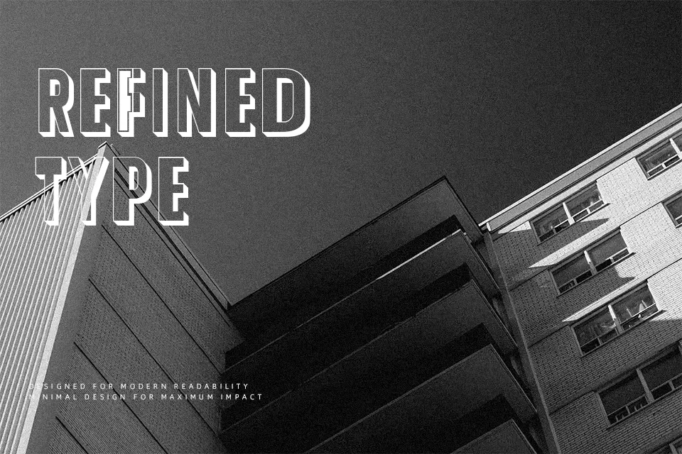
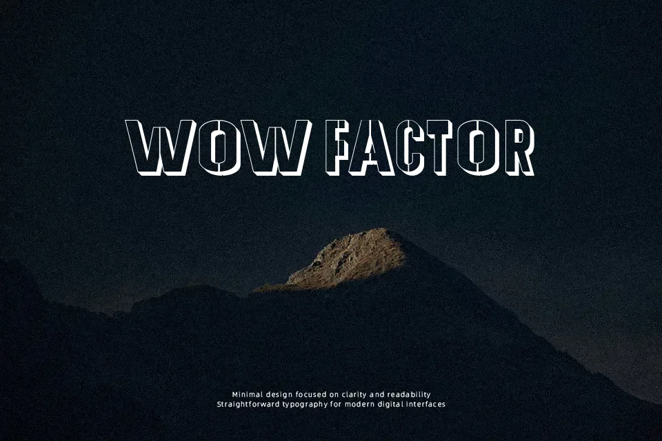
Thick strokes, closed counters, and a divided variant that fragments letterforms into segmented blocks — Army Watch carries a distinctly tactical weight that reads at a glance. The font comes in three files: a standard version, a divided cut, and a gleam variant with depth, giving designers layered options within one release. Works well for gaming titles, military event posters, sports team identity headers, and merchandise labels where toughness is the message. The gleam version adds a 3D illusion useful for screen-printed apparel or embossed cover designs. That said, it stumbles at small sizes — the thick structural segments compress poorly below 18pt — and it has no lowercase characters, which limits its usefulness in any setting requiring full readable sentences.
Best For:- Military-themed poster and event headers
– Gaming title screens or squad logo lockups
– Sports merchandise and apparel graphic labels
– Tactical or survival brand identity visuals
Not Ideal For:- Body text or any copy requiring lowercase letters
– Corporate or professional document design
– Small-size UI labels or mobile interface text
– Feminine or soft-toned brand aesthetics
Perfect for branding, gaming, and logo, with a bold and display style.
License
Gallery