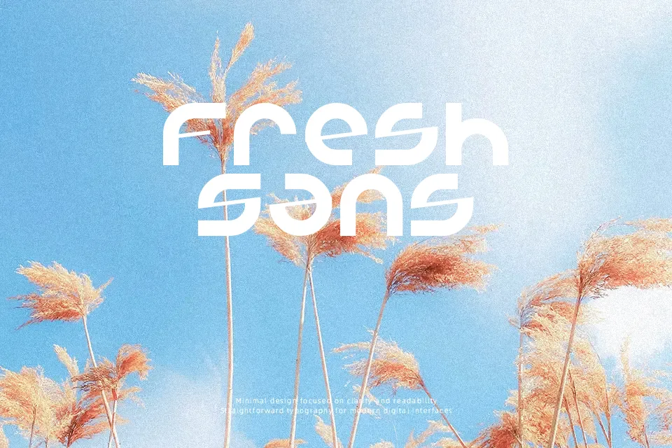
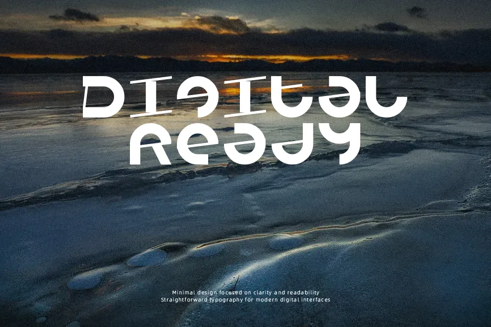
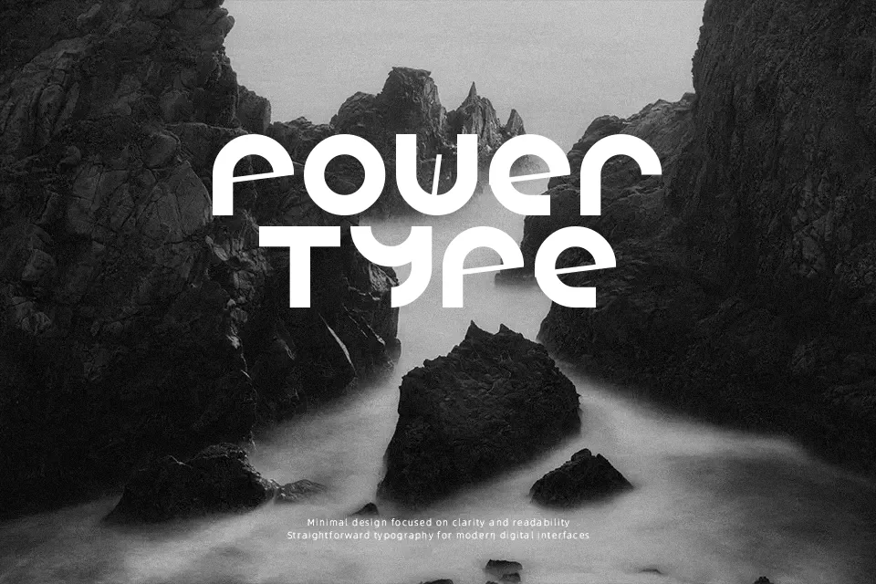
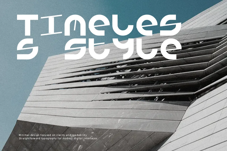
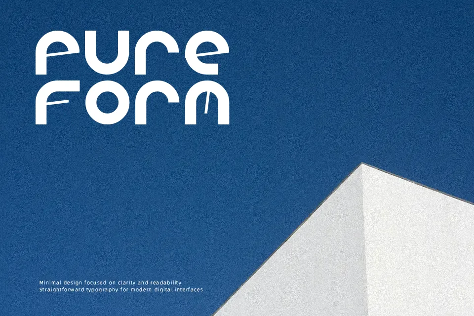
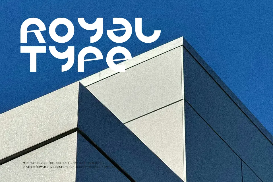
Armada/1991 Font
Free for personal useAbout
Armada 1991 leans hard into cold war-era military typography — tight spacing, blocky strokes, and a condensed structure that reads as commanding rather than decorative. The letterforms carry visible tension, built for headlines that need to feel authoritative or era-specific. It works well on retro game interfaces, military-themed merchandise, and action movie title treatments where the mood needs to feel weathered and purposeful. That same rigidity, however, becomes a drawback in contexts requiring warmth or flexibility — it resists casual or feminine aesthetics entirely. At smaller sizes, the condensed structure can compress into illegibility, so this font earns its keep only at display scale.
Best For:
– Retro military or wartime poster headlines
– Action game title screens or loading screen text
– Vintage-themed merchandise and apparel graphics
– Band merchandise for metal or punk genres
Not Ideal For:
– Body text or long-form reading at any size
– Branding requiring approachable or friendly tone
– Feminine, luxury, or elegant design contexts
– Mobile UI where small size rendering is critical
Perfect for advertising, gaming, and headline, with a bold and condensed style.
License
Gallery