Arenq Font
Free for Commercial UseAbout
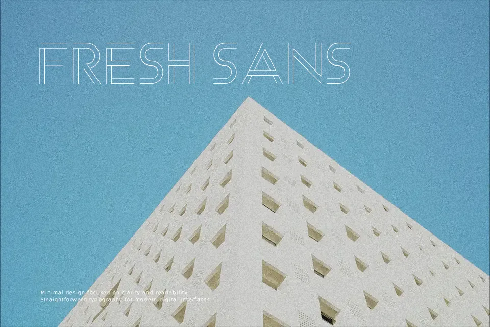
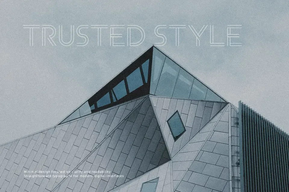
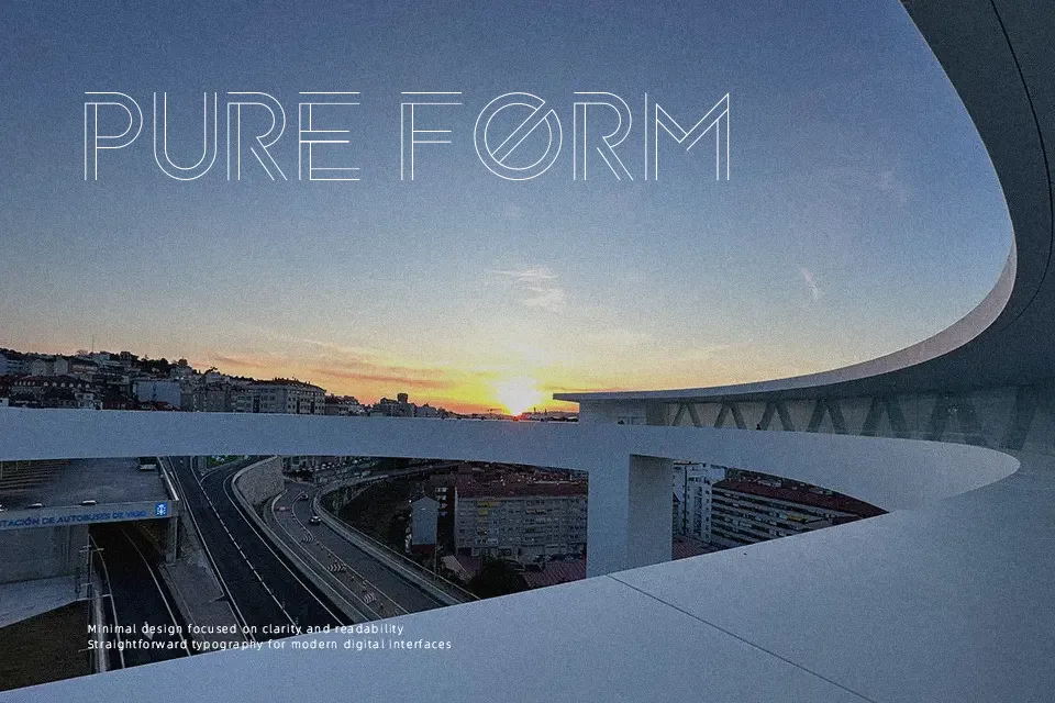
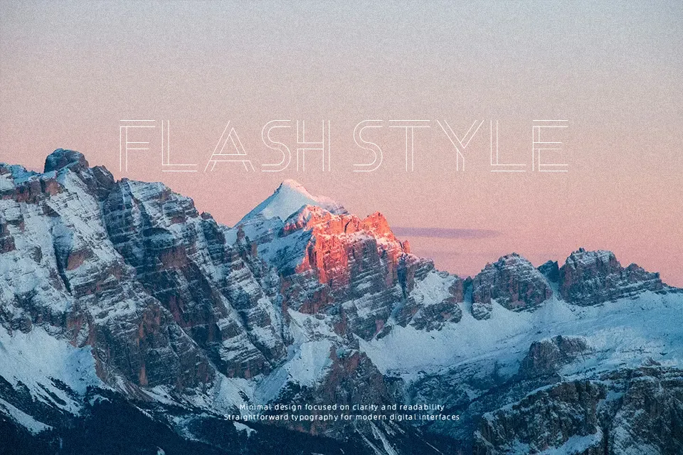
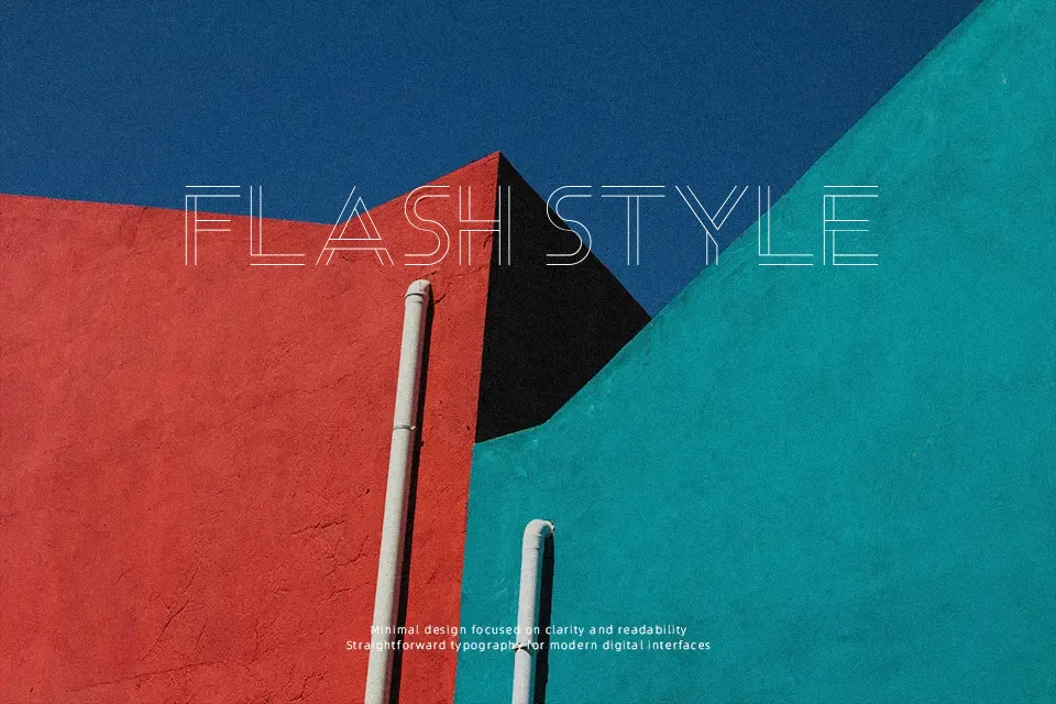
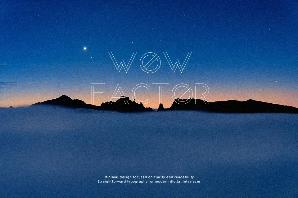
Each letterform in Arenq is assembled from parallel lines running through uniform widths, producing a subtle three-dimensional depth that catches the eye at display sizes. The low contrast between strokes and the consistent cap height give it a structured, almost mechanical composure — fitting for tech startups, music event branding, or esports identity systems. Uppercase characters carry the most visual weight and work hardest at large scales; the lowercase maintains the same geometric rhythm but loses a bit of presence when scaled down. Stylistic Alternates are available for use in Photoshop, Illustrator, and InDesign, offering some flexibility for custom wordmarks. That said, the single-weight design limits its range — it cannot support long-form text or typographic hierarchies on its own, and pairings with a neutral sans-serif body font are essentially mandatory.
Best For:- Tech startup logo wordmarks
– Music festival or event poster headlines
– Esports and gaming team identity
– Short social media display text
Not Ideal For:- Body copy or multi-paragraph reading
– Corporate documents or formal reports
– Projects requiring multiple weight variations
– Small-size print applications
Perfect for branding, gaming, and headline, with a bold and decorative style.
License
Gallery