Architects Daughter Font
Free for Commercial UseAbout
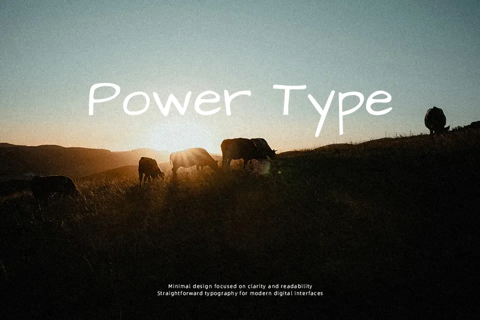
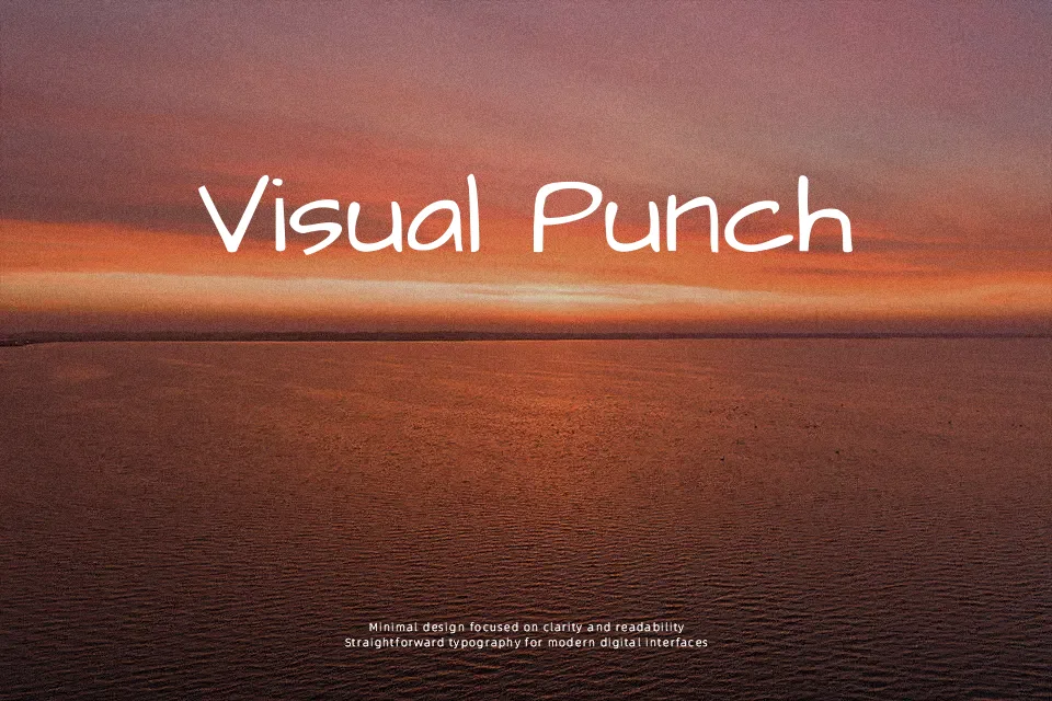
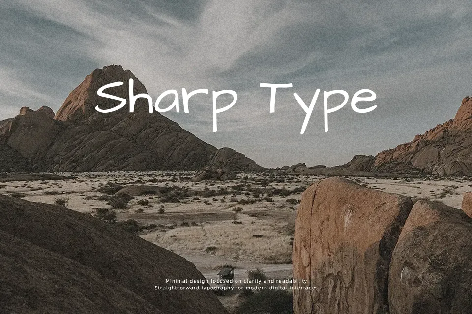
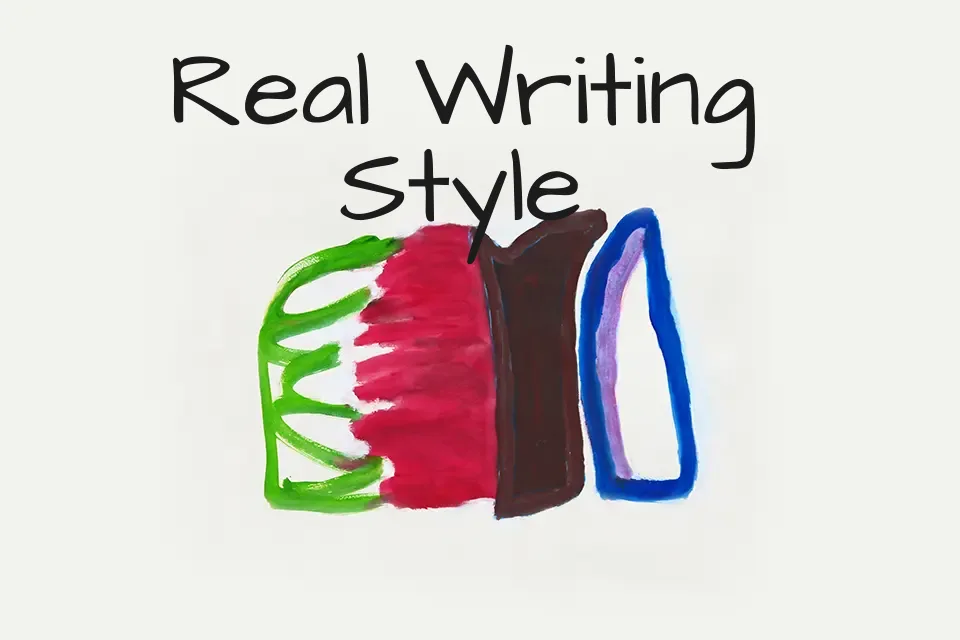
Architects Daughter looks like neat handwriting done with a felt-tip pen: slightly squared curves, consistent stroke weight, and open counters that keep the letters clear on screen and in print. It has the informal rhythm of everyday notes, but the architect-style structure reins in the chaos, so words stay tidy even in all‑caps or tighter tracking. This makes it handy for labeling diagrams, educational materials, kids product packaging, and sketchy UI mockups where a sterile sans serif would feel too stiff. It tends to lose charm in dense paragraphs or very formal layouts, where the hand-drawn character can feel unprofessional or tiring to read. If you like relaxed school-board lettering or comic-inspired handwriting but want something a bit more controlled, this font sits nicely in that middle ground.
Best For:
informal posters and flyers
school or educational graphics
kids-focused branding and packaging
handwritten-style labels and callouts
Not Ideal For:
long body text
formal corporate documents
luxury branding
highly technical reports
Perfect for branding, kids, and packaging, with a creative and display style.
License
Gallery