Arakav Font
Free for personal useAbout
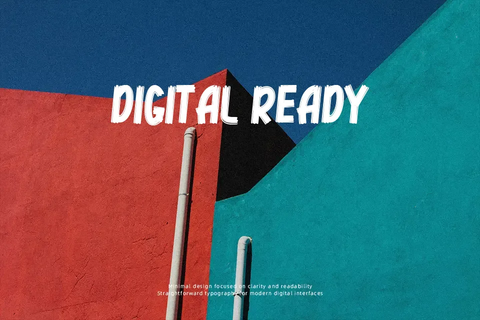
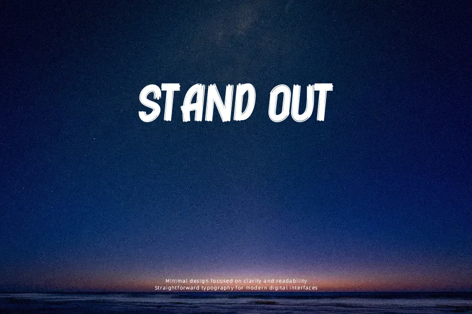
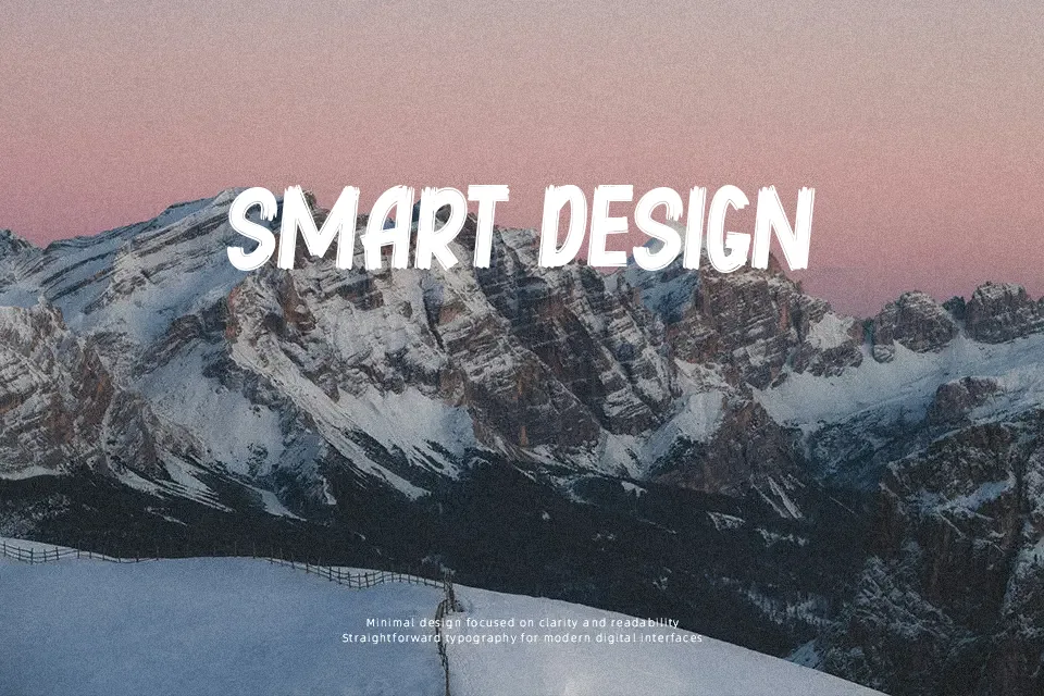
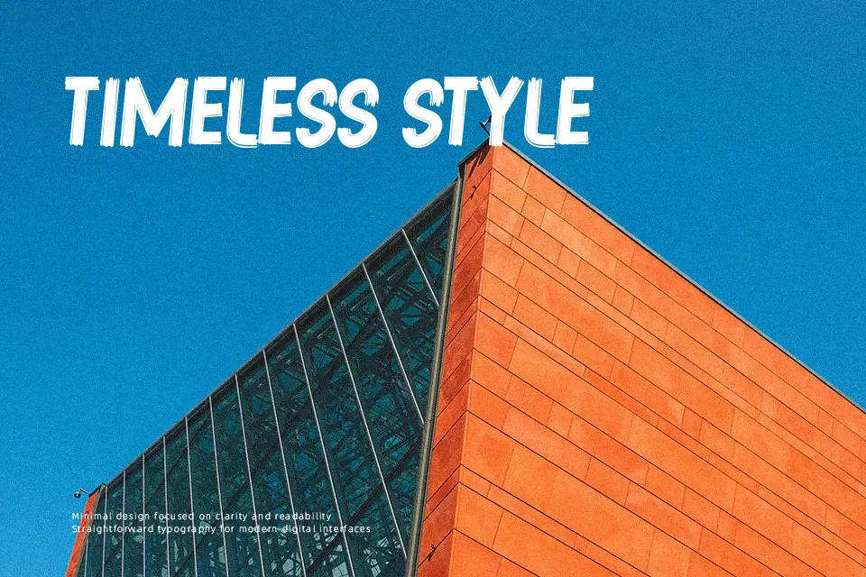
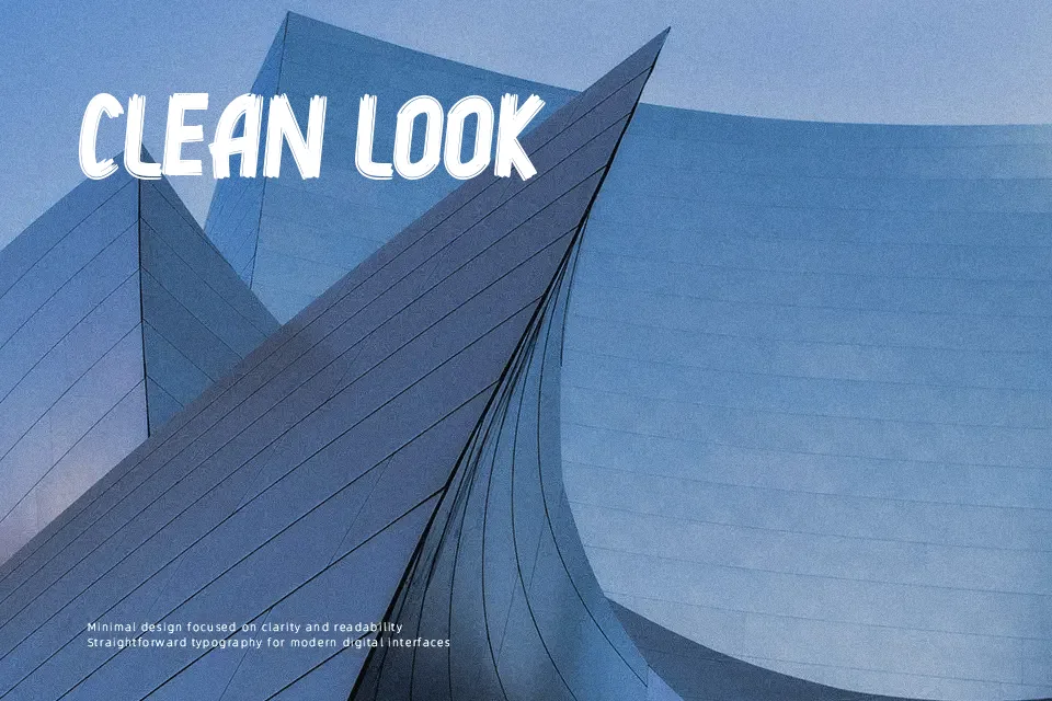
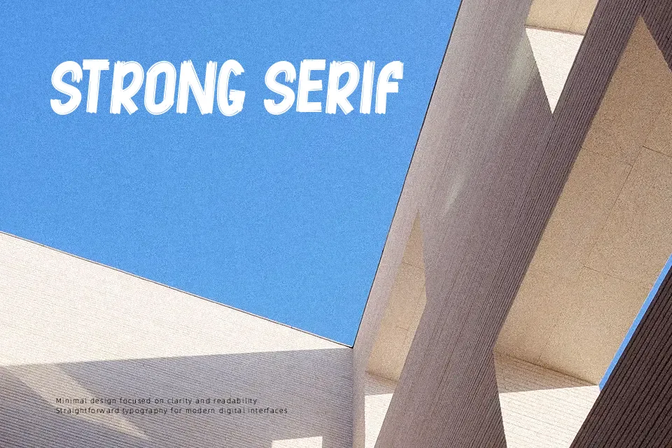
Arakav carries its weight through thick, uneven strokes and a hand-drawn construction that feels raw without being sloppy. The square-line base meets deliberate curves at each letterform junction, giving it a structured energy that leans more toward controlled boldness than pure chaos. It reads well at large display sizes — think event poster titles, comic book chapter headers, or streetwear branding — but loses clarity at small scales where the stroke texture competes with legibility. One honest note: with only one style in the family, typographic flexibility is limited, so pairing it with a clean neutral typeface is nearly mandatory for body content. Works best when the design calls for personality, not subtlety.
Best For:- Comic book or graphic novel chapter headers
– Streetwear and apparel brand logos
– Music event or festival posters
– Indie game or mobile app title screens
Not Ideal For:- Body text or long-form reading
– Corporate reports or formal business documents
– UI labels or navigation menus
– Projects requiring multiple weight variations
Perfect for branding, gaming, and headline, with a bold and brush style.
License
Gallery