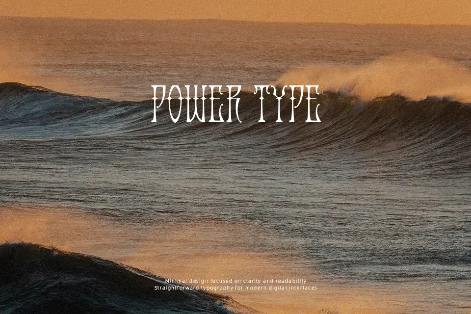
Antique Android Font
Free for personal useAbout
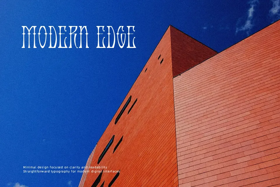
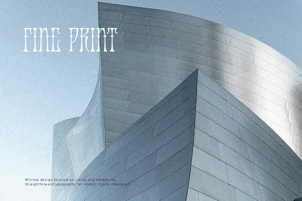
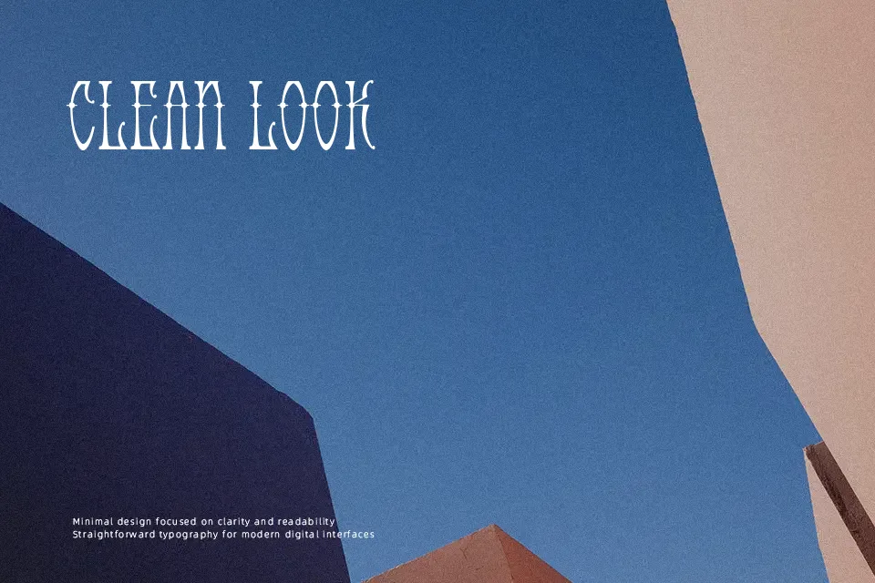
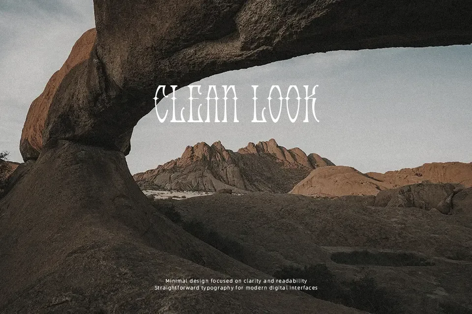
Antique Android carries a stripped-down, mechanical-retro quality — angular letterforms with tight spacing and a signature “dot spur” detail on the Regular variant that gives each character a slightly industrial edge. The Plain version drops those spurs entirely for a cleaner, more utilitarian look. Its low stroke contrast and compact structure read well at display sizes but deteriorate quickly at small scales. The font fits well on record sleeve artwork, sci-fi zine covers, or retro game UI labels where roughness is an asset. That said, the limited character expressiveness makes it unsuitable for editorial layouts or any setting requiring a strong hierarchy between weights — there’s essentially no weight variation to work with.
Best For:
– Retro sci-fi poster headlines
– Indie game title screens or UI labels
– Vintage-themed album or zine covers
– Niche merchandise and apparel graphics
Not Ideal For:
– Long-form body text or editorial copy
– Corporate branding or professional reports
– Projects requiring multiple weight variants
– Small-size applications such as captions or footnotes
Perfect for gaming, headline, and logo, with a dark and decorative style.
License
Gallery