Anta Font
Free for Commercial UseAbout
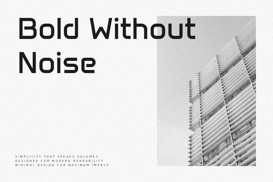
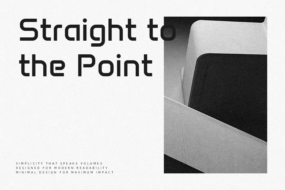
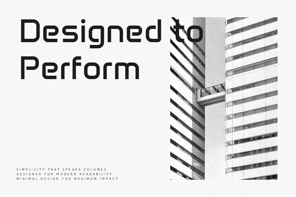
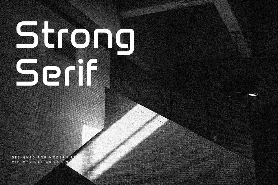
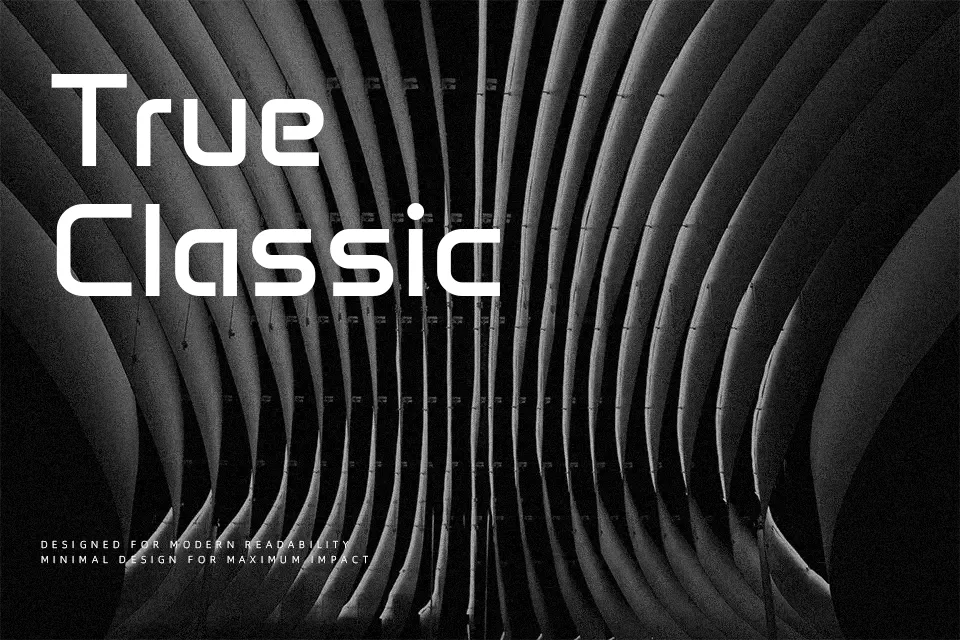
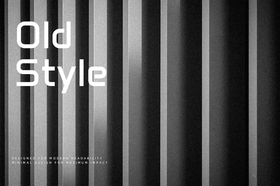
Anta leans on squared curves, straight cuts, and a slightly mechanical rhythm, giving each letter a clean but noticeably constructed feel. Strokes are even, counters are open, and spacing is tuned for digital use, so text stays crisp when scaled or used over imagery. In practice, it shines in tech-oriented branding, app dashboards, data visualizations, and modern signage where you need clarity with a bit of personality. For long narrative reading or formal editorial work, though, its engineered character can become tiring and feel too stiff compared to more neutral text faces.
Best For:
UI labels and menus
tech product branding
data and dashboard graphics
short, bold headlines
Not Ideal For:
long reading paragraphs
formal editorial layouts
traditional print books
highly decorative vintage themes
Perfect for headline, logo, and poster, with a bold and display style.
License
Gallery