Anarchy Brothers Font
Free for personal useAbout
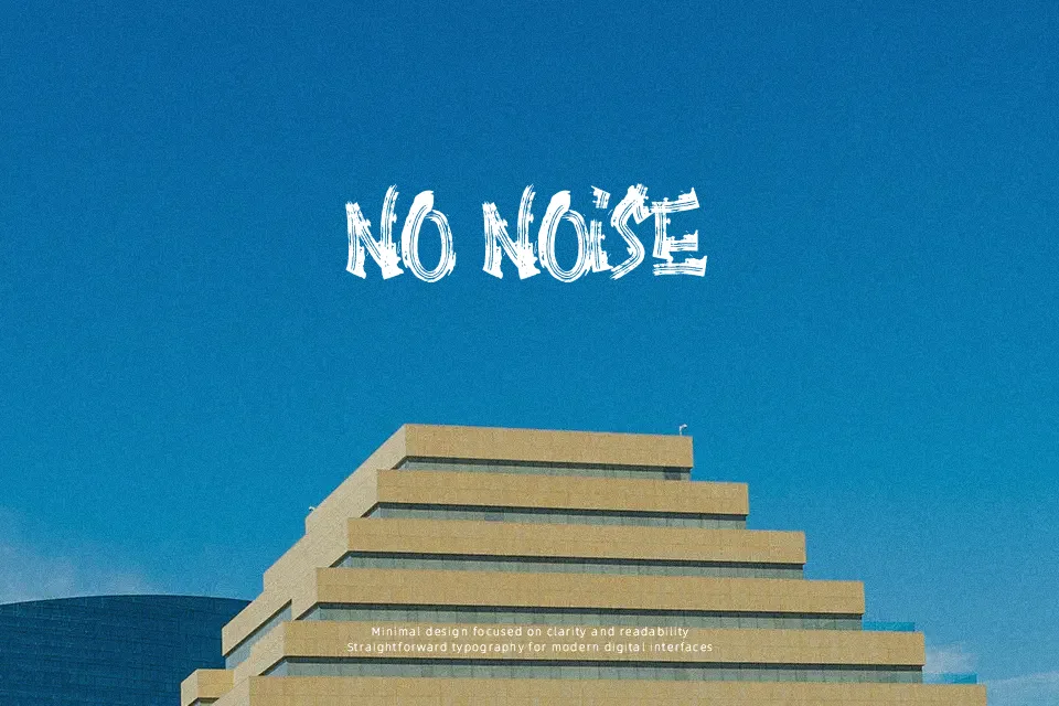
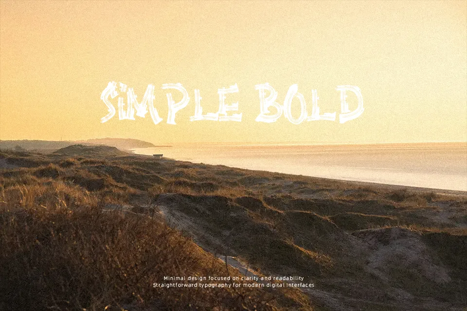
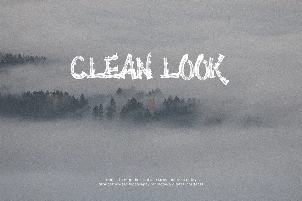
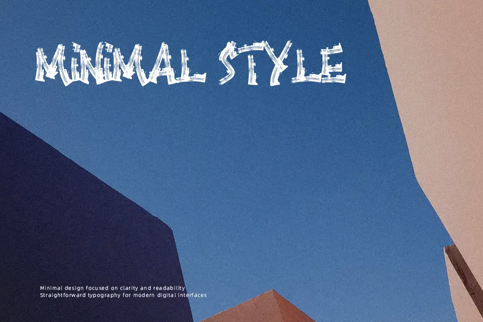
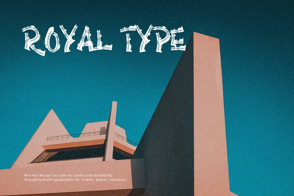
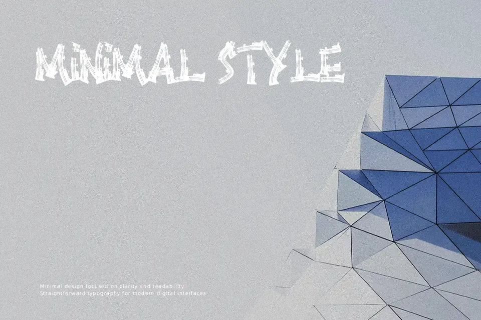
Thick strokes, uneven edges, and a deliberately rough texture define Anarchy Brothers. The letterforms feel handcrafted with purpose — not polished calligraphy, but something more abrasive and deliberate, closer to street-level signage or underground merch. As an all-caps brush display font, it works best when used at large sizes where its gritty character reads clearly. Pairs well with dark-themed layouts, band merchandise, horror event posters, or urban apparel branding. However, it loses legibility quickly in small sizes or tight spacing, and the uppercase-only structure limits typographic flexibility for mixed-case copy. Not a font for projects that need warmth or approachability — the tone here leans edgy and confrontational.
Best For:- Horror event flyers and poster headlines
– Streetwear and urban apparel branding
– Band or music artist logos
– Social media graphics with a dark or rebellious theme
Not Ideal For:- Long body text or paragraph setting
– Corporate or professional branding contexts
– Designs requiring mixed-case lettering
– Children’s content or light-hearted themes
Perfect for branding, fashion, and logo, with a bold and brush style.
License
Gallery