Amarante Font
Free for Commercial UseAbout
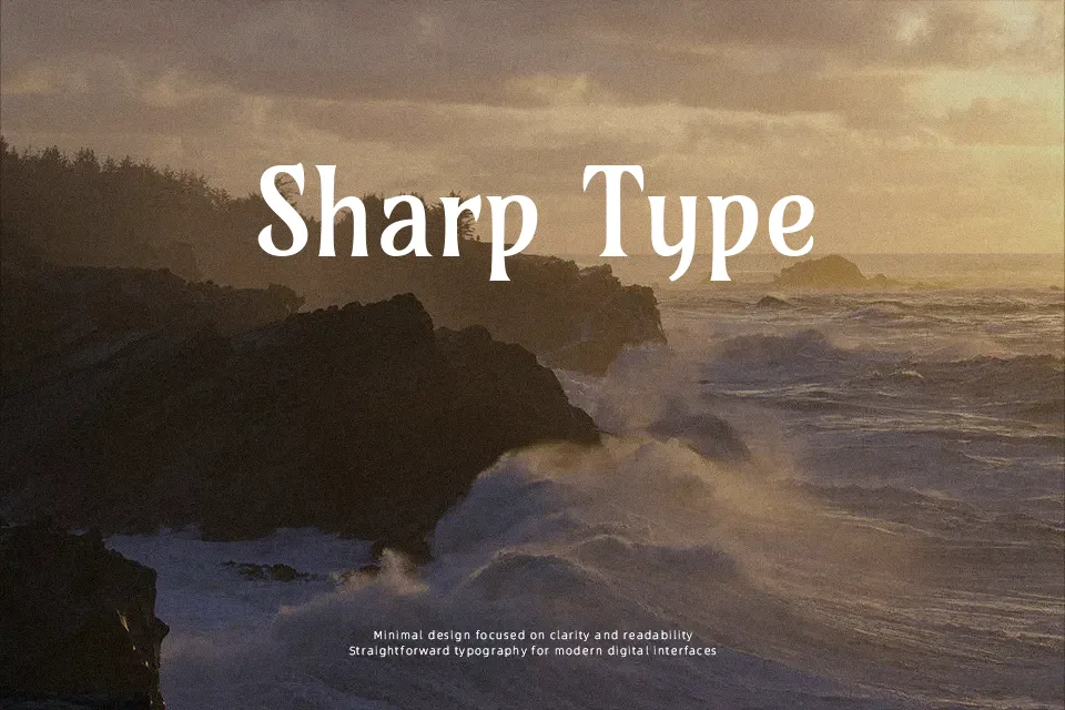
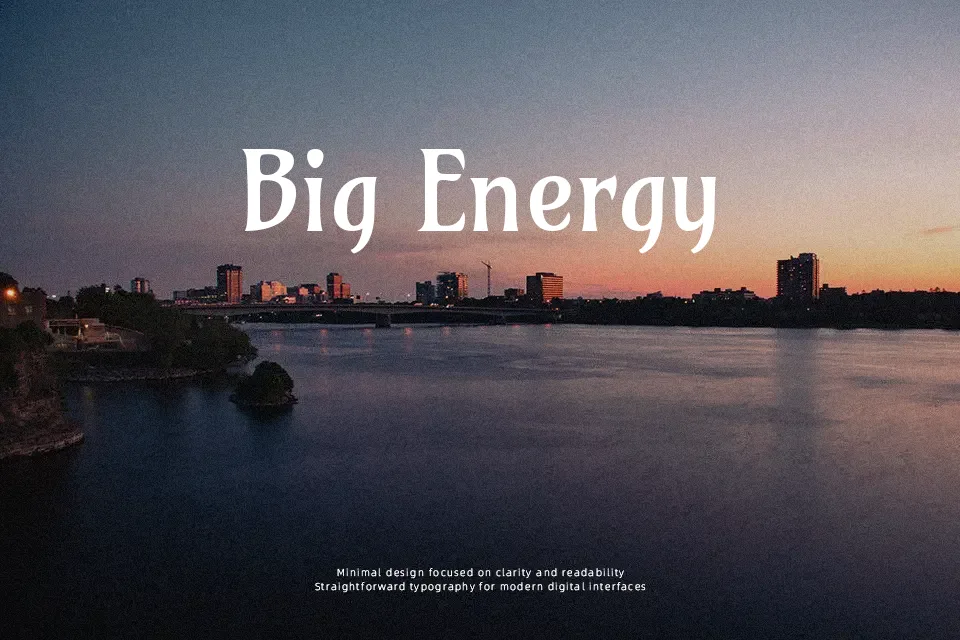
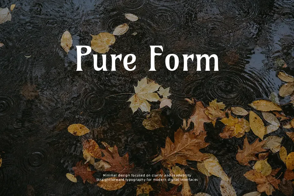
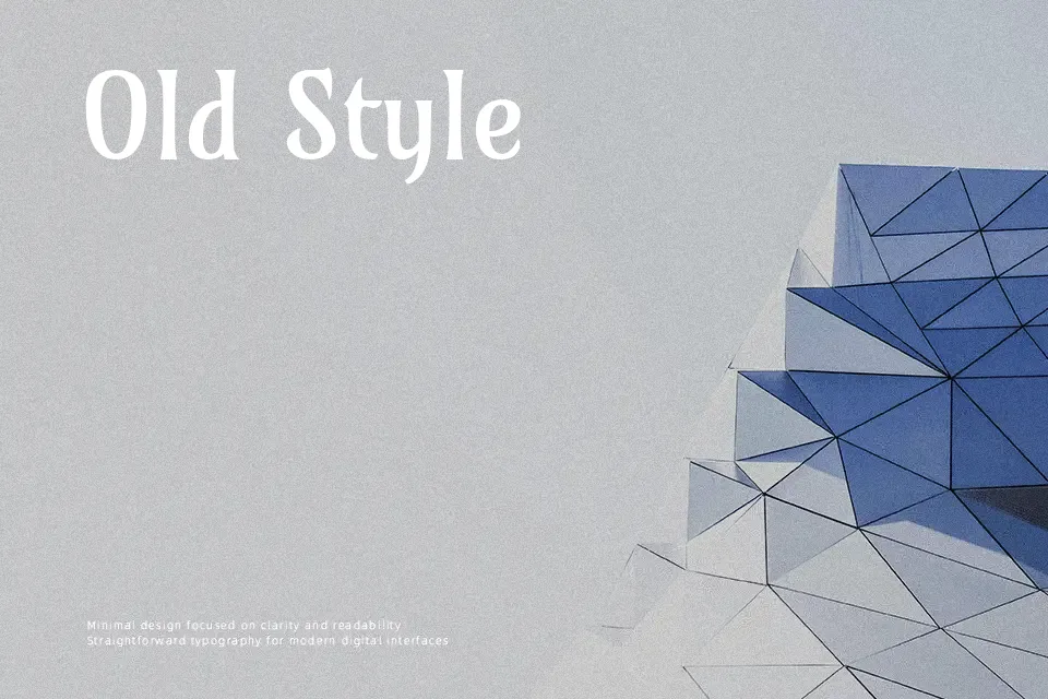
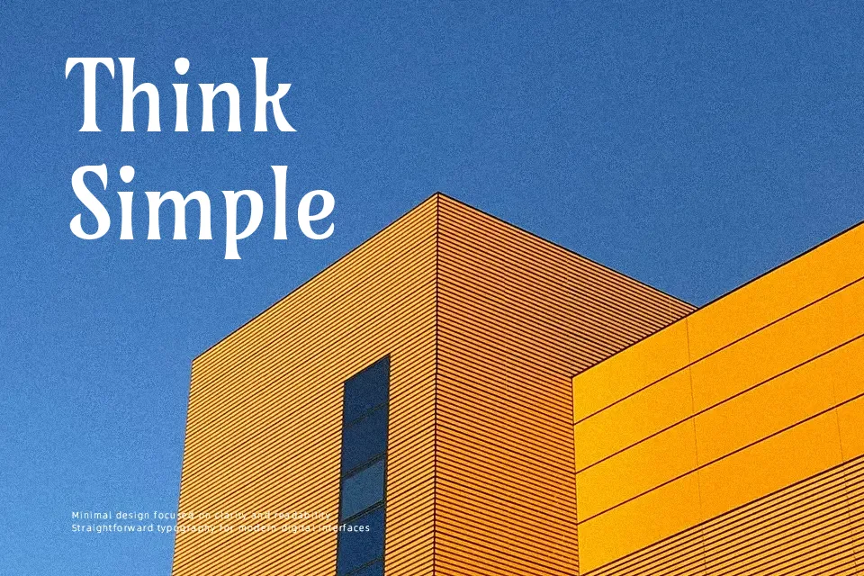
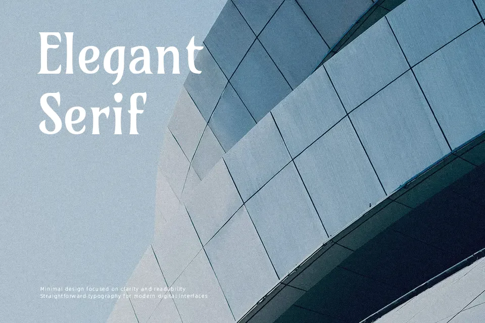
Amarante leans into a narrow, vertical rhythm, with medium-contrast strokes, pointed terminals, and ornamental curves that clearly nod to Art Nouveau poster lettering. The letters feel tall and compact, so you can fit more text into a line while still getting a decorative silhouette. In use, it behaves like a display serif but holds up for short passages, especially in editorial pieces, packaging backs, or menu section titles where you want a slightly eccentric voice. It shines when you embrace its theatrical side—think vintage-themed branding, arts events, or stylized headlines—but it can look fussy in dense body copy or highly technical interfaces. Pair it with a calm sans serif to keep layouts from feeling overcrowded.
Best For:
expressive headlines
vintage-themed posters
characterful branding wordmarks
short editorial intros
Not Ideal For:
long paragraphs
formal corporate documents
small UI labels
dense data-heavy layouts
Perfect for branding, editorial, and headline, with a artistic and condensed style.
License
Gallery