Alike Angular Font
Free for Commercial UseAbout
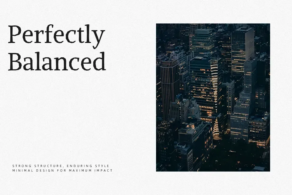
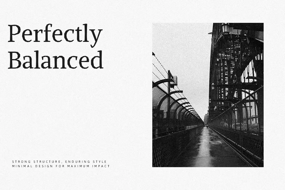
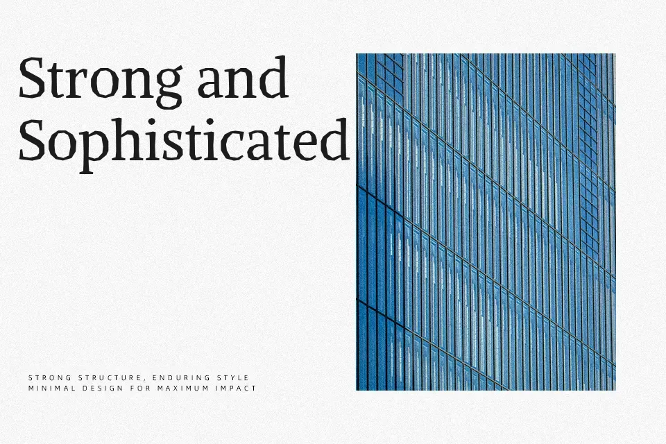
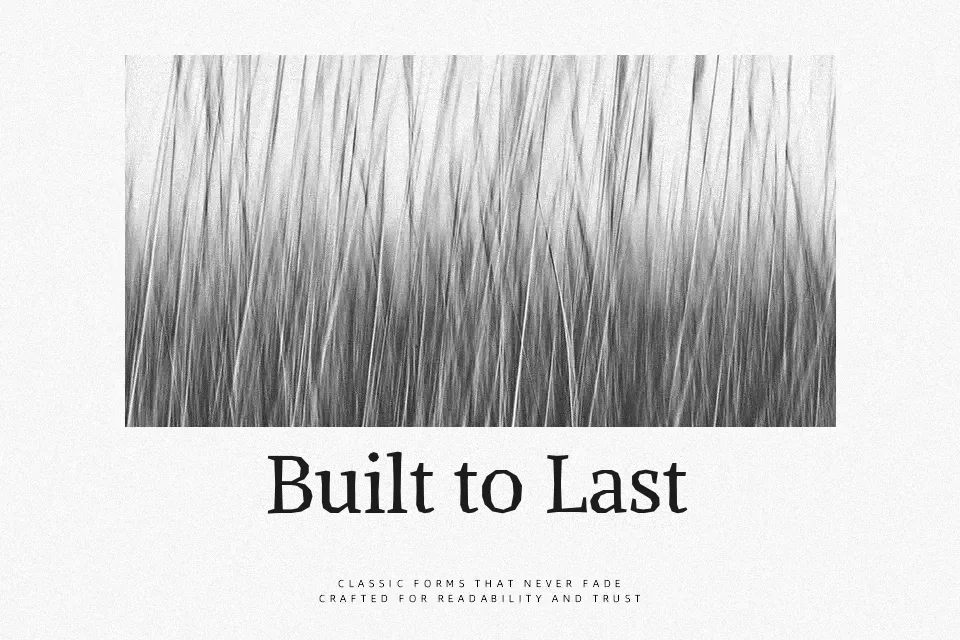
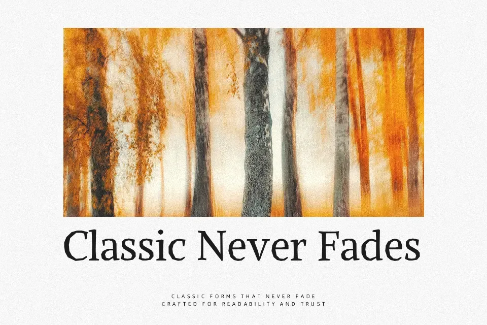
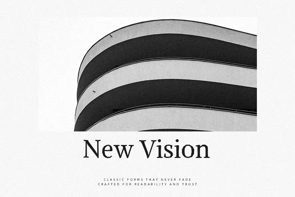
Unlike its sibling Alike Regular, Alike Angular replaces softly curved splines with strict straight-line geometry, giving each character a rigid, architectural precision. Characters like T, Z, M, and E carry expressive structural variations that make the typeface visually assertive at large display sizes. The moderate stroke contrast sits comfortably between formal and functional — serious enough for editorial work, yet not so stiff that it becomes unapproachable. It performs especially well in print-first contexts: book cover typography, cultural institution branding, or structured magazine headers where a serif needs angular authority. At small sizes or in casual digital environments, however, the tight geometry loses its punch and can feel unexpectedly cold — it was built to be seen large.
Best For:
editorial headline design
print poster layouts
cultural institution branding
book cover typography
Not Ideal For:
small-size body text
casual or playful branding
mobile UI interface labels
Perfect for branding, editorial, and headline, with a classic and display style.
License
Gallery