Alice Font
Free for Commercial UseAbout
Designed by Ksenia Erulevich and inspired by Lewis Carroll’s novel, Alice carries a distinctive personality that most text serifs simply don’t attempt — widened letter proportions, generously open apertures, and rounded terminals that feel simultaneously antiquated and approachable. The overall impression sits somewhere between classical book typography and a lightly decorative text face, without fully committing to either direction, which is both its strength and its limitation.
At reading sizes, Alice holds up well across long passages — editorial websites, styled literary blogs, or online magazines where a warm, historically-flavored tone is an asset rather than an afterthought. Where it struggles is in corporate UI contexts or minimalist brand systems that depend on tonal neutrality and weight variation for hierarchy. Its single-weight availability compounds this: once you need a bold variant for contrast, Alice has nothing to offer.
Best For:
long-form editorial content
literary-themed website copy
book-style blog layouts
headline text with vintage warmth
Not Ideal For:
corporate UI design
brand systems requiring weight hierarchy
small-size dense text blocks
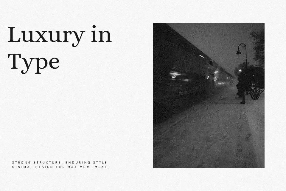
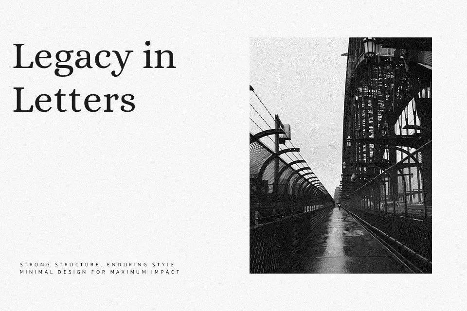
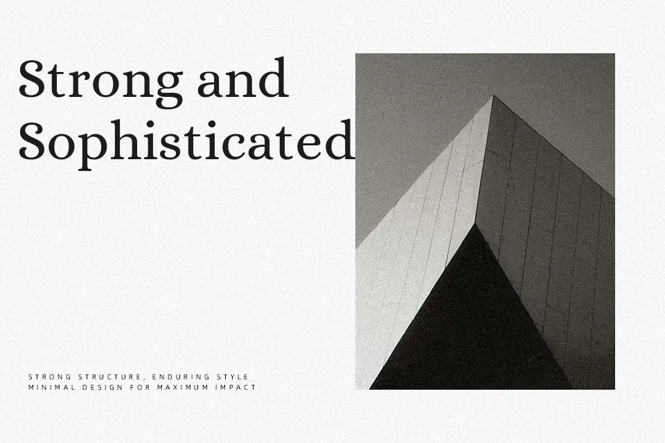
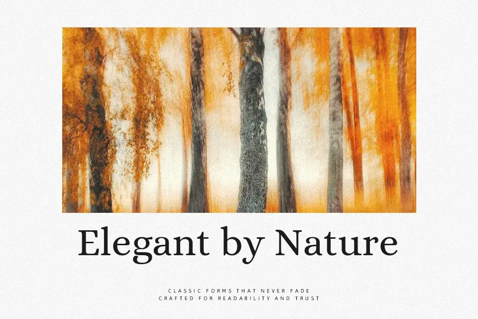
Perfect for body text, editorial, and headline, with a classic and serif style.
License
Gallery