Alegreya Sans Font
Free for Commercial UseAbout
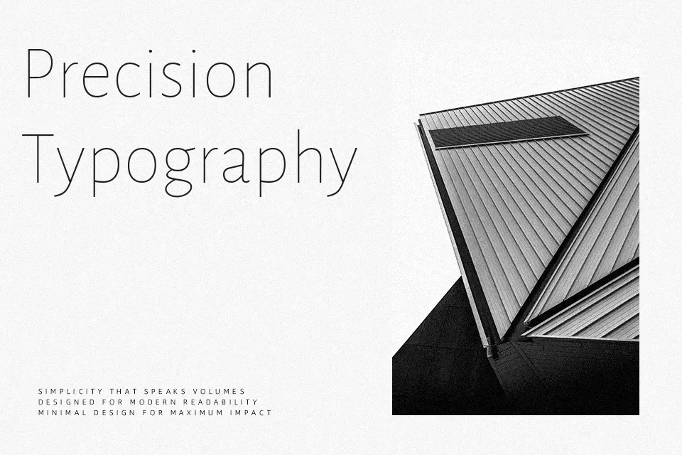
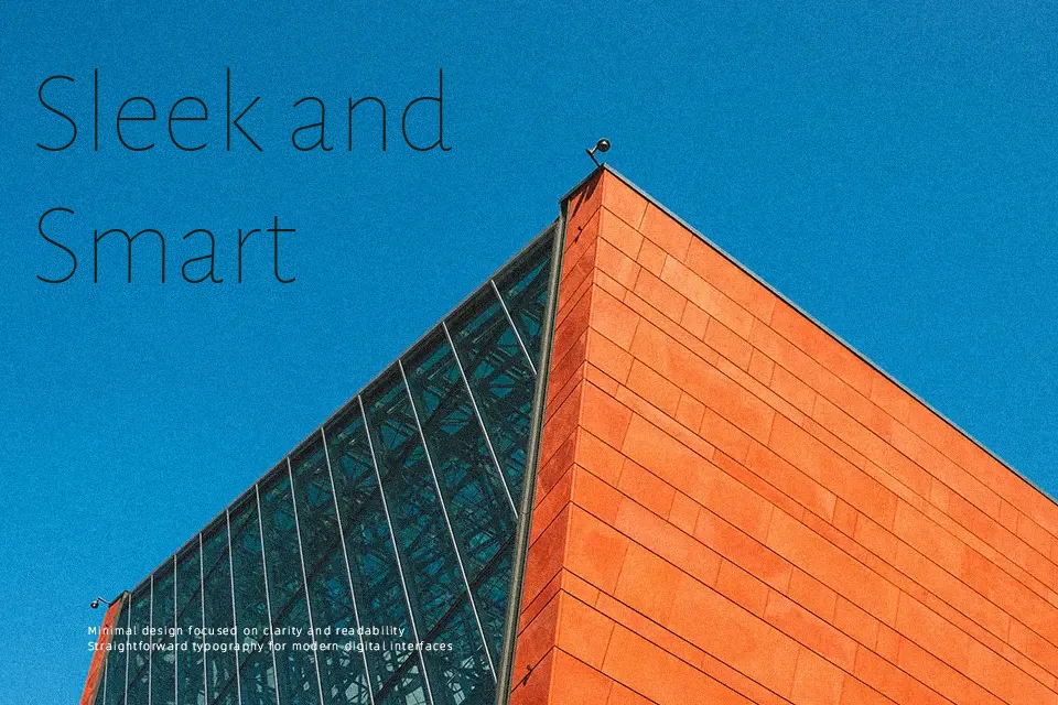
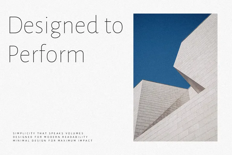
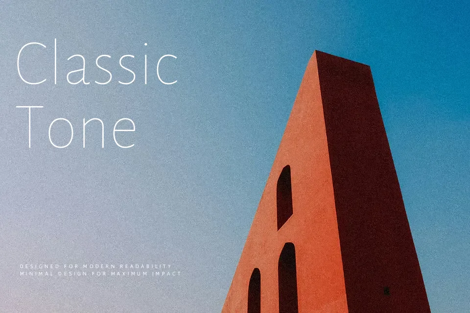
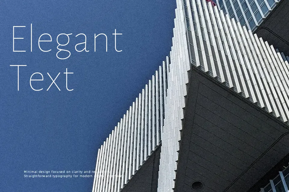
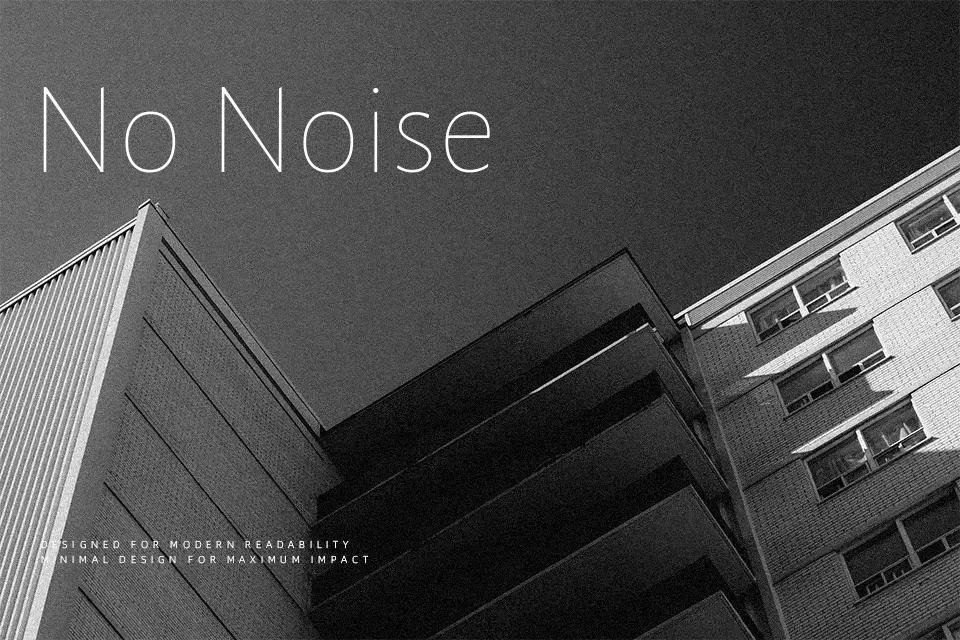
Alegreya Sans carries the kind of warmth most sans-serif typefaces trade away for neutrality. Designed by Argentinian type designer Juan Pablo del Peral as the companion to the Alegreya serif family, it inherits the same calligraphic DNA — visible in subtle stroke contrast, humanist letter proportions, and italics that feel genuinely expressive rather than mechanically sloped. Seven weights, from Thin to Black, give it real range across light editorial copy and assertive display use. It holds up beautifully in long-form reading environments: online literary journals, book interiors, and academic landing pages. Where it falls short is in branding contexts demanding cold geometric precision, or wherever a strongly neutral grotesque is the established visual convention.
Best For:
editorial website body text
literary magazine layouts
long-form article headlines
book cover typography
Not Ideal For:
tech branding requiring geometric neutrality
data-heavy UI dashboards
ultra-tight condensed display contexts
Perfect for body text, editorial, and headline, with a classic and sans serif style.
License
Gallery