Alegreya Font
Free for Commercial UseAbout
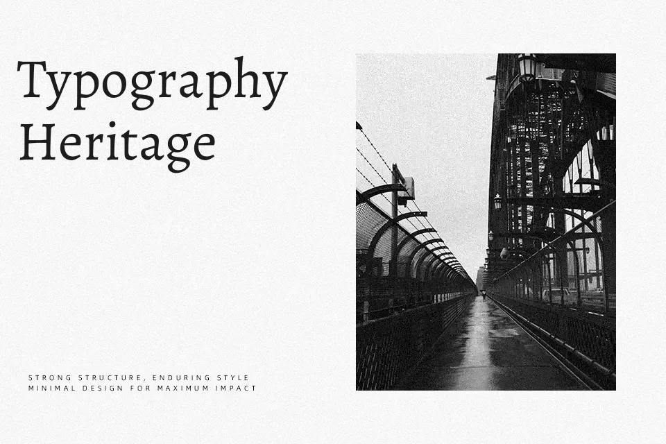
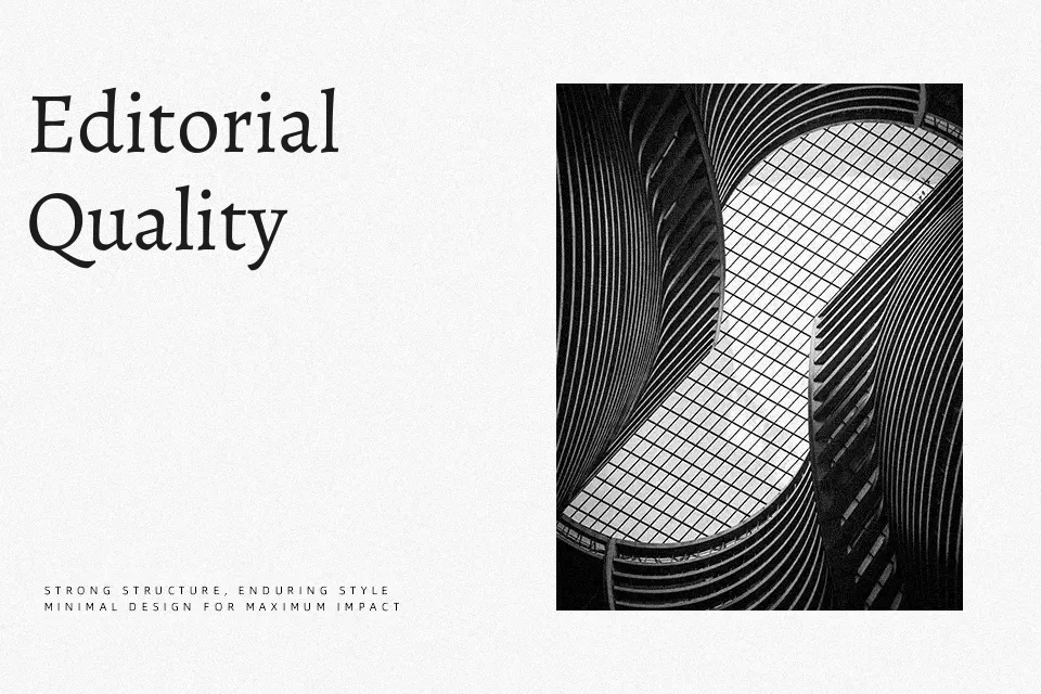
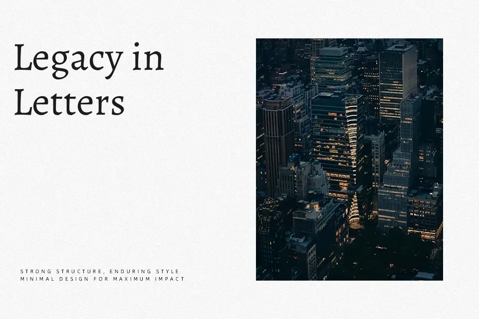
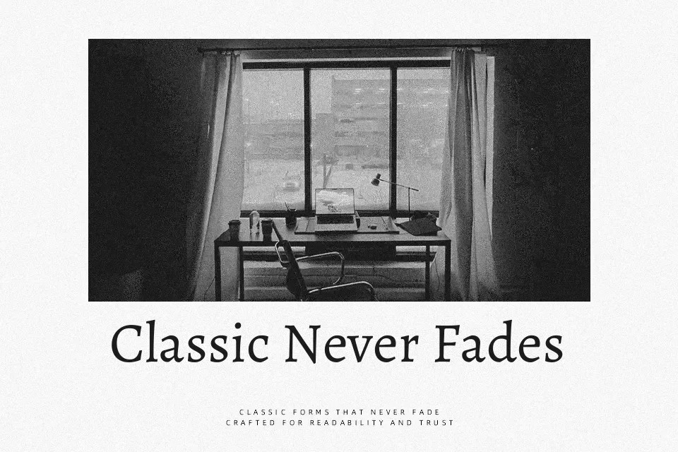
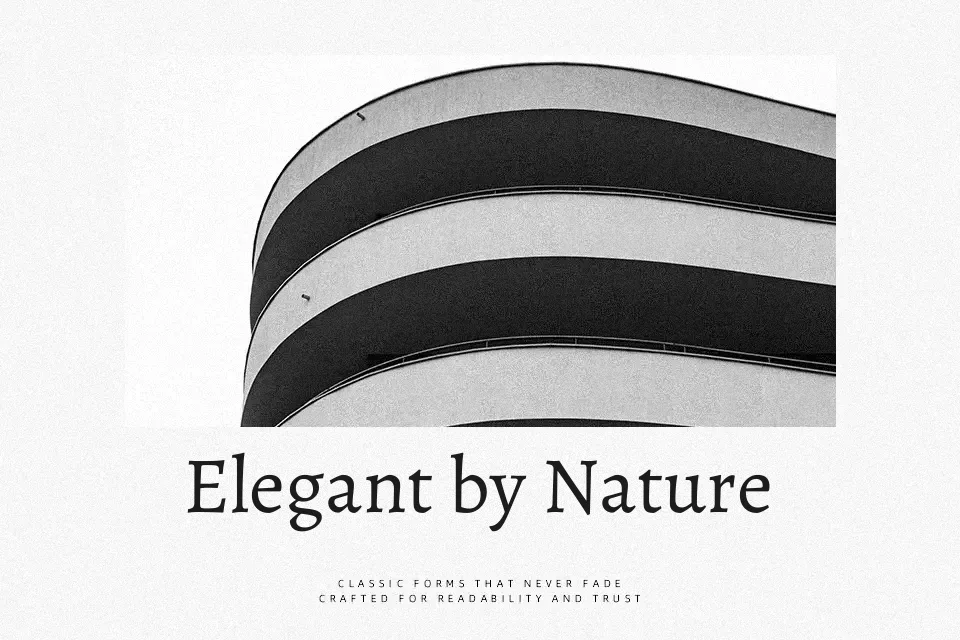
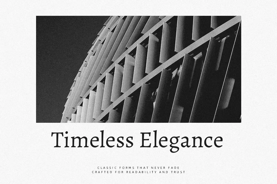
Alegreya carries a calligraphic spirit without leaning into decorative excess. Its asymmetric tilted serifs, rich stroke variation, and curved tails on characters like ‘u’ and ‘d’ give it a handcrafted quality — yet the spacing remains open and deliberate, making extended reading genuinely comfortable on both screen and print. The tapered stems and sharp italic joints add typographic texture that rewards close attention.
Where it works best: literary magazine layouts, academic journal body copy, and humanities-focused website editorial sections. The italic is strong enough to stand alone for pull quotes or subheadings. It performs less well inside minimalist tech interfaces or stripped-back corporate design systems — its inherent warmth and period character tend to feel tonally mismatched in those contexts.
Best For:
book layout body text
literary editorial design
humanities website typography
long-form article copy
Not Ideal For:
minimalist tech product UI
corporate brand systems
geometric sans-heavy design environments
Perfect for body text, branding, and editorial, with a artistic and display style.
License
Gallery