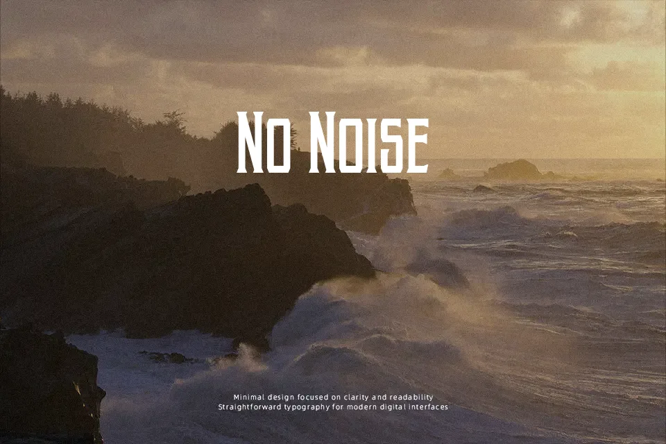
Akura Popo Font
Free for personal useAbout
Sharp, narrow letterforms with pronounced serifs and high contrast between thick and thin strokes — Akura Popo reads less like a polished editorial font and more like a rally cry in print. The condensed structure packs visual impact into tight spaces, making it a reliable pick for sports merchandise, vintage poster headers, and bold letterheads. Uppercase characters carry the most weight here; they’re tall, confident, and consistent across the set. Lowercase glyphs hold the same DNA but soften slightly, which can feel a touch uneven when mixed into display strings. It won’t perform well at small sizes or in body copy — the serif details compress and lose legibility quickly. Where it earns its place is in single-line lockups and headline treatments where that old-school toughness is exactly what the design needs.
Best For:- Sports team logo headers and jersey wordmarks
– Retro or vintage poster headlines
– Letterhead and brand identity with a bold, classic feel
– Music event or concert title treatments
Not Ideal For:- Body text or long-form reading at any size
– Corporate or formal documents requiring neutral tone
– Small-scale use (icons, captions, footnotes)
– Modern minimalist or tech-oriented UI design
Perfect for branding, business card, and editorial, with a bold and condensed style.
License
Gallery