Akronim Font
Free for Commercial UseAbout
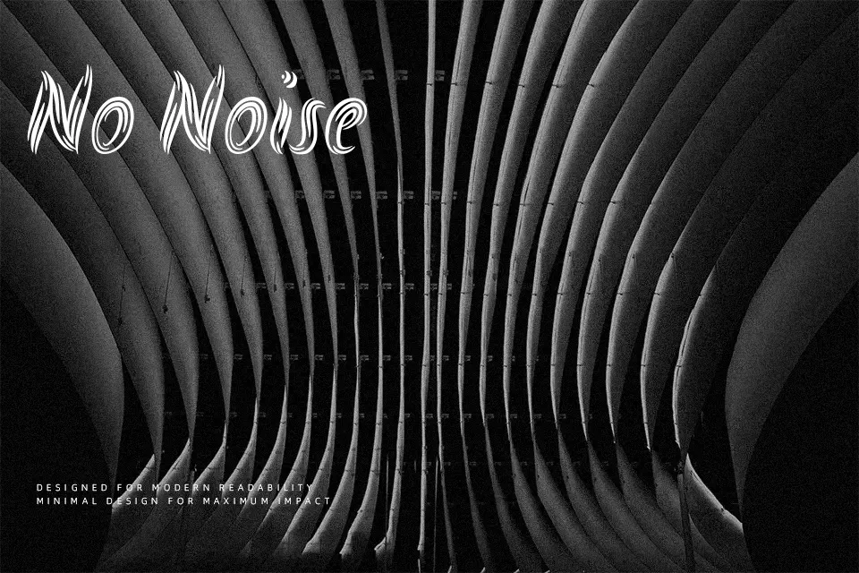
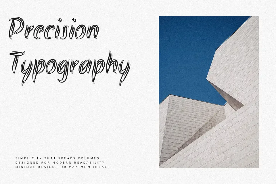
Akronim is a single-weight display typeface with thick strokes, sharp corners, and compact spacing that pushes letters tightly together for a dense, high-impact texture. Its structure leans on geometric shapes but keeps a hand-drawn, slightly rough attitude, so it reads more like painted signage than a sterile digital font. The overall mood is energetic, bold, and a bit gritty, which works nicely on sports graphics, gig posters, YouTube thumbnails, or street-inspired logo work where you only need a few words. It struggles in small sizes or long passages, and the personality is too loud for formal branding or serious editorial layouts, so it is better treated as a visual accent than a workhorse typeface.
Best For:
headline graphics
streetwear or sports branding
music or event posters
short text accents on social media
Not Ideal For:
body copy or long reading
formal corporate documents
minimalist editorial layouts
small interface text
Perfect for branding, headline, and logo, with a artistic and decorative style.
License
Gallery