Ace Richard Font
Free for personal useAbout
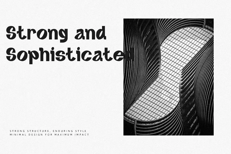
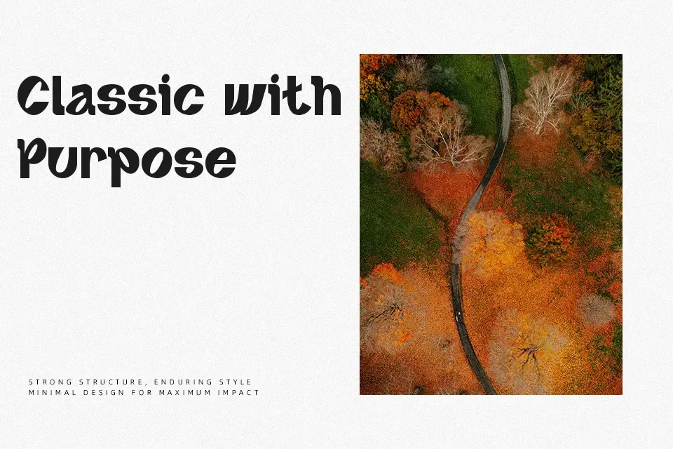
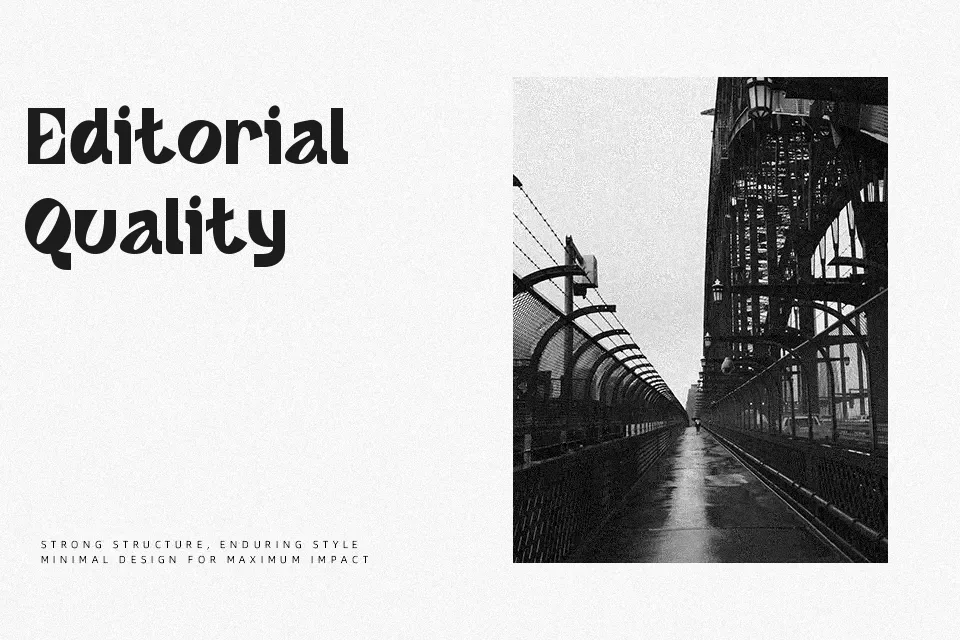
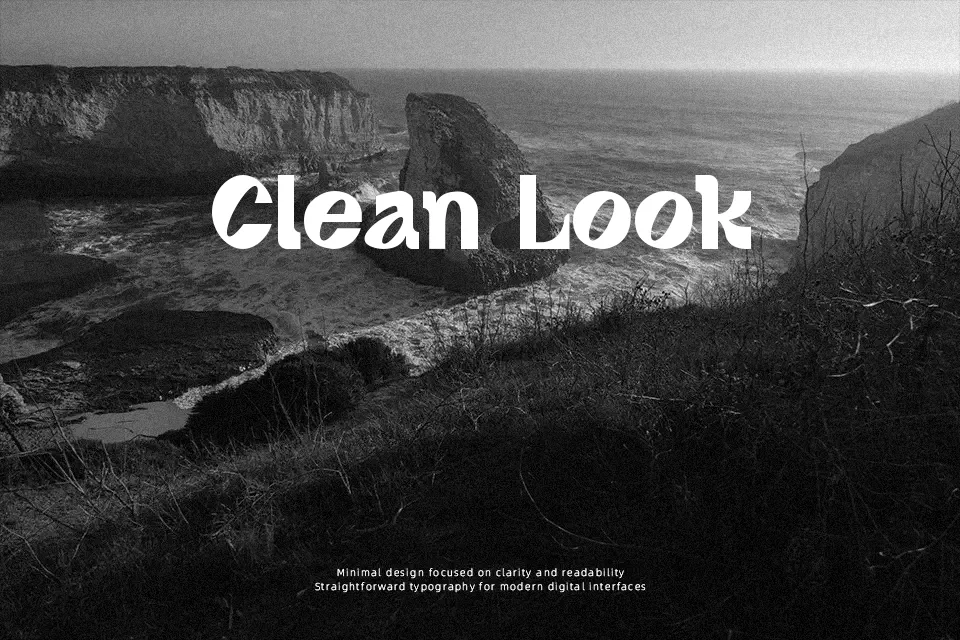
Ace Richard leans hard into its italic stance — the letterforms tilt with intention, giving the whole face a kinetic, forward-moving feel. Strokes are thick and assertive, with a condensed rhythm that keeps headlines tight and punchy. The contrast is moderate, lending it just enough visual weight to dominate a layout without crowding it. It reads well at display sizes for music branding, streetwear labels, sports posters, and social media headers. That said, the personality is specific — use it in the wrong context and it can feel out of place in polished corporate or editorial settings. For small body text, the letterforms lose their impact entirely and become difficult to read. Works best when paired with a neutral sans-serif to balance its boldness.
Best For:- Sports event poster headers
– Streetwear and music brand logos
– Social media campaign visuals
– Product packaging with bold attitude
Not Ideal For:- Long-form body text or editorial copy
– Corporate identity systems or formal business documents
– Elegant wedding or luxury event design
– Small-size UI labels or navigation text
Perfect for advertising, branding, and headline, with a bold and condensed style.
License
Gallery