Aborto Espacial Font
Free for personal useAbout
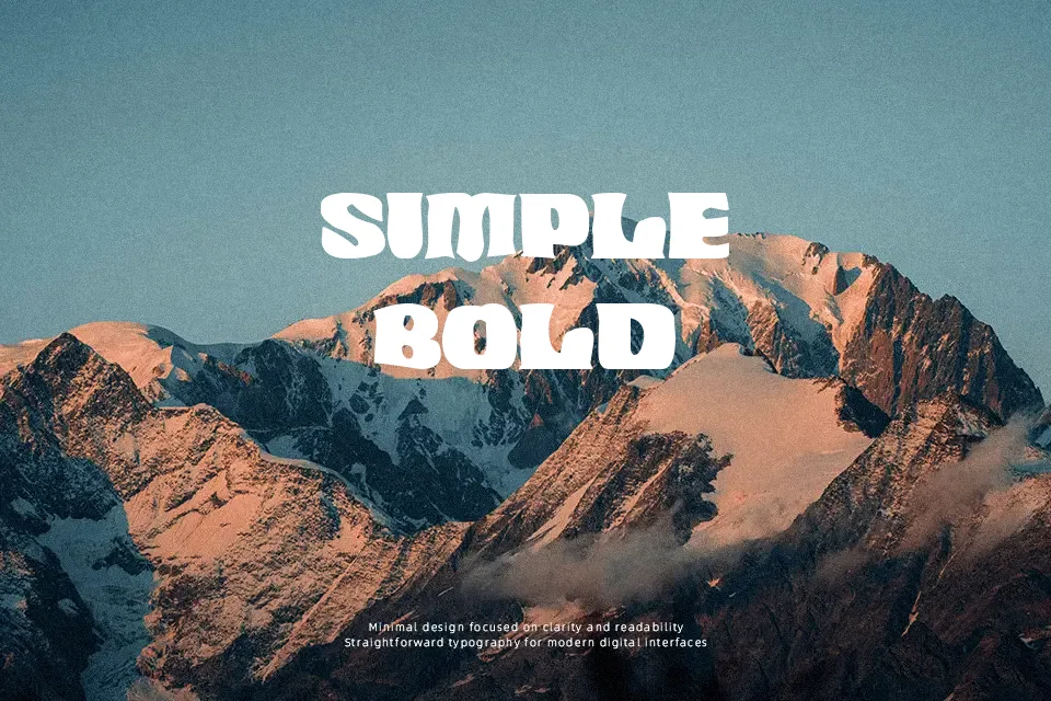
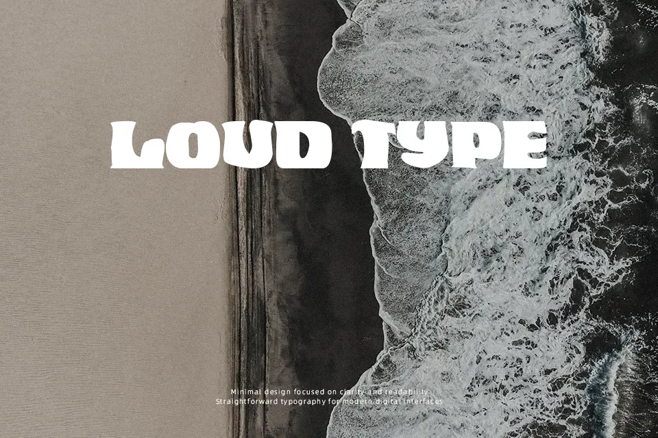
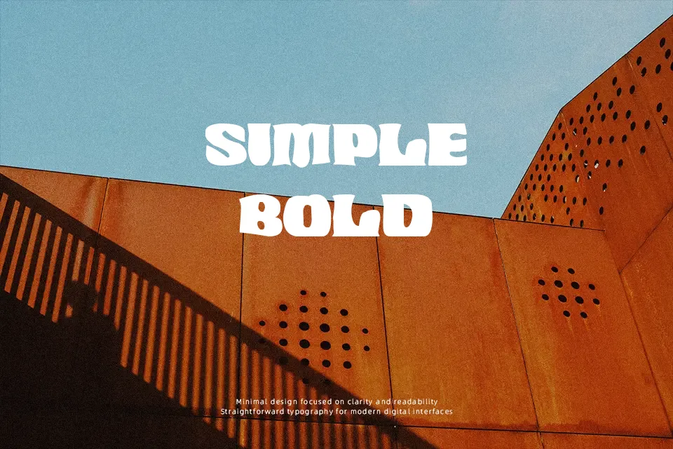
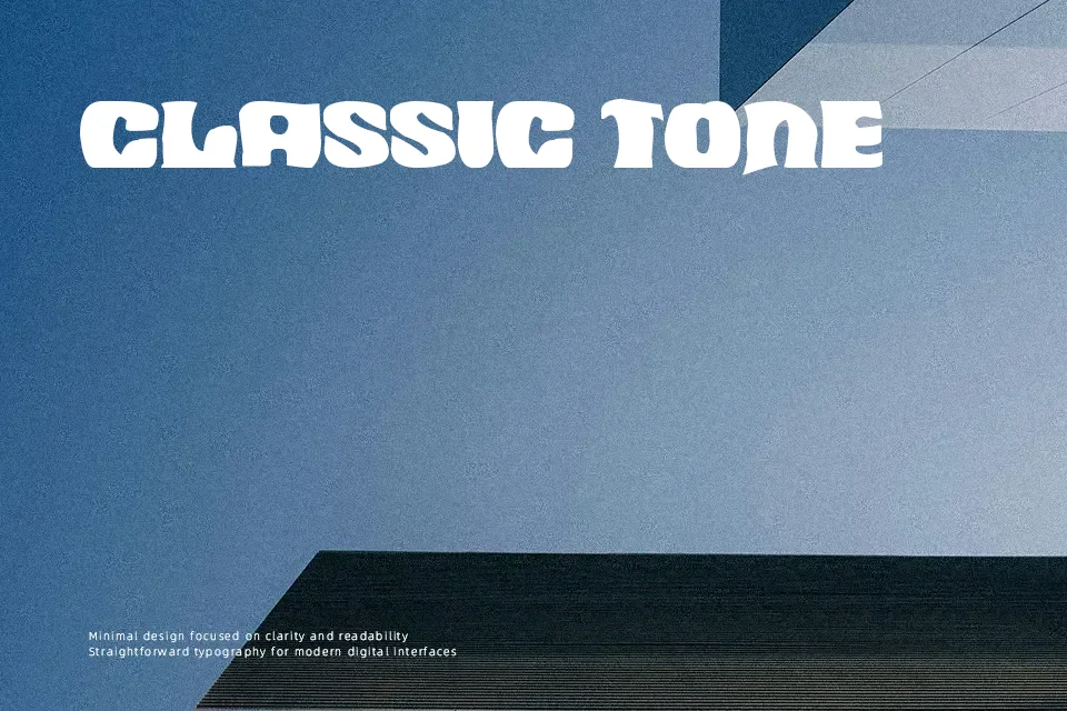
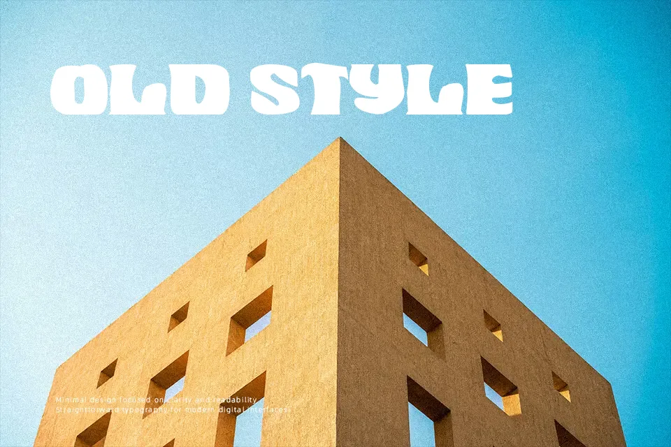
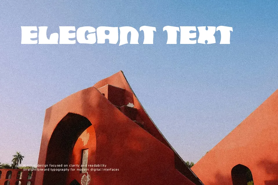
There’s something immediately cinematic about Aborto Espacial — it reads like a title card pulled straight from a 1970s science fiction B-movie. The letterforms are wide and expanded, with thick strokes, low contrast, and a groovy rhythm that straddles retro camp and cosmic drama. It suits large-scale headline use well: band posters, festival graphics, zine covers, and sci-fi game titles all play to its strengths. Where it struggles is readability at small sizes — the decorative weight and character spacing break down quickly below display scale. It’s also a poor fit for mixed-case running text; this is a font that lives at the top of the page, not in a paragraph. For designers who need something with genuine character rather than polished neutrality, this one earns its place.
Best For:- Sci-fi and retro-themed poster headlines
– Music festival and concert flyer titles
– Zine and underground magazine covers
– Game or film title treatments with a vintage-futuristic vibe
Not Ideal For:- Body text or long-form reading
– Corporate or professional branding
– Small-size usage such as captions or UI labels
– Projects requiring a clean, modern typographic tone
Perfect for advertising, film, and gaming, with a bold and decorative style.
License
Gallery