Aberforth Rough Font
Free for personal useAbout
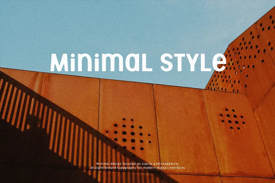
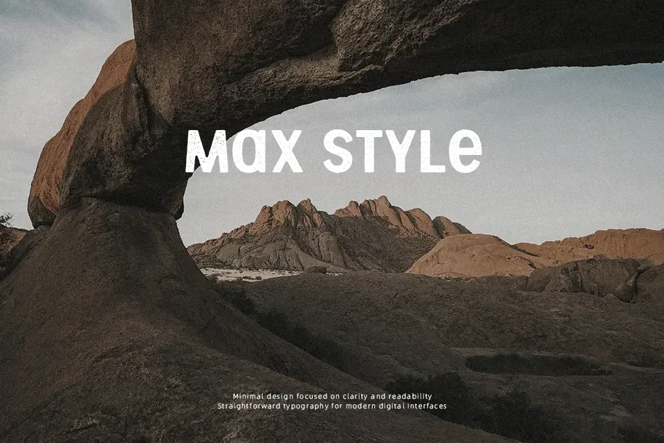
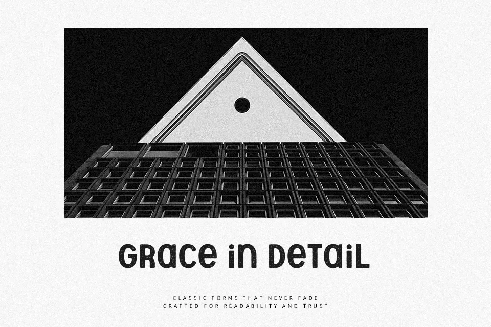
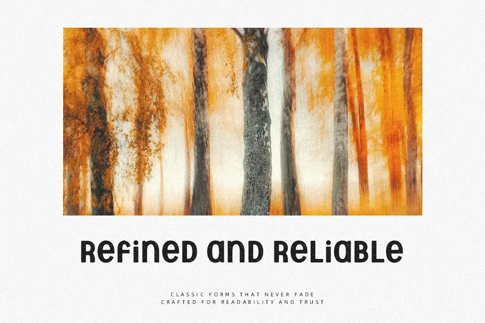
The roughened strokes and uneven ink edges of Aberforth Rough give it a distinctly handcrafted, weathered feel — the kind of texture you’d expect on a vintage label or a hand-stamped crate. Each letterform carries subtle irregularities that keep it from feeling sterile or over-designed. It works well at large display sizes where those details breathe, lending authenticity to craft brewery labels, festival posters, or indie band merchandise. That said, the rough treatment becomes noise at small sizes, making it a poor fit for captions, body copy, or any context demanding legibility under 18pt. Designers who appreciate analog imperfection over polish will find it useful; those needing clean, scalable type should look elsewhere.
Best For:
– Craft brewery or distillery label headers
– Indie music poster titles and event flyers
– Rustic packaging and artisan product branding
– Vintage-style apparel graphics
Not Ideal For:
– Body text or small-size copy
– Corporate or formal business materials
– Digital UI elements requiring crisp rendering
– Long-form editorial typesetting
Perfect for branding, headline, and music, with a artistic and display style.
License
Gallery