A Typewriter For Me Font
Free for personal useAbout
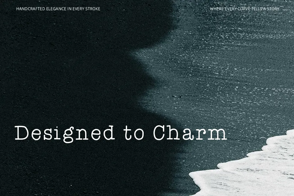
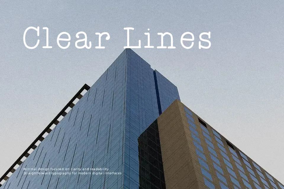
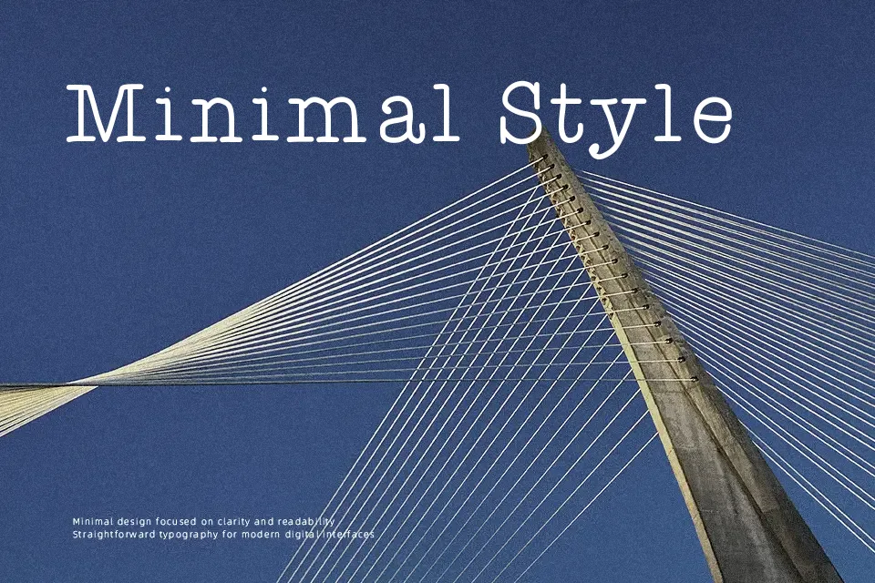
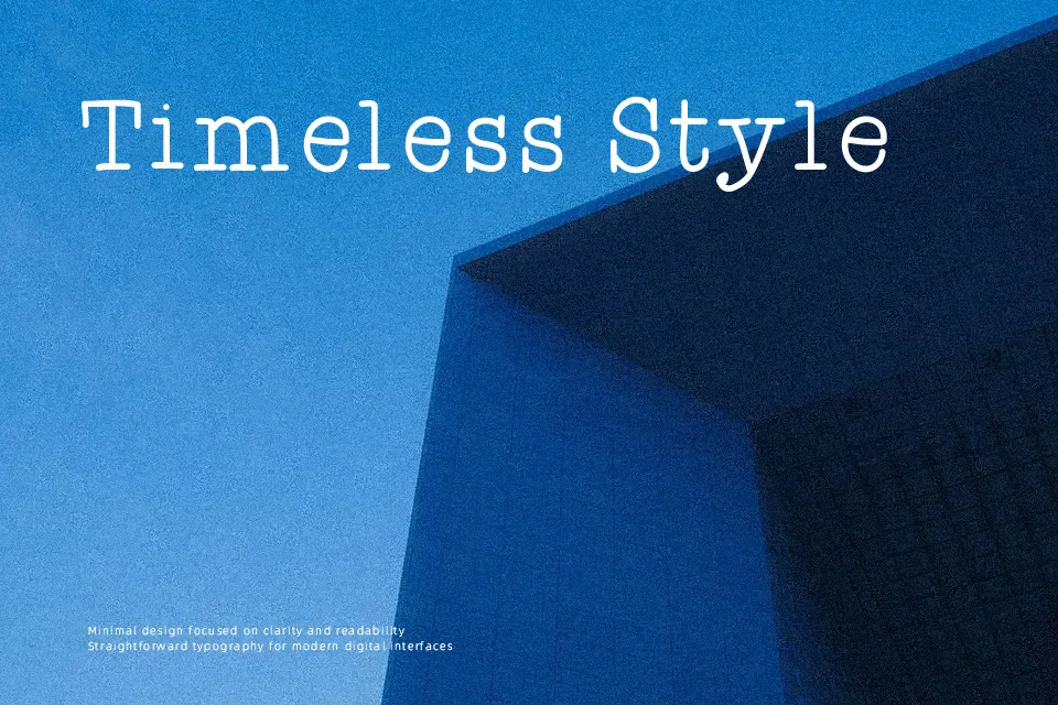
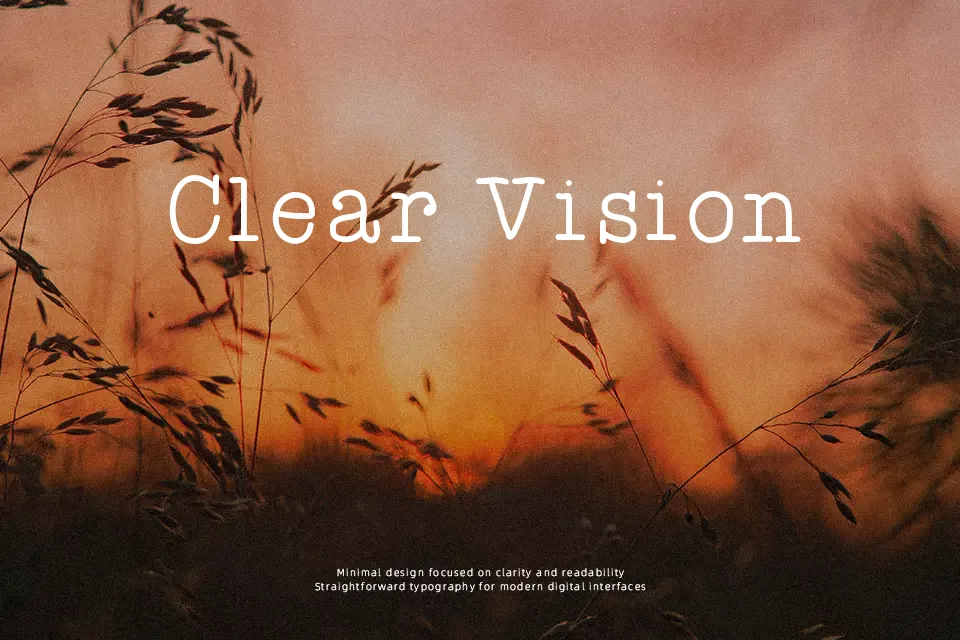
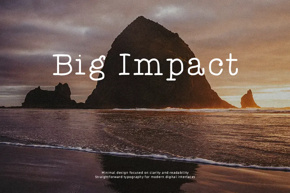
What stands out immediately is the deliberate imperfection — letters sit at slightly inconsistent baselines, ink density shifts across characters, and the overall texture reads like a well-used ribbon typewriter from decades past. That roughness is the point, and it works convincingly for short-form vintage editorial pieces, nostalgic packaging labels, or retro-themed social media graphics. The spacing carries a casual looseness that reinforces the handmade impression without tipping into illegibility — at moderate sizes. Push it into small body text, though, and that charm collapses into visual noise. Long paragraphs are genuinely difficult to read, which limits its practical range. Best used as a headline or accent element rather than a workhorse typeface.
Best For:
– Vintage zine or journal cover headers
– Retro packaging and product labels
– Nostalgia-themed social media posts
– Personal stationery or handcrafted invitation accents
Not Ideal For:
– Body text or long-form reading
– Corporate or professional documents
– Digital UI labels requiring clarity at small sizes
– Projects demanding typographic consistency across weights
Perfect for editorial, invitation, and packaging, with a classic and display style.
License
Gallery