A Little Scribble in My Book Font
Free for personal useAbout
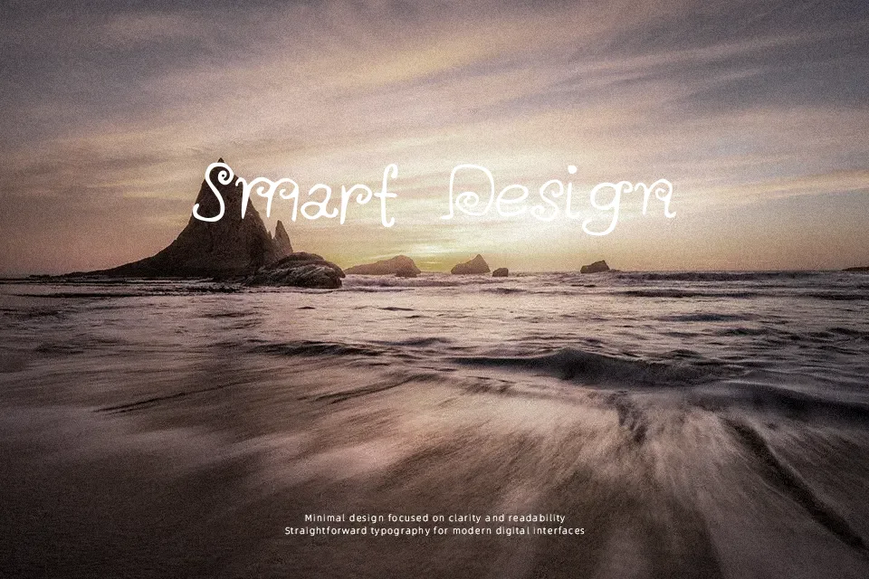
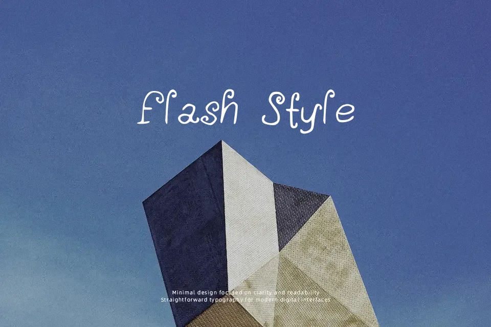
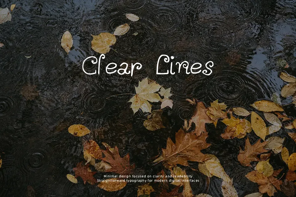
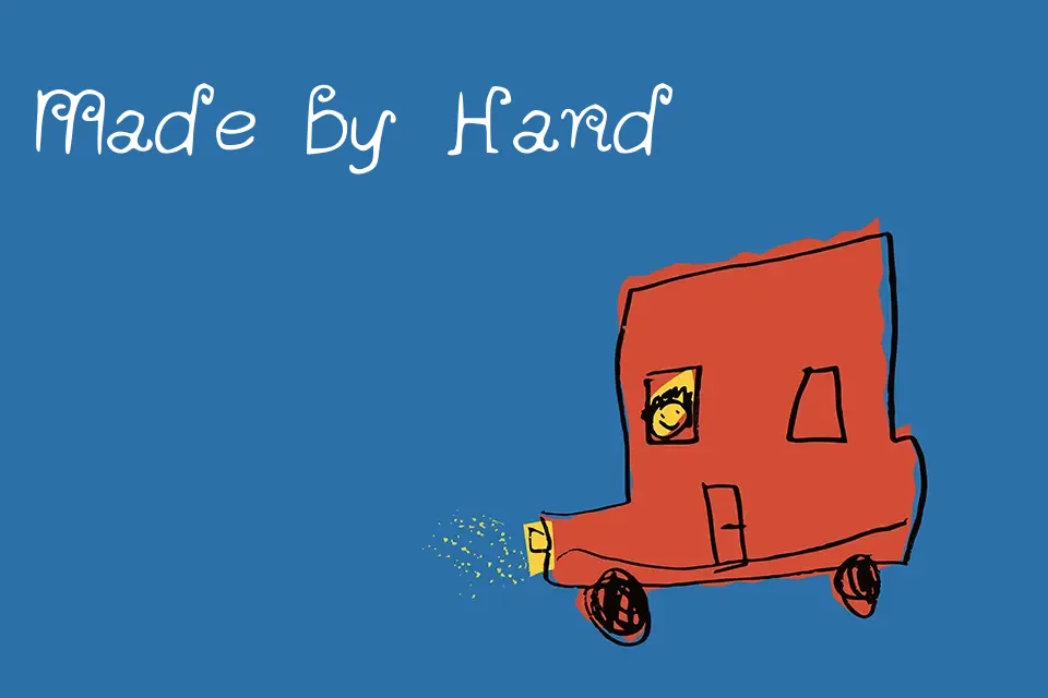
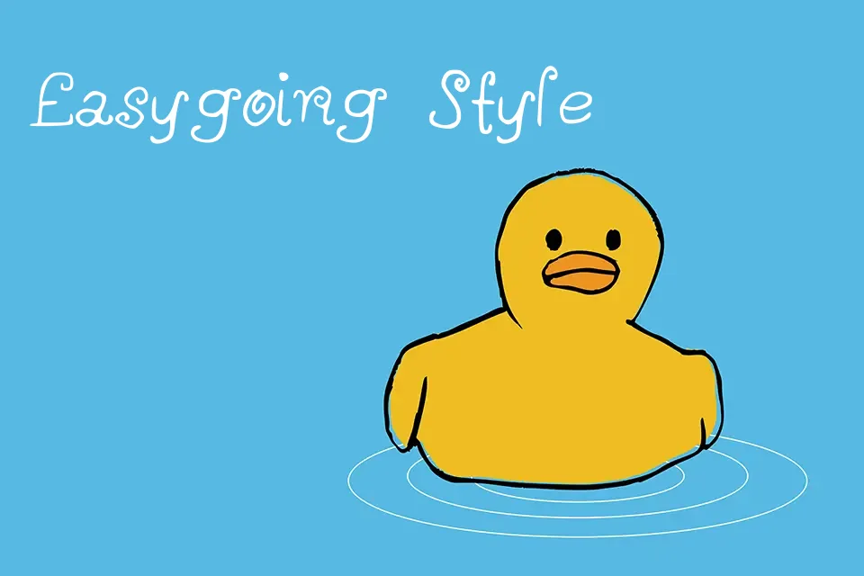
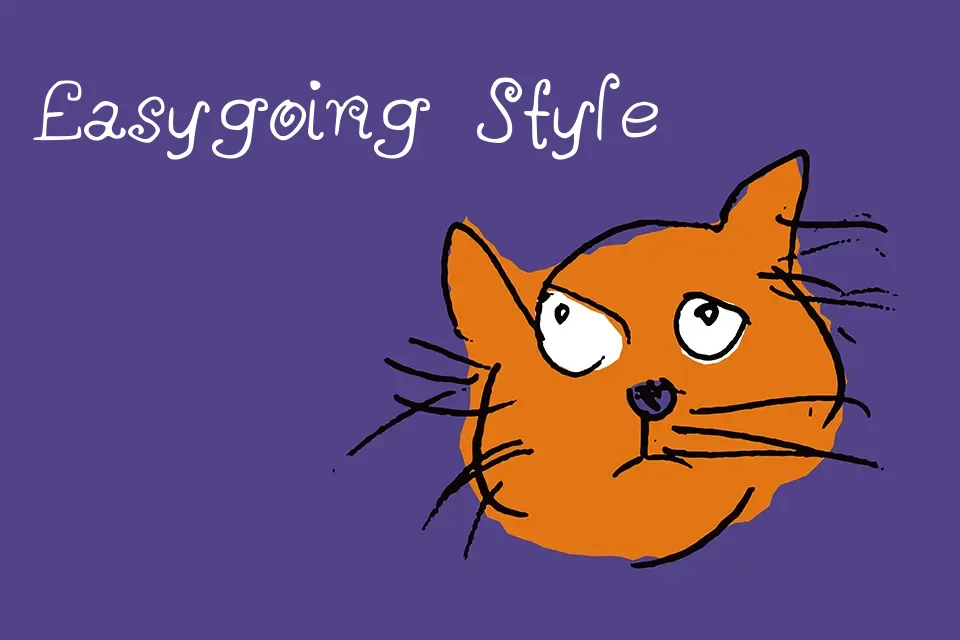
The strokes here are deliberately imperfect — slightly uneven baselines, irregular letter spacing, and a rhythm that feels more like a pencil dragged across paper than a carefully lettered composition. That rawness is exactly its appeal for projects like children’s educational materials, handmade greeting card headlines, or indie zine covers where a manufactured look would kill the mood. Kerning is loose by design, so tight typesetting won’t work; trying to use this at small sizes or in dense blocks of text will quickly reveal its limits. It reads best at display sizes with breathing room around it. If your project needs warmth and a touch of imperfection over polish, this delivers — but graphic design work demanding consistency or professional precision should look elsewhere.
Best For:
– Children’s book chapter headers or activity sheet titles
– Handmade-style greeting card headlines
– Indie zine or personal blog display text
– DIY packaging labels with a crafted, personal feel
Not Ideal For:
– Body text or any extended reading passages
– Corporate branding or formal business materials
– Small-size print where stroke irregularity becomes visual noise
– Projects requiring tight, consistent kerning
Perfect for editorial, invitation, and kids, with a creative and display style.
License
Gallery