A Habesha’s Typewriter Font
Free for personal useAbout
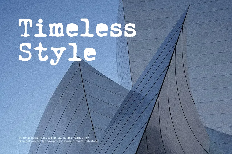
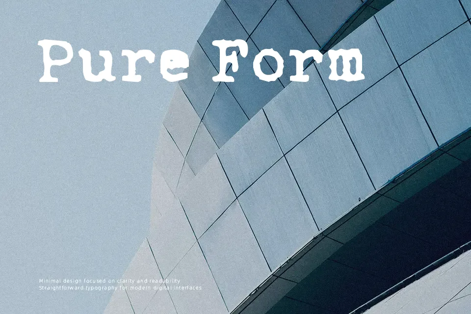
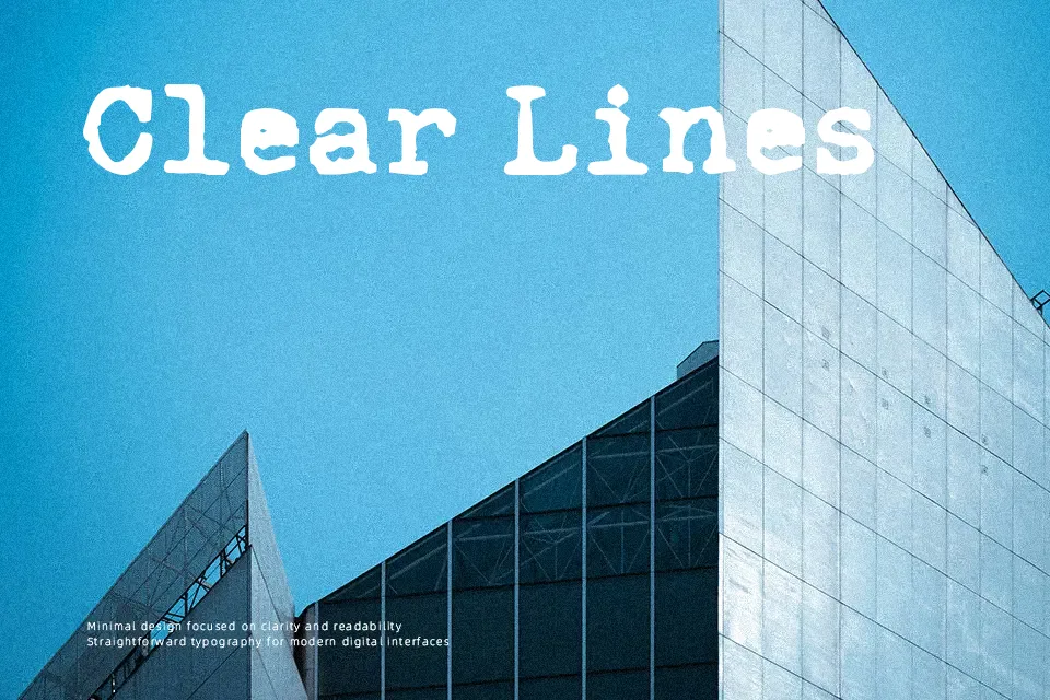
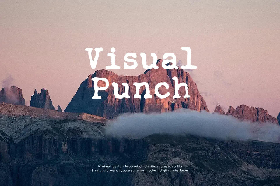
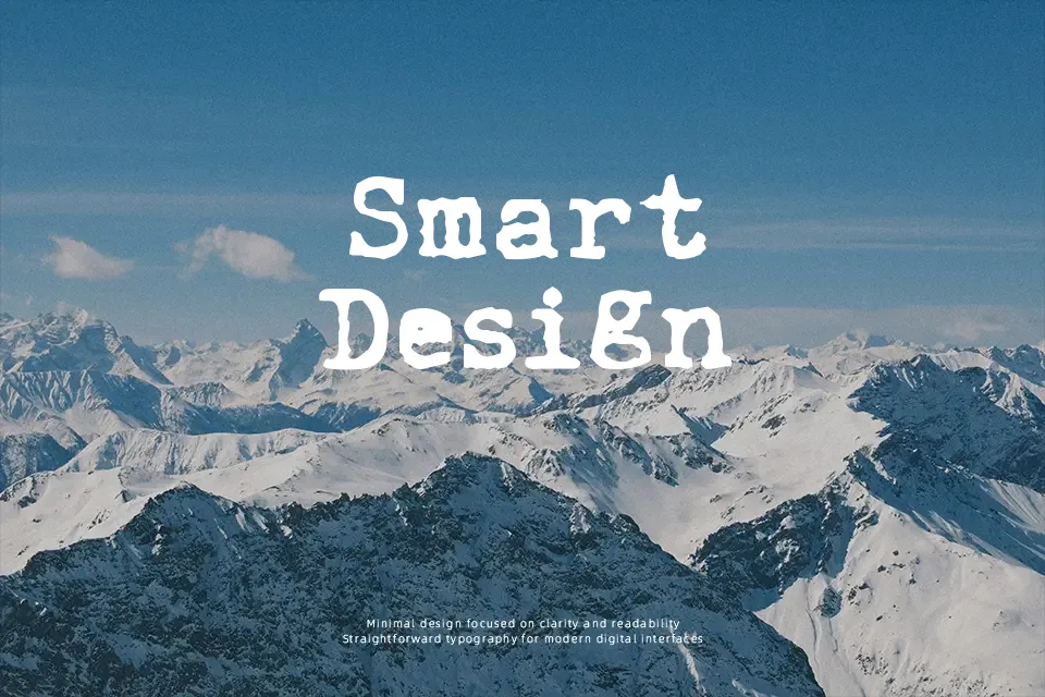
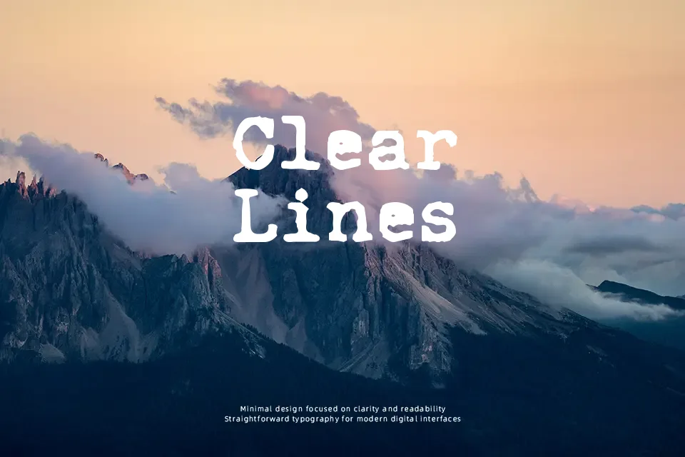
Each character in this font carries the uneven ink pressure and slightly misaligned baseline that makes typewriter-style fonts feel lived-in rather than constructed. The strokes are monospaced in character, with subtle weight variation that mimics a ribbon running low on ink — giving text a textured, analog quality. It works well in short-form editorial headers, vintage-themed social posts, and personal creative projects where roughness reads as authenticity. That said, extended body copy becomes fatiguing quickly — the irregular rhythm that charms at a headline scale turns into visual noise across paragraphs. Small sizes also suffer; detail gets muddy below 14pt on screen. If you need typewriter aesthetics for professional print collateral, something with cleaner stroke consistency might serve better.
Best For:
– Retro zine headers and DIY publication titles
– Personal blog or journal-style social media graphics
– Nostalgic poster design with limited text
– Vintage-themed packaging labels
Not Ideal For:
– Long-form body text or reading-heavy layouts
– Corporate or formal business documents
– Small-size usage below 14pt on screen
– Projects requiring multilingual or extended character support
Perfect for editorial, headline, and poster, with a classic and display style.
License
Gallery