Mate SC Font
Free for Commercial UseAbout
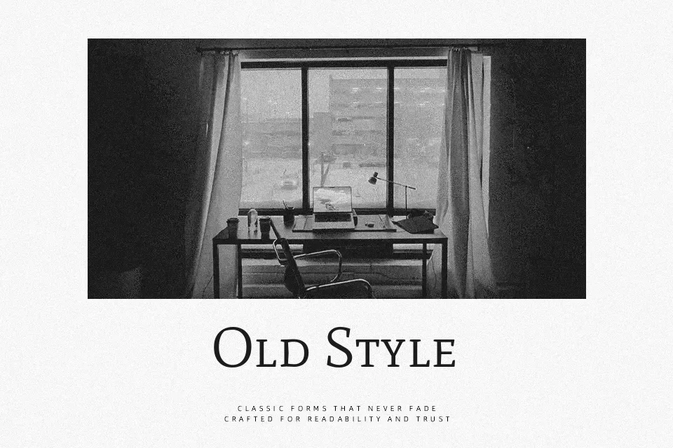
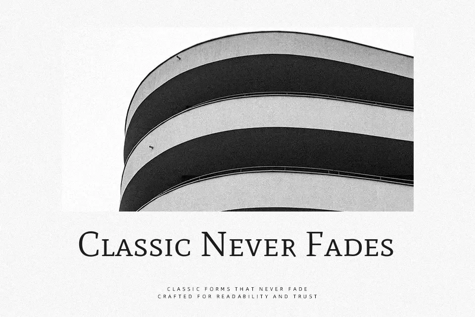
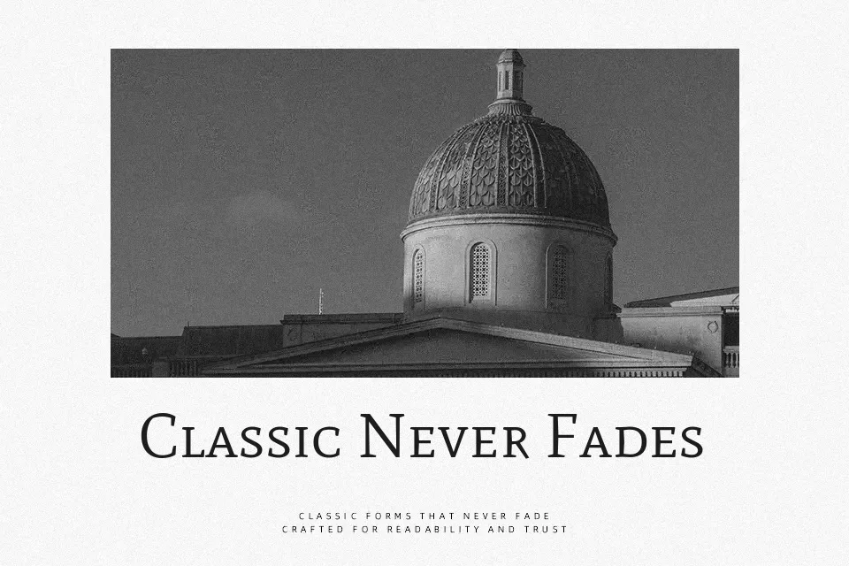
Mate SC is a small-caps-only serif with sharp detailing, generous counters, and a medium overall texture, so it stays clear even at modest sizes. Its proportions draw from Renaissance and humanist styles, which gives text a calm, bookish tone rather than a trendy look. It works especially well for chapter titles, side column labels, navigation menus, footnote heads, and academic or legal titling where you want authority without resorting to heavy weights. However, because it ships in a single weight and uses all small caps, it is not a good choice for long body copy or interfaces that rely on upper‑ and lowercase contrast for accessibility.
Best For:
section headings in publications
navigation labels and UI tags
academic or legal titling
subtle branding on stationery
Not Ideal For:
long paragraphs of body text
mobile UI text requiring high legibility hierarchy
informal or playful branding
dense data tables or dashboards
Perfect for body text, business card, and editorial, with a classic and serif style.
License
Gallery