M PLUS 1p Font
Free for Commercial UseAbout
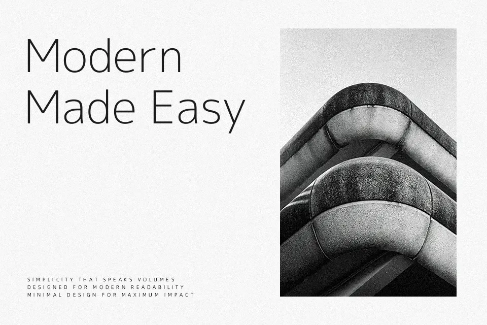
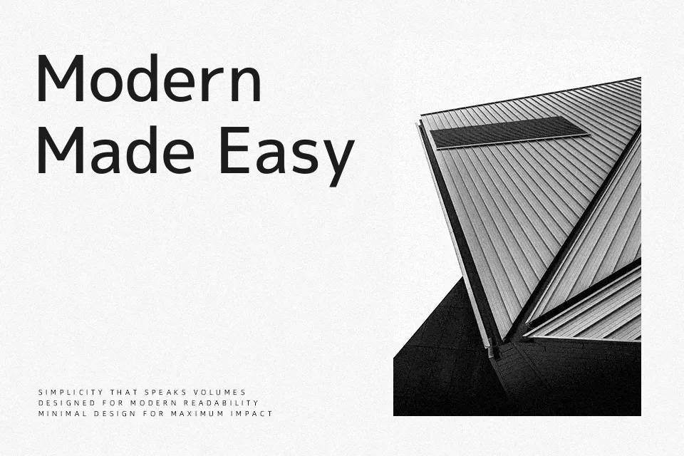
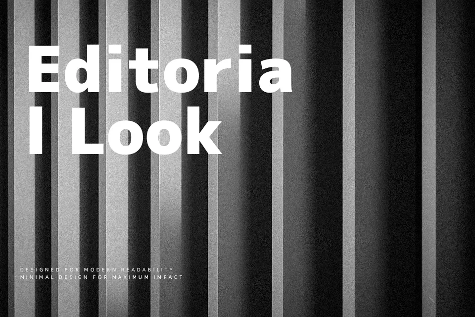
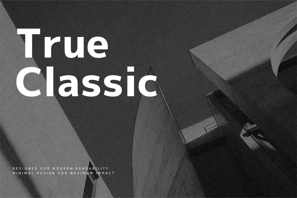
M PLUS 1p combines proportional Latin glyphs with full-width Japanese characters, giving text a measured, grid-aware rhythm that stays readable even in dense layouts. Strokes are straightforward and relatively low-contrast, with a rational skeleton that feels modern without becoming cold. Across the seven weights, spacing remains controlled, so menus, subtitles, and labels line up neatly on screens and in print. It shines in multilingual user interfaces, signage-style captions, and documentation where Japanese and Latin must coexist cleanly. For long, book-style reading or highly expressive branding, its tone can feel a bit neutral, so you may want something more characterful there.
Best For:
bilingual UI labels and controls
Japanese–Latin app interfaces
structured captions and subtitles
technical documentation with Japanese
Not Ideal For:
long-form book typography
highly expressive logos
ornate invitations
Perfect for body text, editorial, and headline, with a clean and sans serif style.
License
Gallery