Lunasima Font
Free for Commercial UseAbout
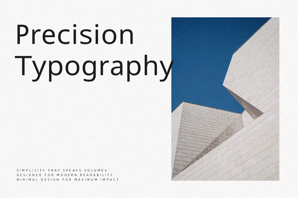
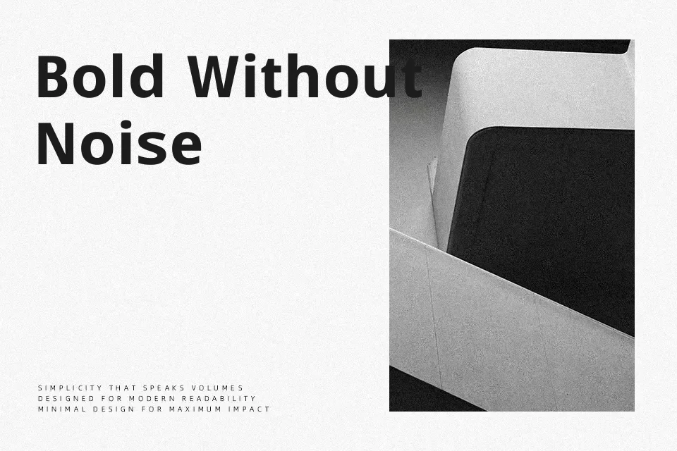
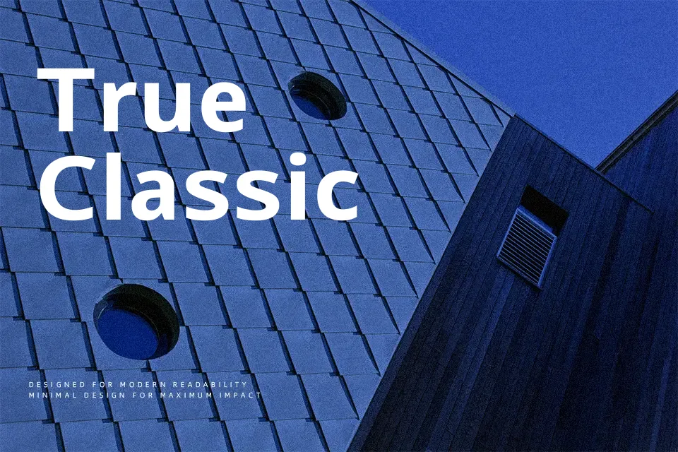
Rooted in the DNA of Noto Sans, Lunasima carries a clean, unmodulated stroke structure with carefully measured spacing and neutral letterforms that hold up at both small and large sizes. Its humanist construction gives it a gentle, approachable tone — less mechanical than geometric sans-serifs, but composed enough for extended reading sessions. Originally engineered for ISO/IEC 29500 document compliance, it performs well in web interfaces, long-form editorial layouts, and multilingual digital publishing. Where it shows its limits is in expressive display work — the design deliberately prioritizes reliability over personality, making it a weak fit for branding that depends on visual distinctiveness or typographic character.
Best For:
– web body copy
– multilingual UI layouts
– editorial and long-form digital content
– document-heavy digital products
Not Ideal For:
– expressive logo or display headlines
– decorative or themed branding
– projects requiring strong typographic personality
Perfect for body text, editorial, and ui design, with a clean and sans serif style.
License
Gallery