Lacquer Font
Free for Commercial UseAbout
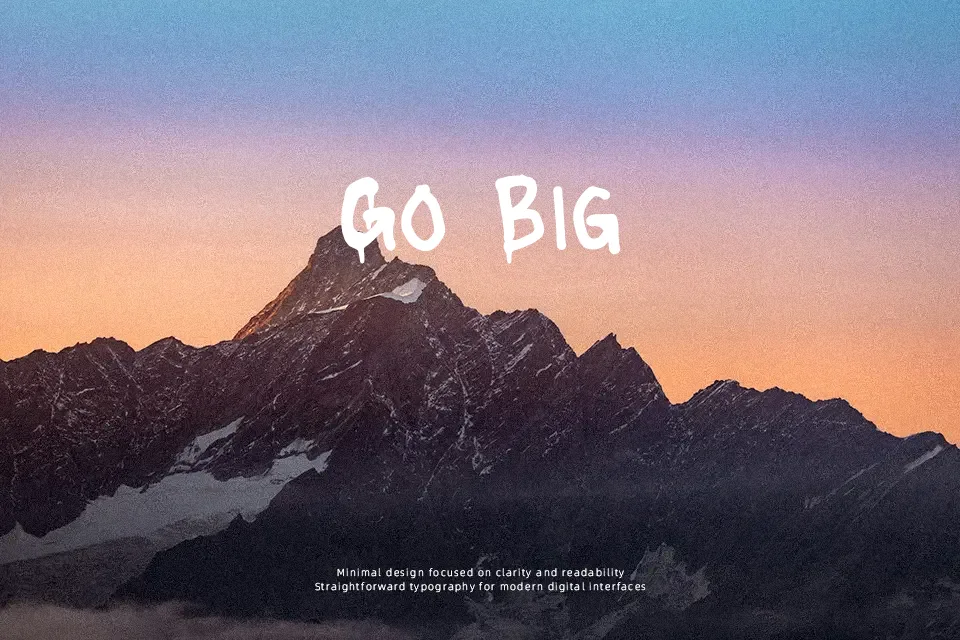
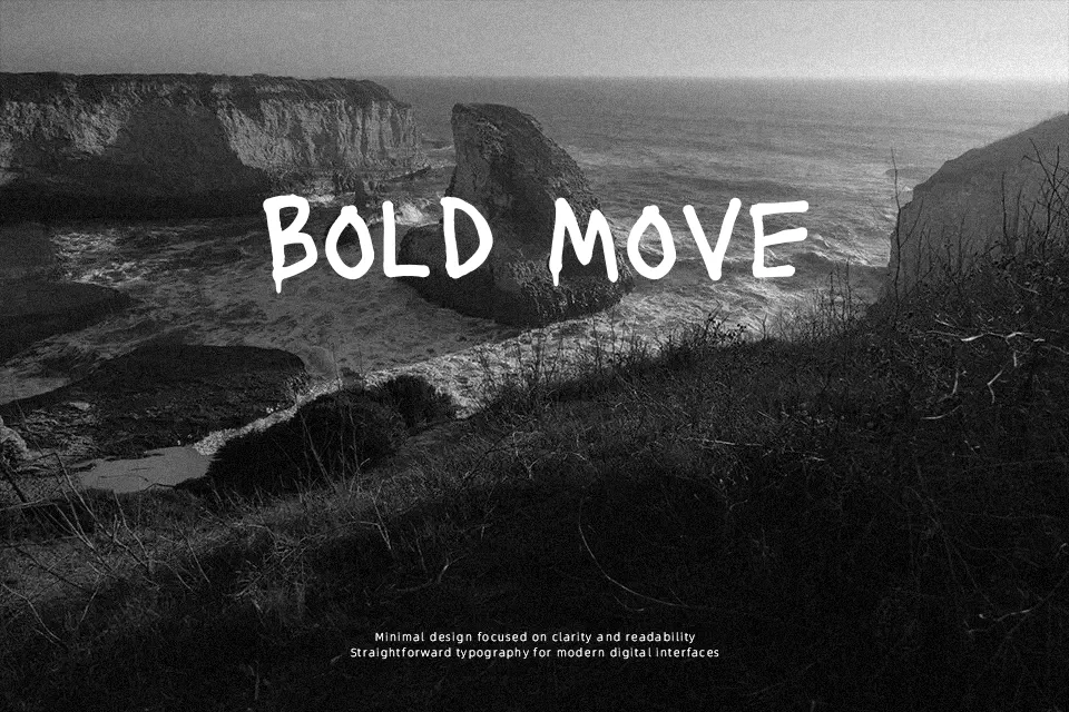
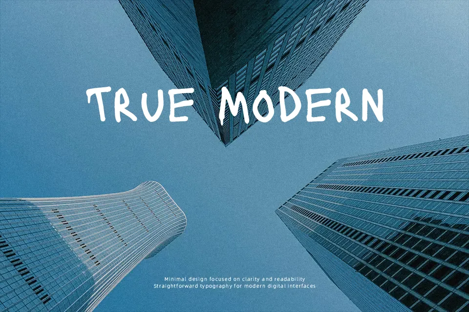
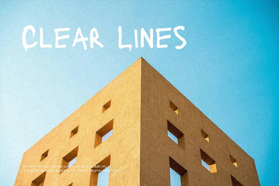
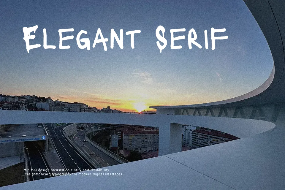
Lacquer looks like thick paint marker letters left to drip, with heavy, irregular strokes, tight spacing, and a rough outline that keeps every word feeling loud and a little unstable. The caps feel blocky and graffiti-leaning, while the lowercase keeps the same blunt rhythm, so short lines read as one strong graphic shape instead of tidy text. It works when you want your title to feel raw and urban—think gig posters, skate or streetwear artwork, horror or thriller graphics, or bold overlays on photos. For longer copy, clean tech branding, or anything that needs quiet hierarchy, the drips and uneven texture quickly become tiring, so it is better kept for short, punchy words.
Best For:
street art inspired posters
music and band graphics
edgy branding wordmarks
horror or thriller titles
Not Ideal For:
long paragraphs or body text
formal corporate documents
minimalist or clean UI
elegant wedding materials
Perfect for branding, halloween, and logo, with a artistic and decorative style.
License
Gallery