Labrada Font
Free for Commercial UseAbout
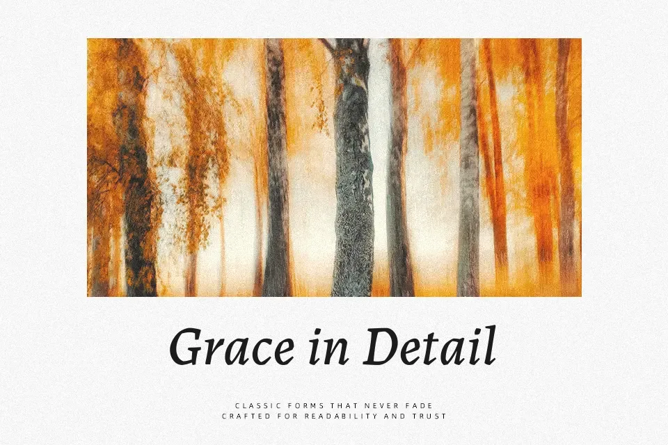
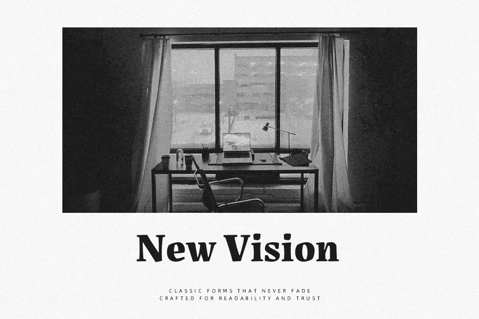
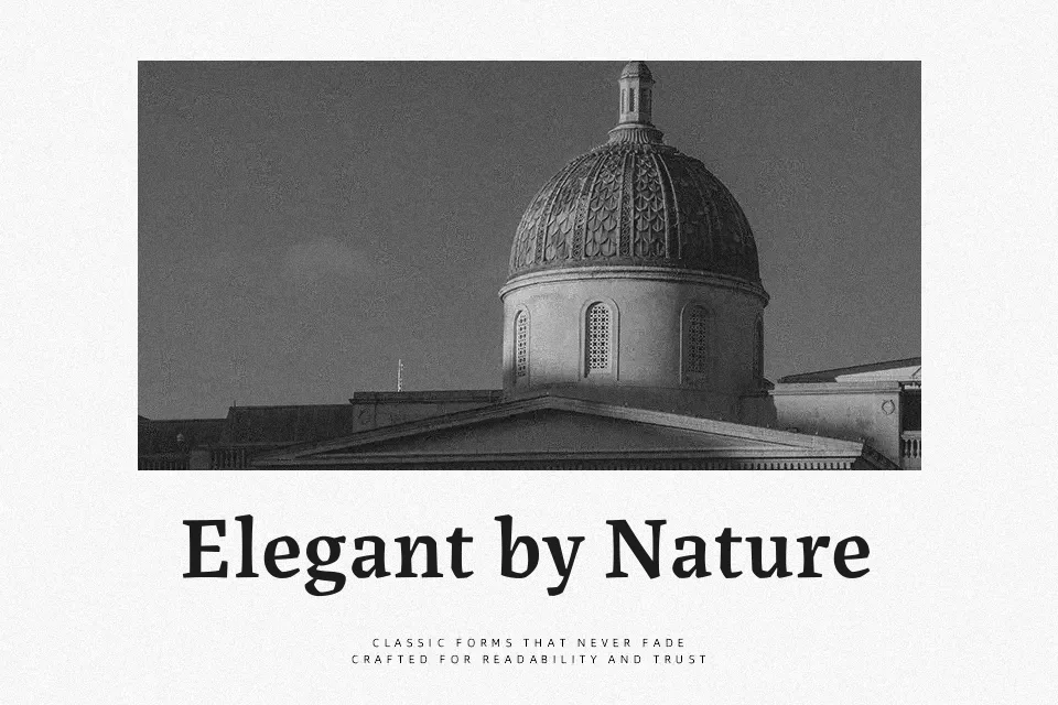
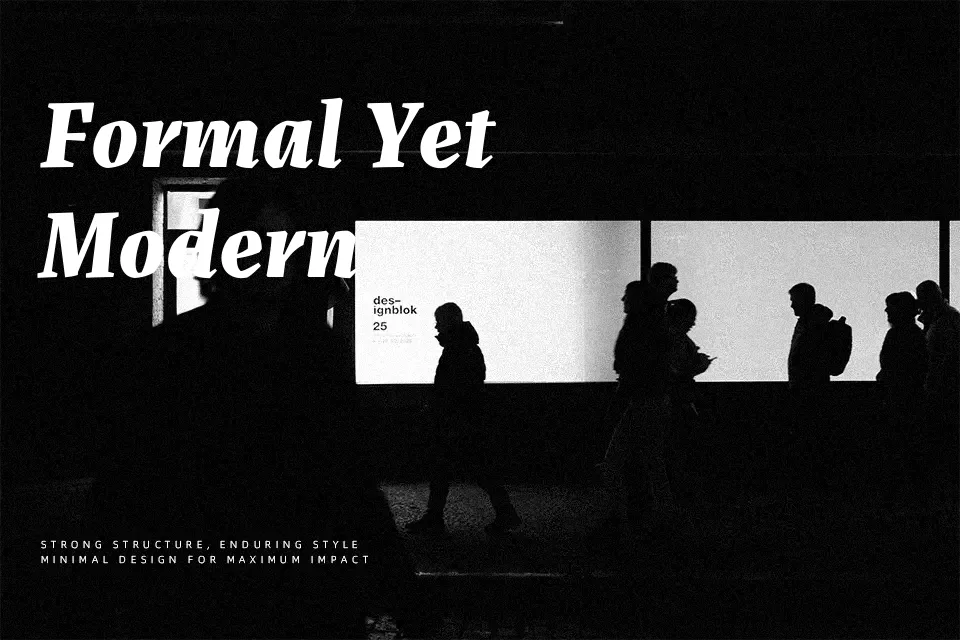
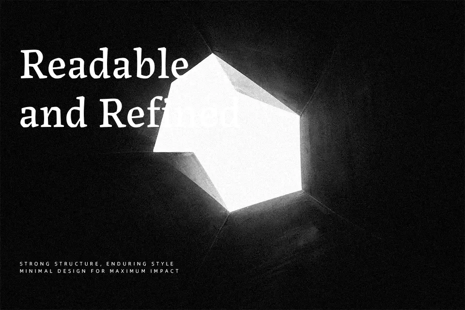
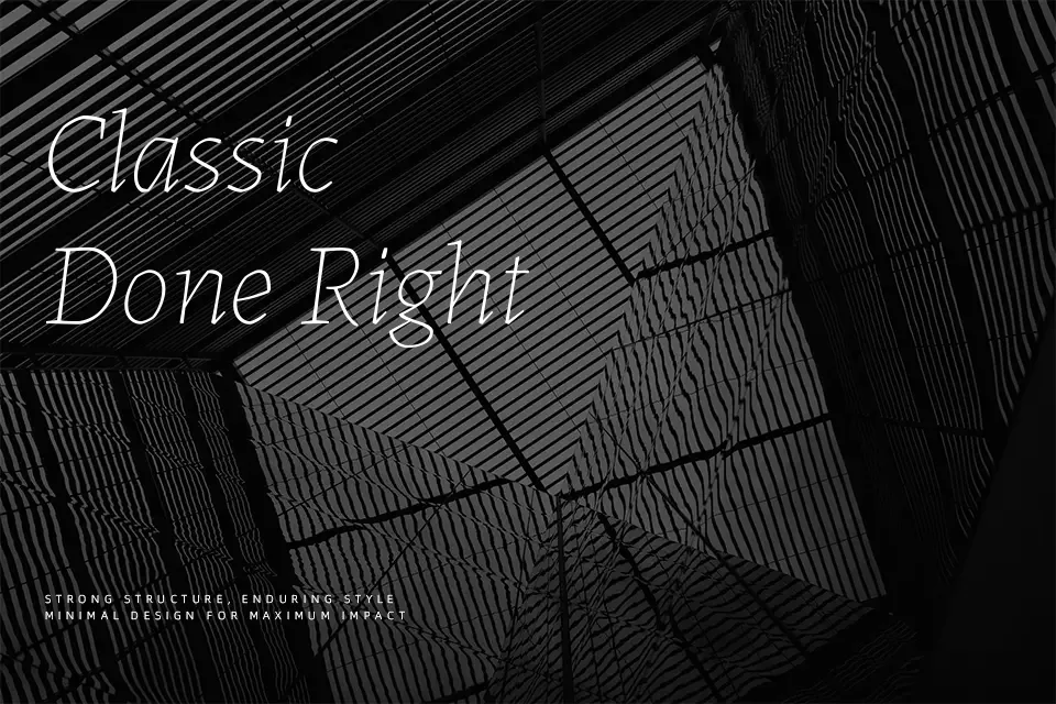
Labrada is a serif typeface with moderate stroke contrast, a readable x-height, and carefully spaced letterforms that stay calm even at small sizes. Its shapes lean toward a humanist, oldstyle structure, with gently flared serifs and organic curves that feel more bookish than corporate. In practice, it works especially well for continuous reading in articles, novels, and documentation where you want warmth without losing clarity on screens. At larger sizes, the italics and heavier weights add nuance to section titles, pull quotes, or thoughtful branding for cultural and educational projects. If you need something punchy for loud advertising or highly compressed UI labels, Labrada can feel too restrained and spacious, so a more condensed or display-driven family may suit better.
Best For:
editorial body text
long-form reading on screen
book and report typography
quiet, text-led branding
Not Ideal For:
tight UI labels
high-impact advertising slogans
very small legal fine print
ultra-formal corporate documents
Perfect for body text, branding, and editorial, with a calm and serif style.
License
Gallery