Kanchenjunga Font
Free for Commercial UseAbout
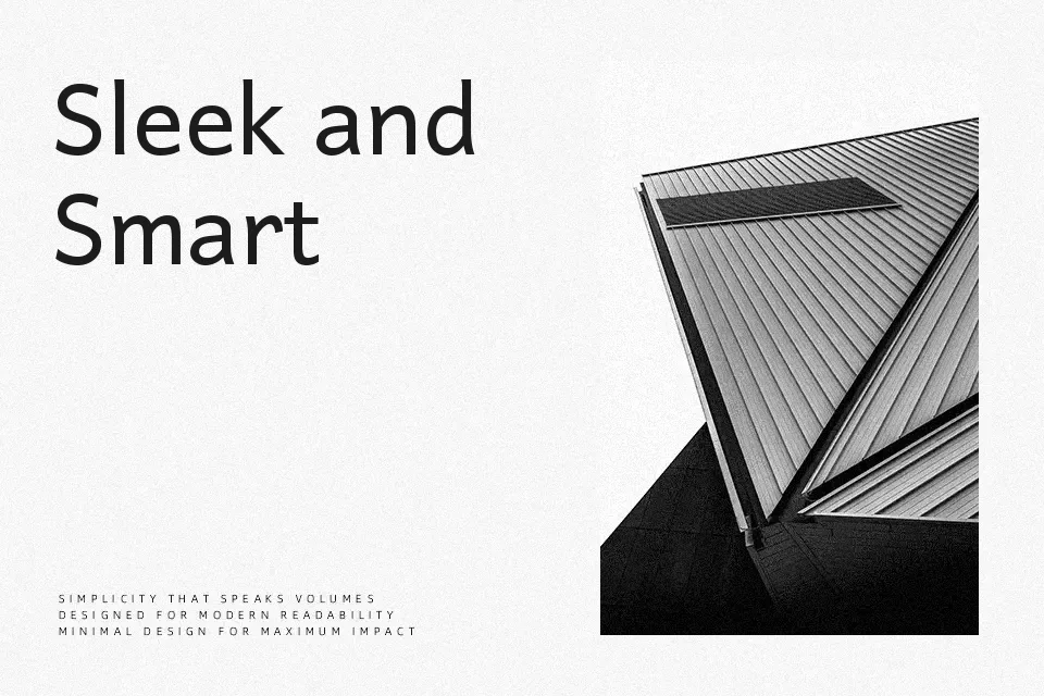
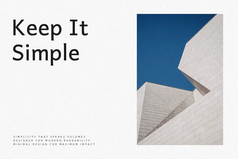
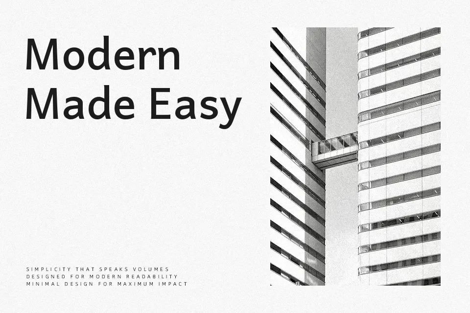
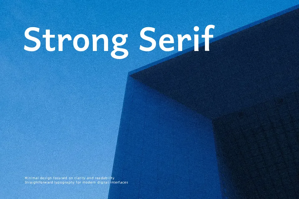
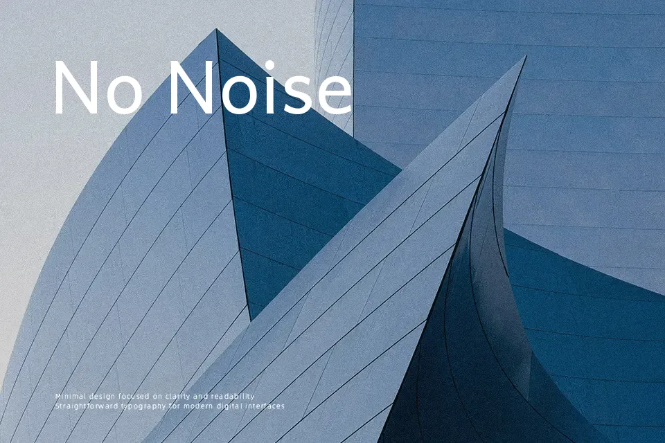
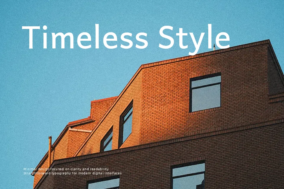
Kanchenjunga is a structured, workhorse typeface: strokes feel steady rather than showy, with consistent weight and measured spacing that keeps clustered Kirat Rai characters readable even at smaller sizes. The overall impression is functional and calm, closer to a utilitarian sans serif than to a decorative display font. With four weights from Regular to Bold, it adapts well to hierarchy in textbooks, bilingual infographics, and community publications where Kirat Rai text needs to carry real content, not just a title. It is less convincing for expressive branding or highly stylized layouts, where you might want more personality or contrast than this restrained design offers.
Best For:
bilingual educational materials
community publications and newsletters
UI labels and navigation text
informational posters and signage
Not Ideal For:
long Latin-only body text
highly decorative branding
luxury-focused editorial layouts
loud, experimental display typography
Perfect for body text, editorial, and headline, with a calm and sans serif style.
License
Gallery