Kameron Font
Free for Commercial UseAbout
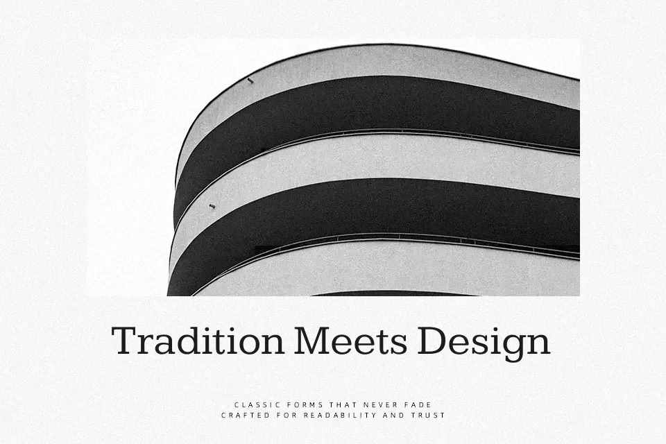
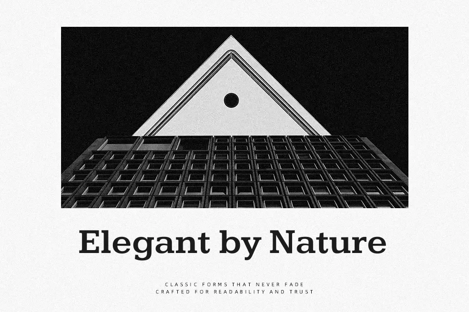
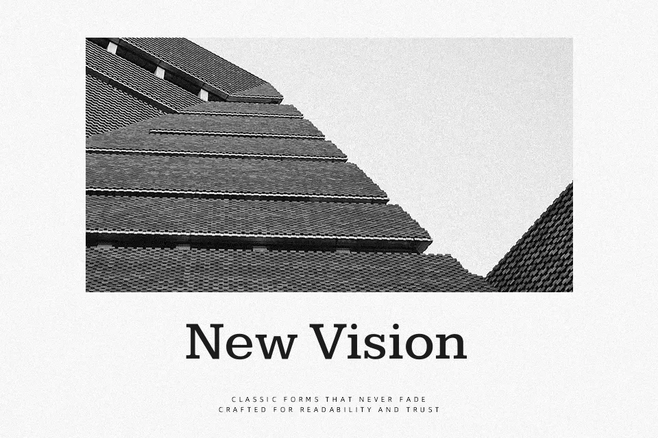
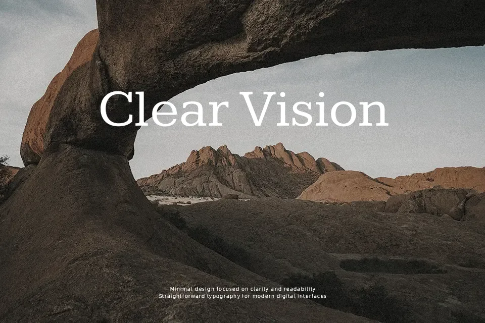
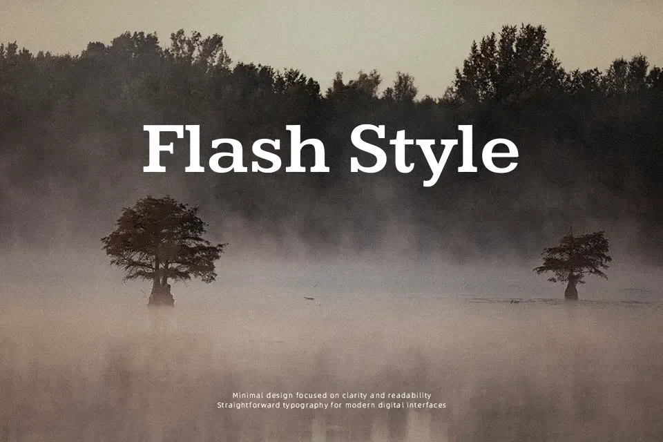
Kameron is a slab serif that reworks classic Egyptian styles into a cleaner, more contemporary structure. It has solid verticals, chunky rectangular serifs, and a fairly tall x-height that helps text hold together at medium sizes. The spacing leans open enough for short paragraphs, but its weight and strong slabs push it visually toward headings, pull quotes, price points, and UI labels rather than dense book pages. If you like the feel of Clarendon-style slabs but want something a bit more restrained and digital-friendly, Kameron sits in that space. It works nicely on posters, editorial layouts, and simple logos, but can look heavy and monotonous in long-form reading or highly formal corporate reports.
Best For:
headline text on blogs and news sites
poster titles and announcement graphics
simple logo wordmarks and badges
price tags, labels, and short UI strings
Not Ideal For:
long book pages or reports
highly formal legal or academic documents
tiny caption sizes
dense multi-language layouts
Perfect for branding, editorial, and headline, with a bold and serif style.
License
Gallery