Kaisei Decol Font
Free for Commercial UseAbout
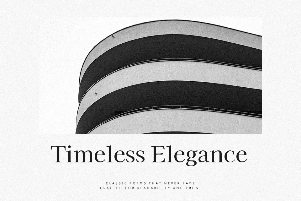
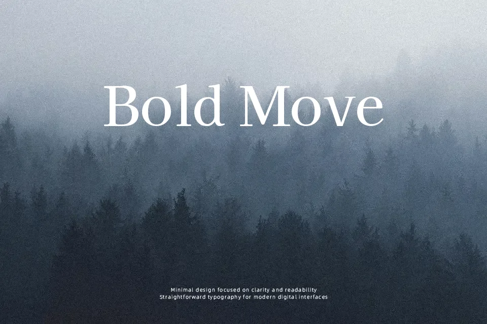
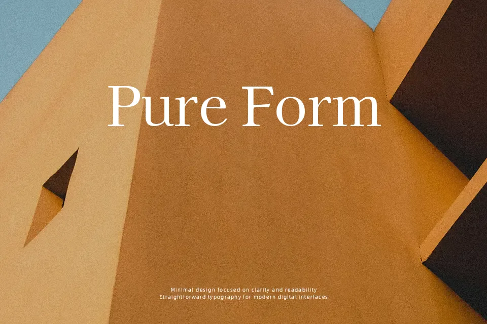
Kaisei Decol combines structured serif letterforms with soft curves and playful dot accents that echo Japanese display typography. Strokes are moderately heavy with steady contrast, so text feels substantial without turning clumsy, and the spacing stays fairly open for a display face. Visually, it lands between retro sign painting and contemporary editorial, which gives it a friendly, slightly whimsical tone rather than a stiff, formal one. I like using it for headlines on event posters, confectionery or stationery packaging, and casual restaurant branding where a hint of kawaii character is welcome. It tends to be too ornamental for dense body copy or serious corporate layouts, where the decorative dots and weight can become distracting over multiple lines.
Best For:
short Japanese and Latin headlines
food, café, or stationery branding
packaging with a cute retro feel
event posters and flyers
Not Ideal For:
long paragraphs or body copy
formal legal or corporate documents
small UI text or dense data tables
Perfect for branding, headline, and logo, with a classic and decorative style.
License
Gallery