Hammersmith One Font
Free for Commercial UseAbout
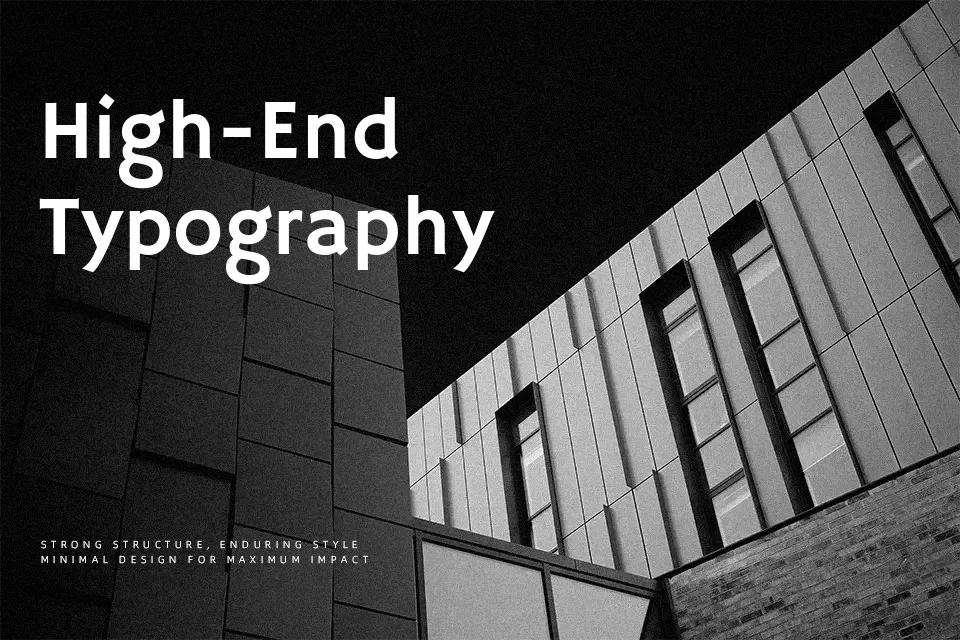
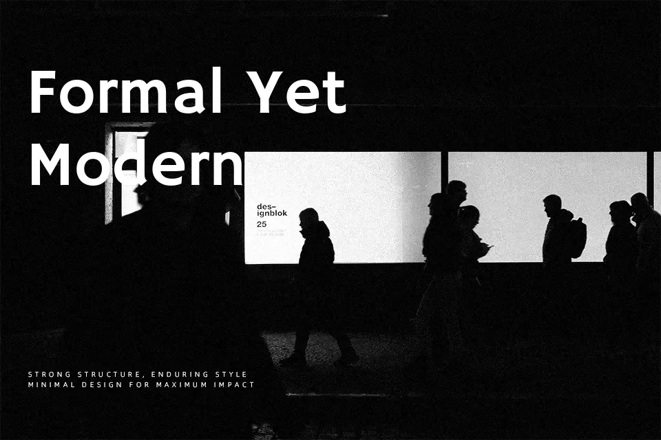
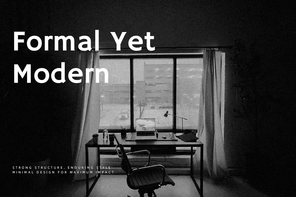
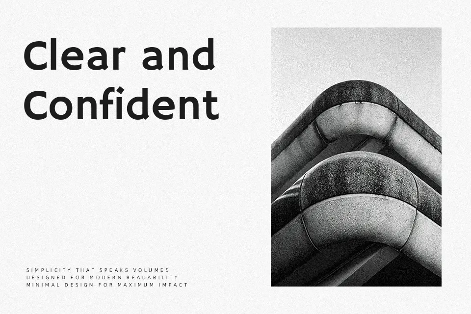
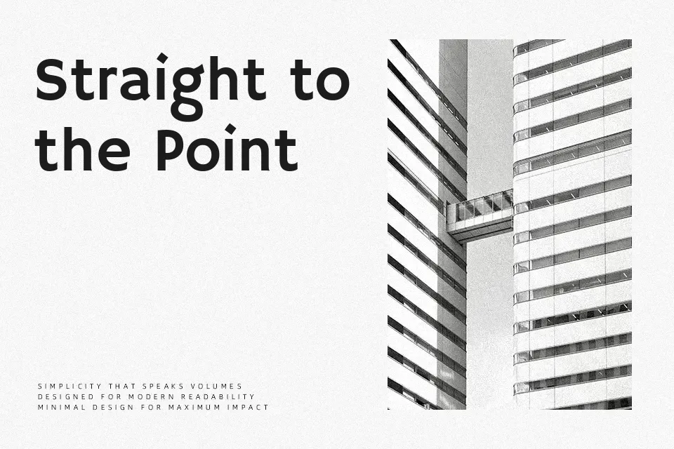
Hammersmith One has a low contrast, sturdy skeleton and open counters, with details like a wider “e” and “s” that give it a slightly quirky rhythm without hurting clarity. Strokes feel even and confident, leaning more toward a humanist sans than a geometric one, so it reads as approachable rather than cold. On screen, it holds up nicely for short paragraphs and interface labels, especially when you want something less generic than a system sans but still unobtrusive. It can feel a bit heavy or informal in dense, long-form editorial work or highly formal corporate documents, where a more neutral text family would behave better. If you like the clarity of classic transport-inspired lettering but want something more contemporary, this strikes a good middle ground.
Best For:
bold headlines
web UI labels
marketing banners
short editorial intros
Not Ideal For:
long body copy
formal reports
dense book typography
Perfect for advertising, headline, and poster, with a clean and sans serif style.
License
Gallery