Federant Font
Free for Commercial UseAbout
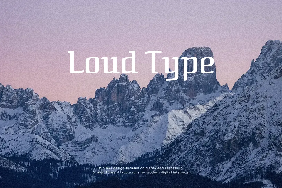
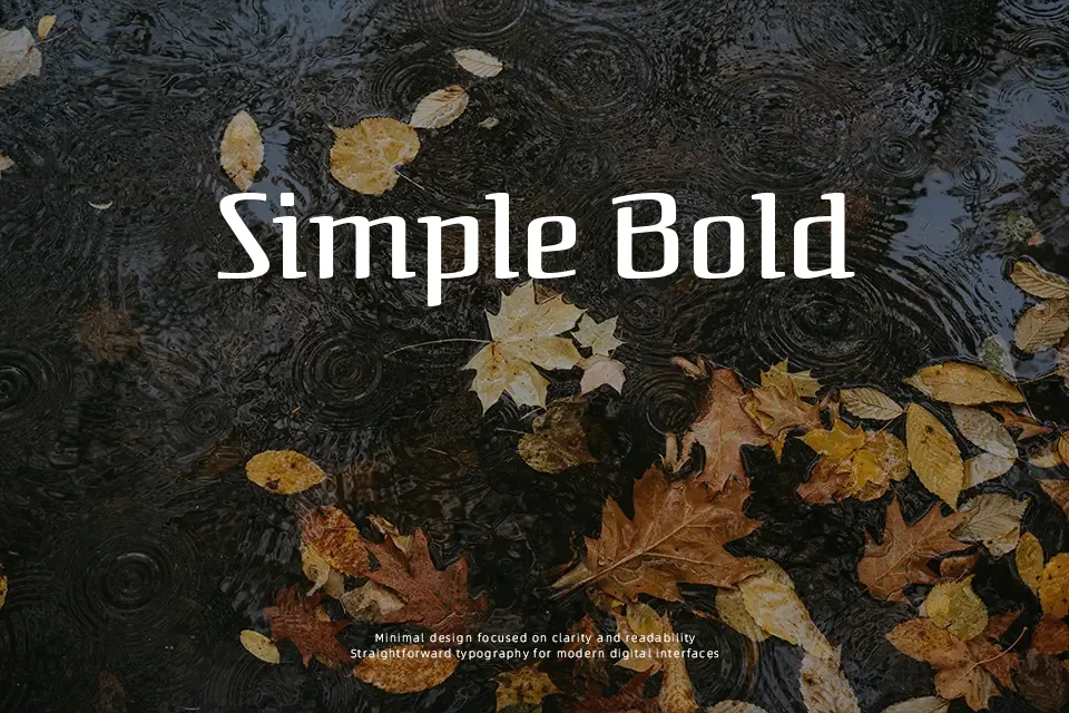
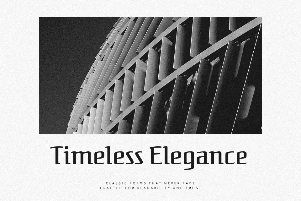
Federant brings back a 1911 advertising serif with sharply cut terminals, calligraphic curves, and a lightly bouncy rhythm that feels drawn rather than machined. The strokes are moderate in weight with noticeable contrast, and the spacing stays open enough that short lines remain legible even at smaller display sizes. Visually it lands between a book serif and a sign painter’s script, so it suits characterful titles, cafe menus, and retro‑flavored branding more than corporate interfaces. It shines when you want a distinctive wordmark or headline, but the quirky outlines and uneven texture can become tiring in dense paragraphs or very formal documents.
Best For:
expressive headlines
vintage-flavored branding
short editorial titles
menu and poster design
Not Ideal For:
long paragraphs
strict corporate documents
small UI labels
technical reports
Perfect for branding, editorial, and headline, with a artistic and display style.
License
Gallery