Dosis Font
Free for Commercial UseAbout
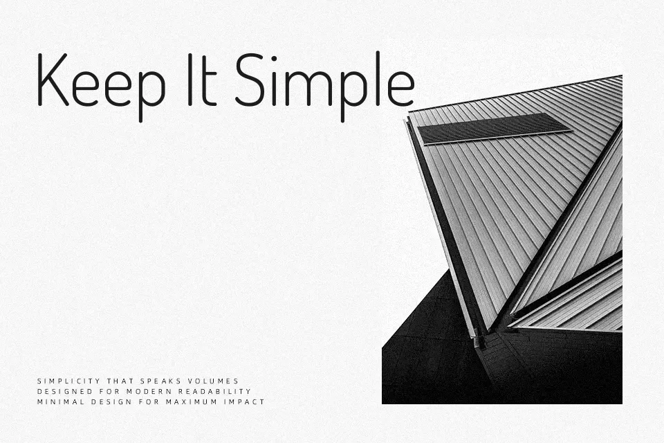
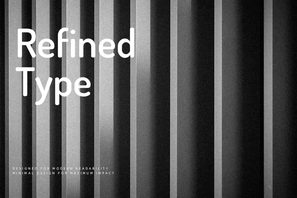
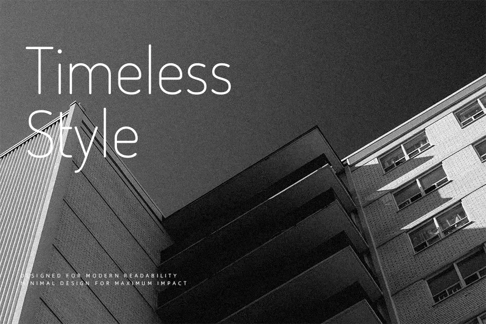
Dosis is a **rounded** sans serif family with simple, open shapes, generous x-height, and smooth terminals that give text a soft, approachable tone. The lighter weights feel almost minimalist, while the heavier cuts gain more character and presence, so you can move from subtle labels to bolder titles without leaving the family. In practice it works well for interface labels, pricing grids, startup landing pages, and friendly product branding where a harsh geometric sans would feel too cold. I would avoid using Dosis for dense body copy or highly formal layouts, because the rounded strokes and even rhythm can become tiring to read in long paragraphs and lack the gravity of a serif or more neutral grotesk.
Best For:
UI labels and menus
startup landing page headings
friendly product branding
short marketing copy
Not Ideal For:
long-form body text
formal corporate reports
dense editorial layouts
Perfect for advertising, branding, and headline, with a clean and geometric style.
License
Gallery