Convergence Font
Free for Commercial UseAbout
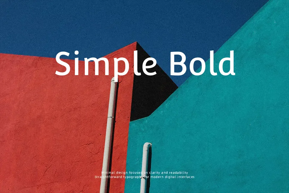
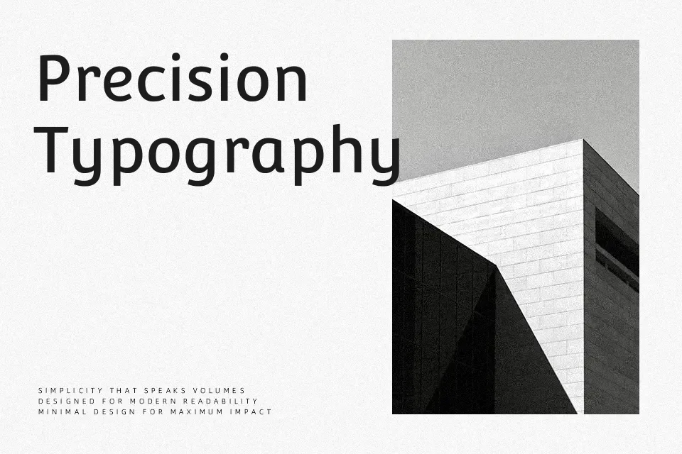
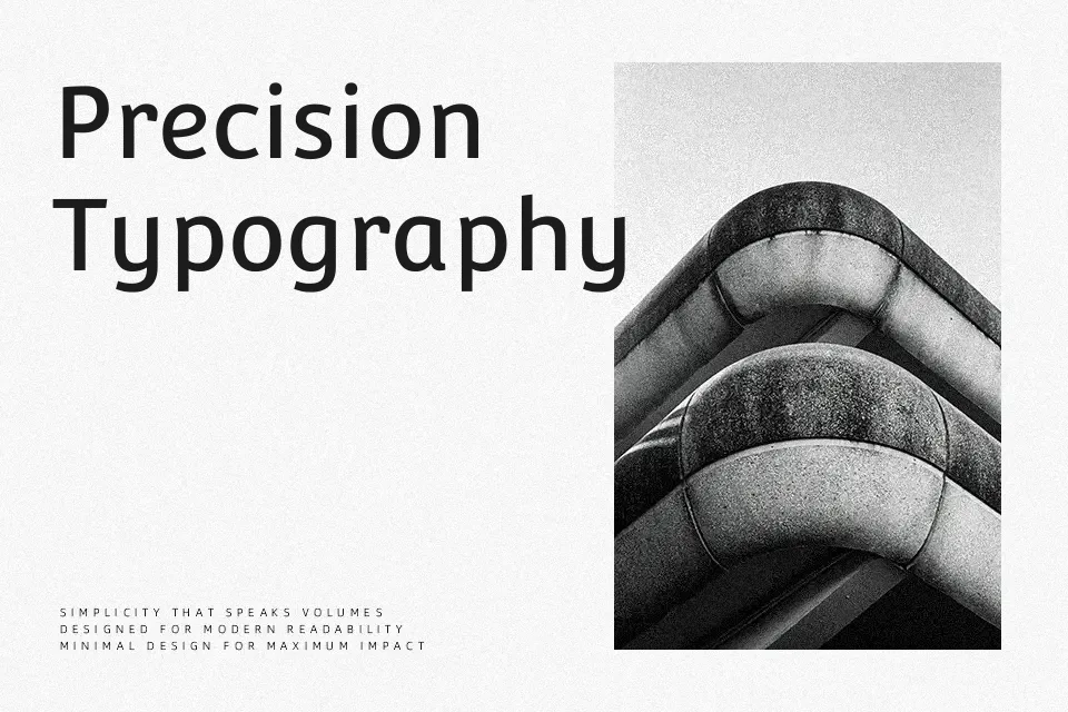
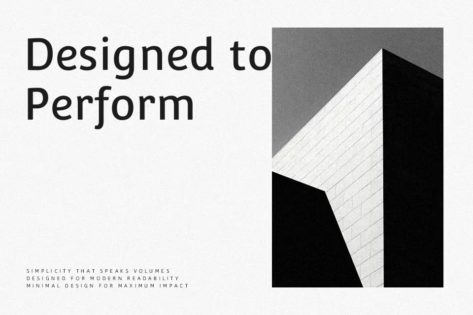
Convergence is a low contrast upright italic sans serif that leans forward with a gentle cursive energy while keeping strokes controlled and relatively simple. The x-height is generous and counters are open, so short and medium-length text stays legible even at smaller sizes. A distinctive touch is the hybrid construction: the lower parts of letters pick up small, almost serif-like details, while the upper terminals remain clean and sans, giving the texture a slightly humanistic tilt rather than a rigid geometric feel. This makes the font feel informal yet considered, which works nicely in uses like app onboarding screens, editorial pull quotes, product UI labels, or approachable brand wordmarks. When paragraphs get very long or the voice needs to be strictly corporate or legal, the italic slant and informal flavor can start to feel a bit tiring, so a more neutral sans is better there.
Best For:
headline
branding systems
interface labels
short editorial text
Not Ideal For:
dense long-form reading
formal legal documents
highly technical manuals
Perfect for branding, editorial, and headline, with a artistic and condensed style.
License
Gallery