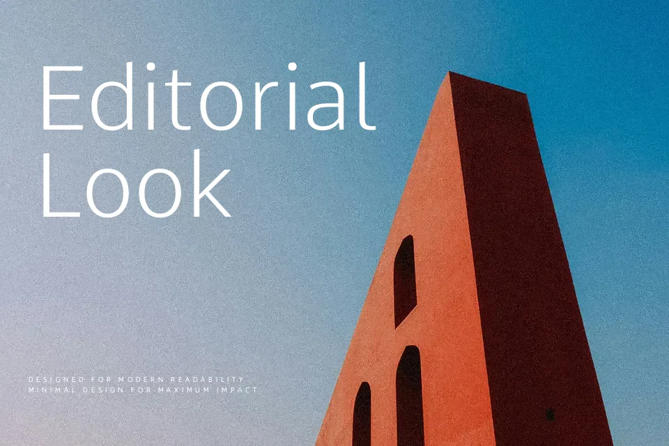
Comme Font
Free for Commercial UseAbout
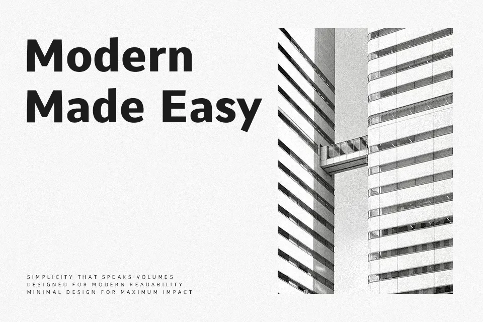
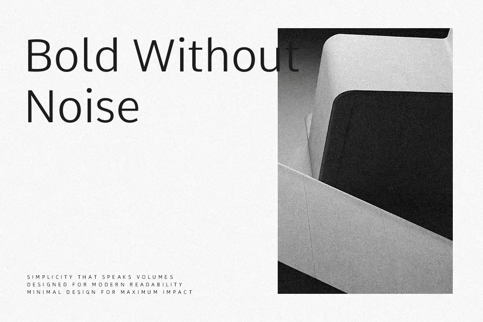
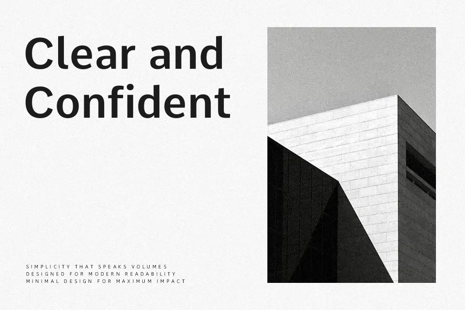
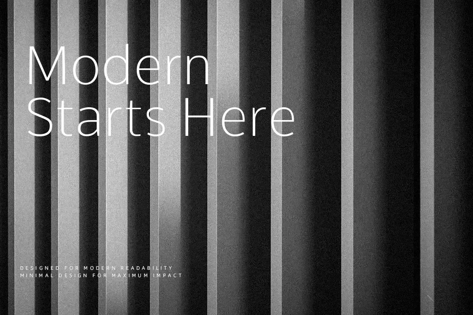
Comme is a **sans** serif typeface with a variable weight axis, starting from a lean, airy light and running up to a dense, confident bold. Strokes are straightforward and mostly monolinear, with open counters and a relatively tall x‑height that keeps small sizes legible on screens. Spacing feels measured rather than tight, which works nicely for dashboards, app menus, and longer interface labels, though ultra-light weights can look fragile in busy backgrounds. Compared with more neutral UI faces such as Oxygen, Comme feels a touch more contemporary and flexible, especially when you lean into the heavier styles for section titles or data highlights. If you need something highly expressive for a character-driven logo, you may find its voice a bit restrained.
Best For:
Website,UI Design,Body Text,Headline
Not Ideal For:
Logo,Kids,Wedding,Film
Perfect for advertising, editorial, and headline, with a clean and geometric style.
License
Gallery