Chokokutai Font
Free for Commercial UseAbout
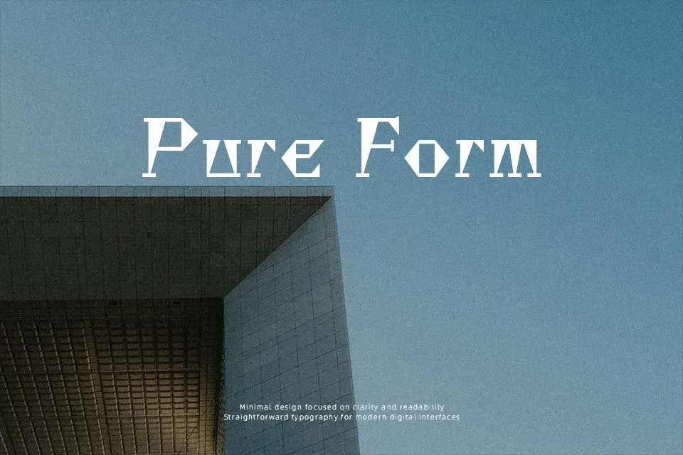
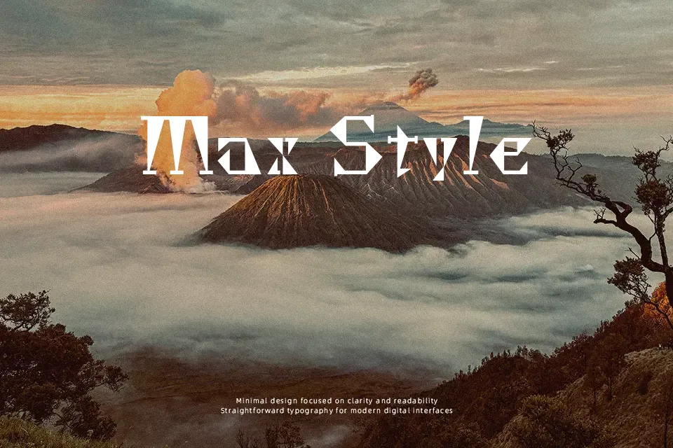
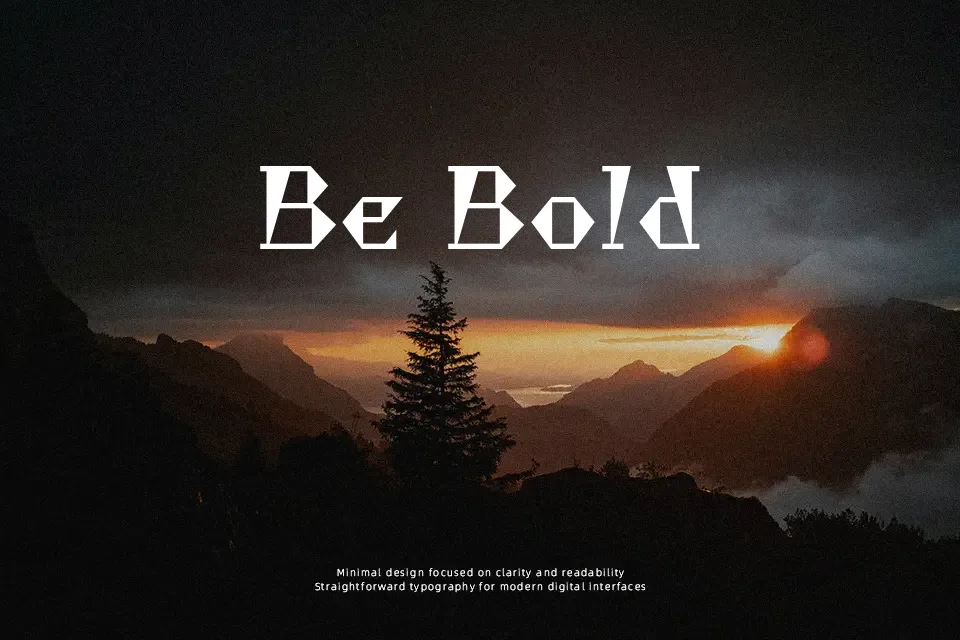
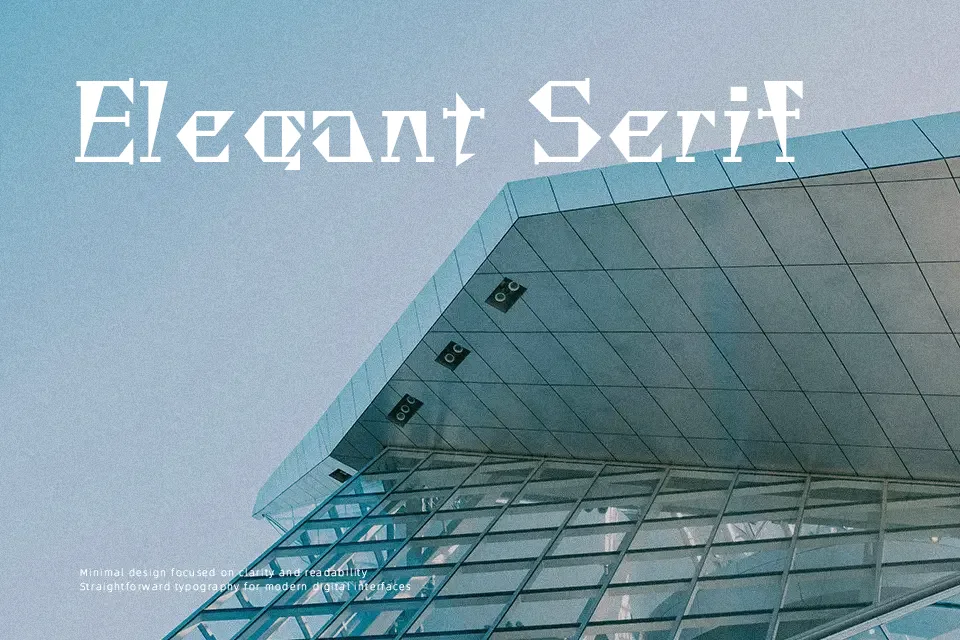
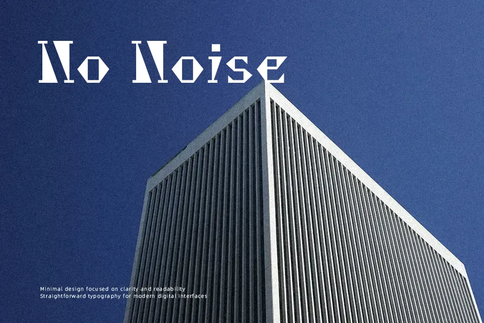
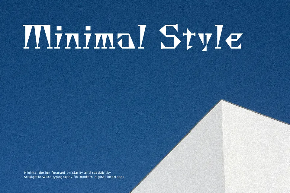
Chokokutai takes its visual cue from letters etched into wood chips and stone slabs — and that origin shows up in every letterform. Strokes are heavy and purposefully irregular, producing a blocky, tactile density with minimal contrast between thick and thin. The character structure has a funky geometric quality: shapes feel compressed and graphic, not calligraphic. Spacing is tight, reinforcing the compact, printed-block presence overall.
This font holds up well in gaming title screens, Japanese cultural event graphics, and streetwear branding where a hand-carved visual energy reinforces the concept. Large-print poster headlines are another natural fit.
Where it falls short: small-size usage turns the stylized forms into visual noise, and the textured irregularity conflicts with clean corporate or editorial environments. It carries a specific personality — when that personality aligns with the brief, it delivers real impact. When it doesn’t, no sizing adjustment compensates for the tonal mismatch.
Best For:
– gaming title screens and event posters
– streetwear and subculture branding
– Japanese cultural or festival graphics
– short display headlines with visual texture
Not Ideal For:
– small-size body text or captions
– formal corporate or editorial layouts
– multilingual continuous reading
Perfect for branding, gaming, and headline, with a artistic and decorative style.
License
Gallery