Calistoga Font
Free for Commercial UseAbout
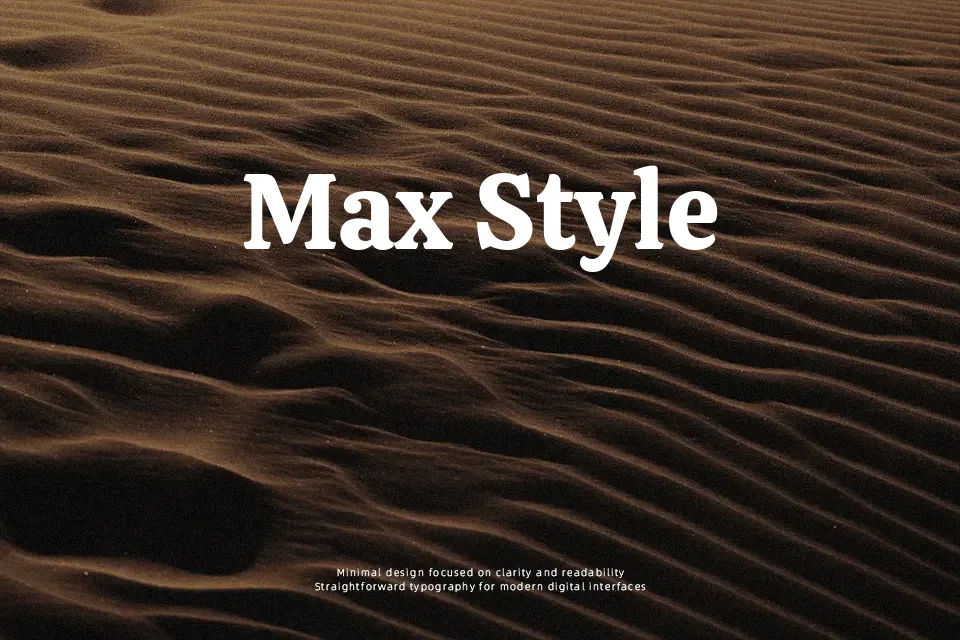
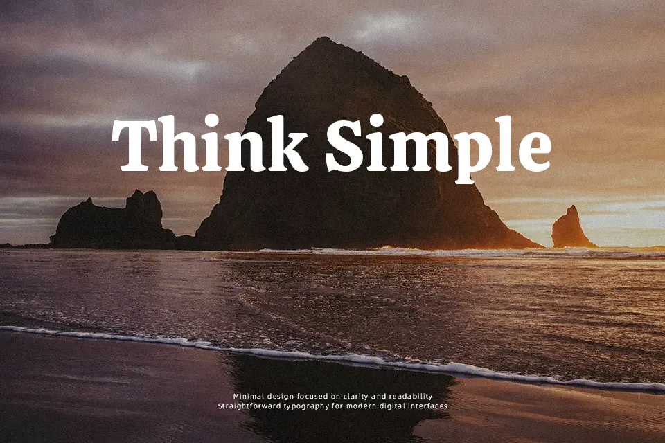
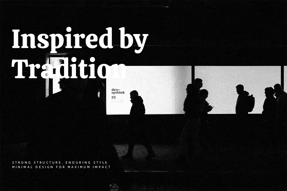
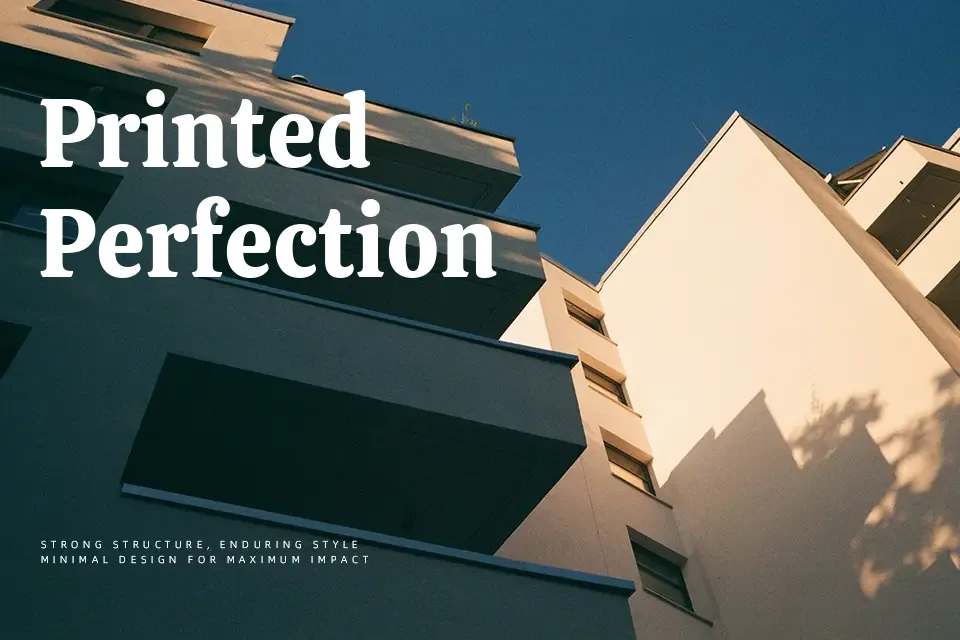
Calistoga comes in a single, chunky weight with rounded, swelling strokes and curving slab-like serifs that lift slightly at the baseline, giving each word a buoyant, approachable feel. The proportions are space-saving, with a generous x-height and tight spacing that helps short headlines feel dense and graphic without turning into a wall of ink. Visually it sits between a slab serif and a retro display face, so it brings more personality than a sober text serif but reads cleaner than many novelty display fonts. I reach for it when a layout needs friendly, old-time charm—think diner menus, western-flavored posters, or YouTube thumbnails about travel or food—but I would avoid it for body copy or corporate reports where subtlety and long-form legibility matter more.
Best For:
bold headlines
vintage branding
restaurant and food posters
YouTube thumbnails and social graphics
Not Ideal For:
long paragraphs
formal corporate documents
small UI text
minimalist branding systems
Perfect for branding, headline, and logo, with a bold and display style.
License
Gallery