Crashy Font
Free for personal useAbout
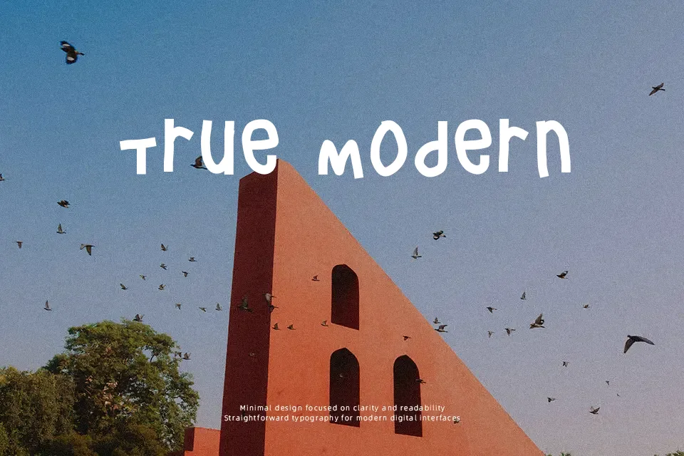
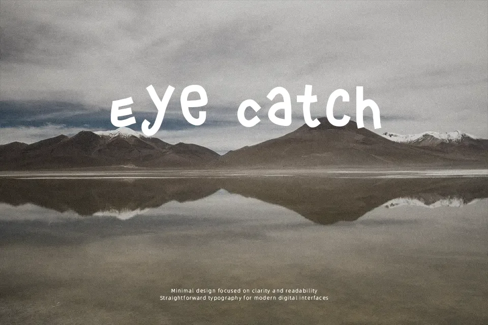
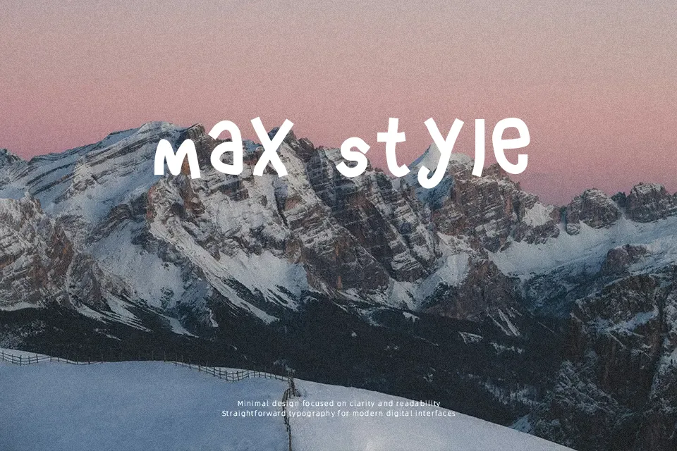
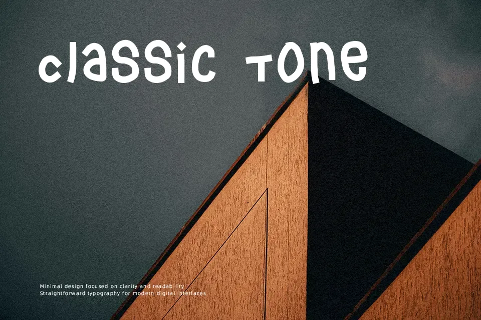
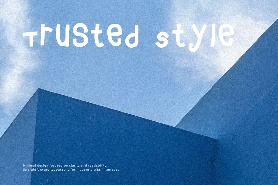
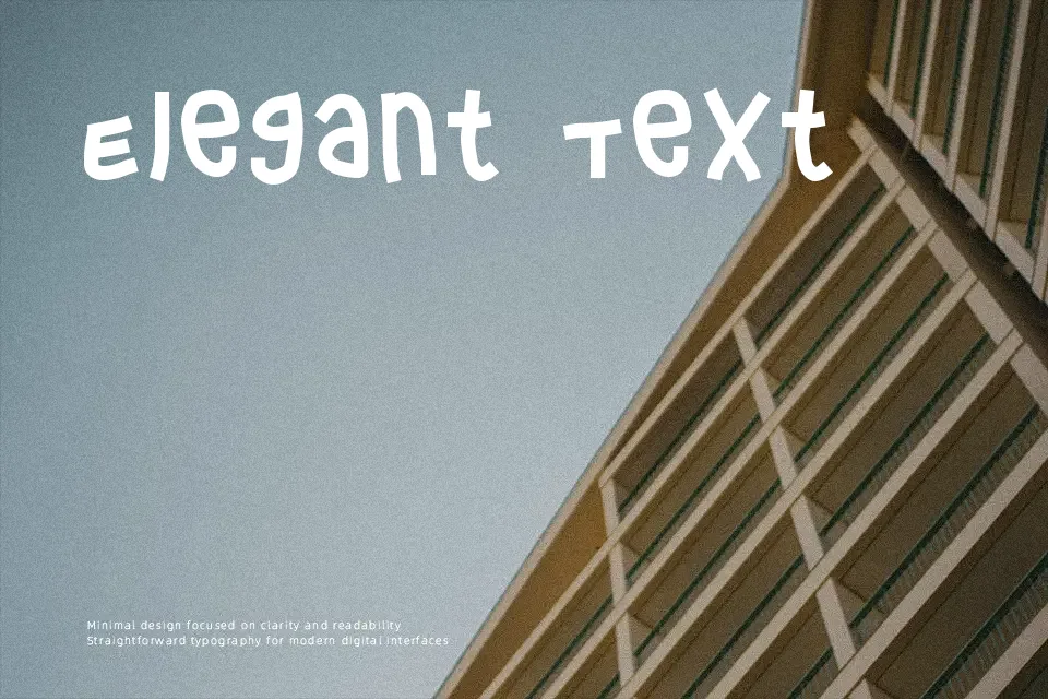
Crashy Font showcases a fractured display structure built with heavily distressed strokes, sharp angular intersections, and irregular silhouette edges. The letterforms maintain relatively uniform widths and tight character spacing, generating a dense visual rhythm suited for impactful display applications. Stroke contrast remains consistently heavy, reinforcing extreme prominence while sacrificing interior counters and subtle structural nuance. In practical evaluation, the compressed negative spaces and aggressive contours preserve distinct identity at large scale, yet readability declines sharply as sizing decreases. Consequently, the typeface thrives across music festival banners, extreme sports branding, and package titles, but remains entirely unsuitable for extended body copy, dense editorial layouts, or compact interface labels.
Best For: action game titles, music festival posters, apparel graphics, packaging headlines
Not Ideal For: long body text, mobile interface labels, corporate annual reports, technical diagrams
Perfect for gaming, headline, and packaging, with a bold and decorative style.
License
Gallery