Cortes Font
Free for personal useAbout
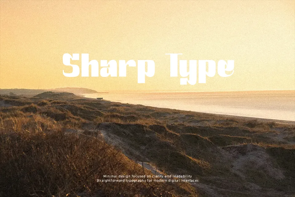
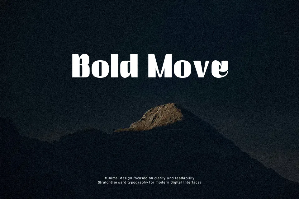
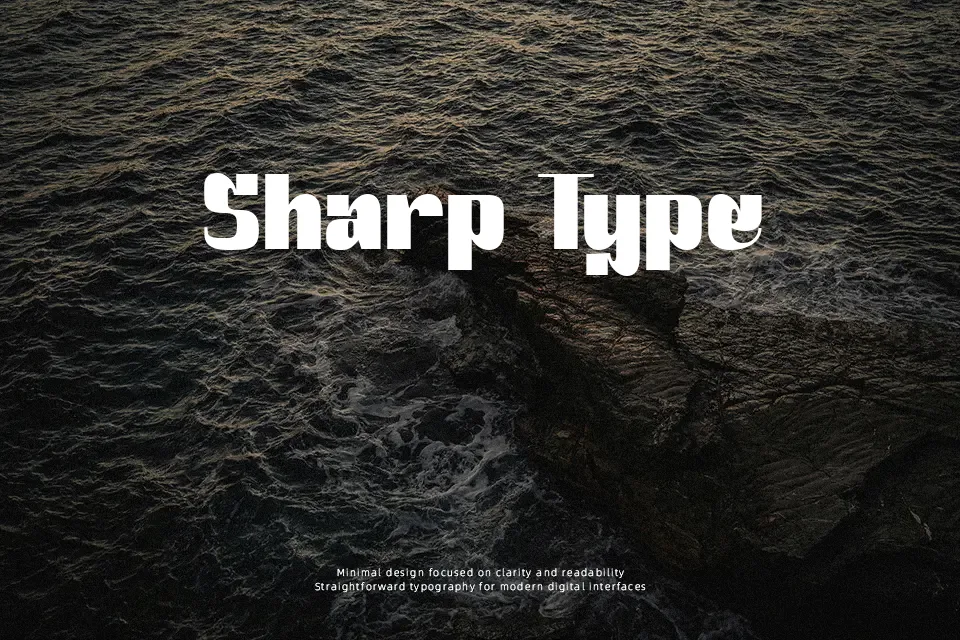
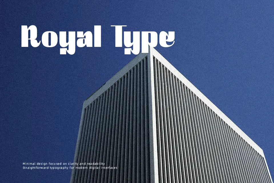
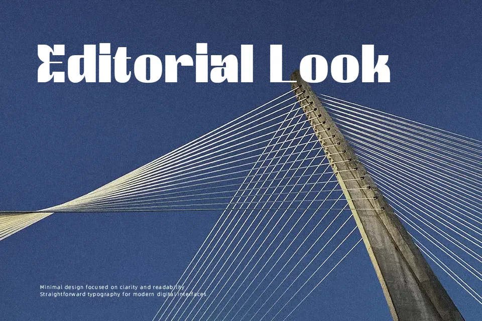
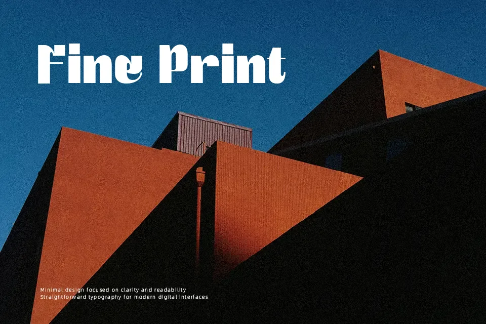
Cortes Font commands immediate visual attention through heavyweight construction and distinctively stylized slab serifs. The letterforms exhibit uniform stroke thickness with minimal contrast, squared structural joins, and slightly condensed horizontal proportions. Tight character spacing reinforces an assertive, cohesive rhythm across title lines, ensuring that short headlines and apparel graphics retain sharp focal definition. While the glyph architecture delivers remarkable legibility in large-scale display applications, dense internal counters become noticeably constricted at reduced point sizes. Consequently, the design works best for focal titling and signage rather than continuous body paragraphs, where its robust weight quickly impairs reading comfort.
Best For: vintage poster headlines, craft beverage packaging, retro apparel graphics
Not Ideal For: long body text, mobile interface labels, dense editorial layouts
Perfect for branding, headline, and logo, with a bold and decorative style.
License
Gallery