Contra Muerta Font
Free for Commercial UseAbout
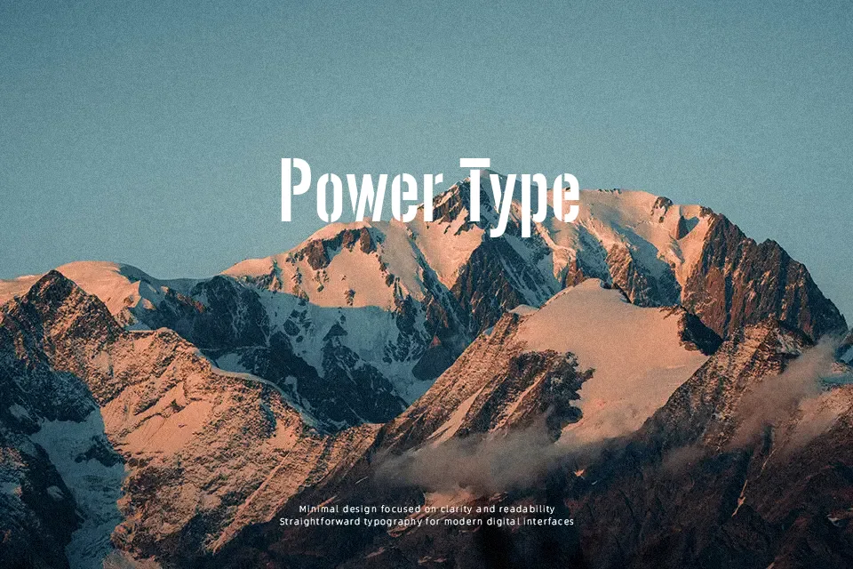
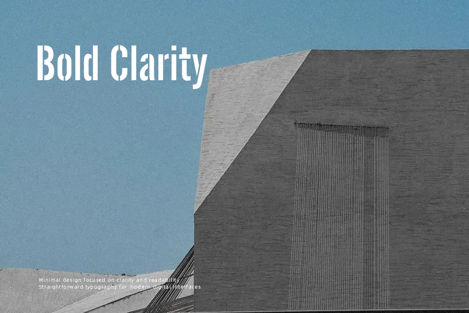
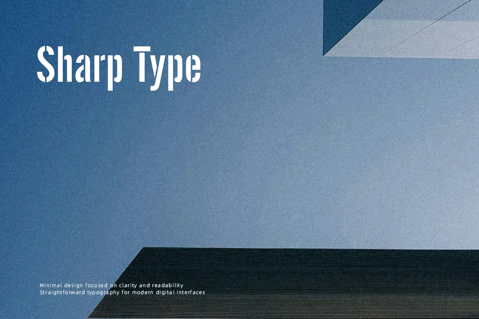
Contra Muerta Font functions most effectively when set at prominent display scales where its segmented architecture can command immediate attention. Built with thick, uniform strokes and prominent vertical cuts, the typeface exhibits balanced letter spacing that keeps individual forms easily identifiable. Proportions remain sturdy and upright, ensuring balanced rhythm across concise headlines, rugged product packaging, and event banners. While the letterforms maintain strong readability in isolated words, dense stencil breaks reduce comfort during continuous reading across multi-line paragraphs. For branding assets, badge insignias, and outdoor signage requiring an authoritative presence, the design provides dependable graphic punch without sacrificing structural cohesion.
Best For: poster headlines, apparel graphics, rugged packaging, outdoor signage
Not Ideal For: long paragraph text, small interface labels, mobile captions, dense book layouts
Perfect for advertising, headline, and logo, with a bold and display style.
License
Gallery