Consider Font
Free for personal useAbout
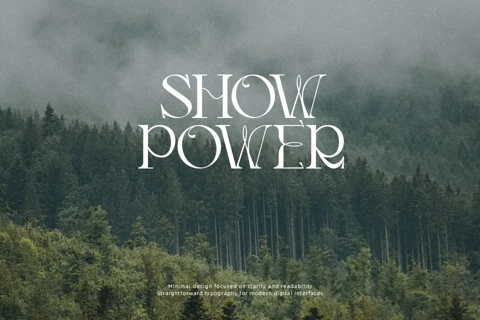
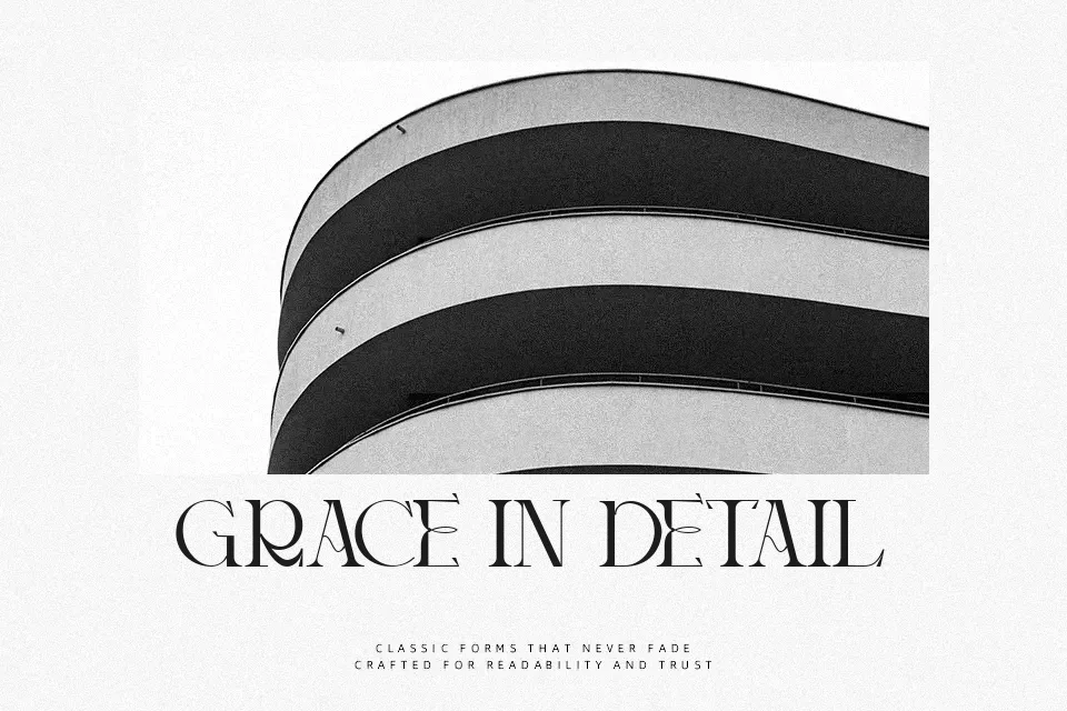
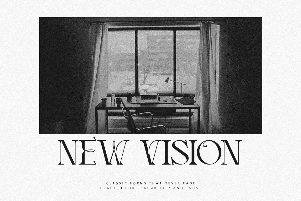
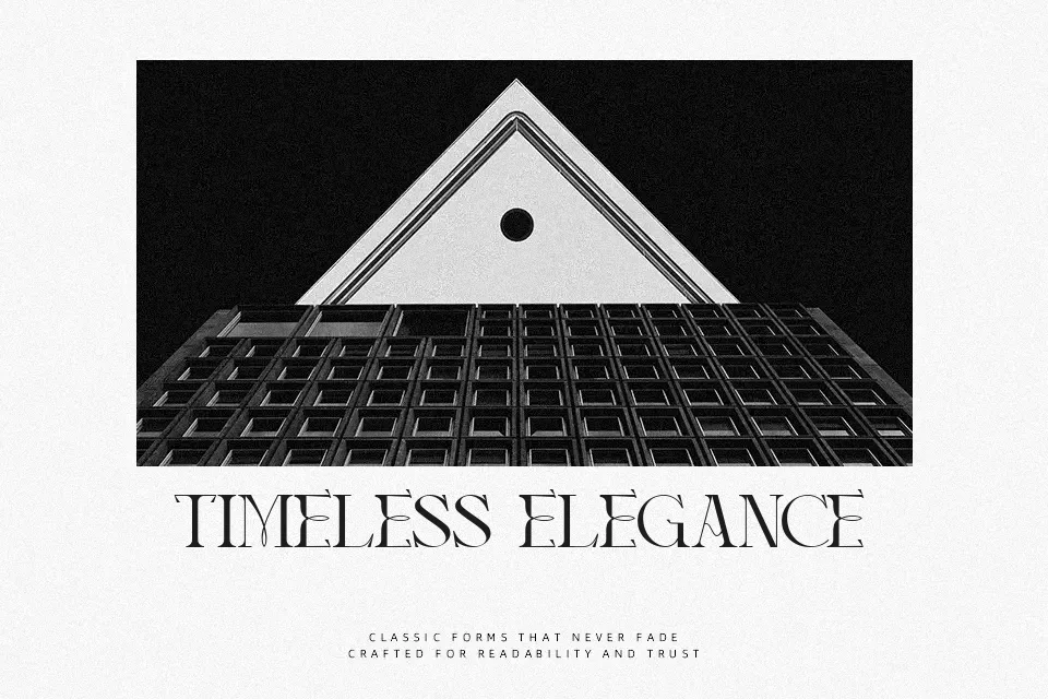
Consider Font presents a distinctive retro serif architecture defined by pronounced stroke contrast, sharp terminals, and sweeping curved connections between adjoining letterforms. The glyphs showcase relatively narrow horizontal proportions with tight tracking that creates a cohesive, rhythmic texture in short display settings. While uppercase characters command immediate attention with dramatic flourishes, the letterforms remain legible across medium and large title treatments such as book jackets, restaurant identity systems, and apparel graphics. However, dense structural details and compact internal counters noticeably hinder reading comfort in continuous body paragraphs. For smaller captions or data tables, the delicate joins tend to diminish, making the typeface far more effective as a prominent visual focal point.
Best For: book cover titles, restaurant identity systems, apparel graphic prints, luxury packaging labels
Not Ideal For: long paragraph body text, mobile interface captions, technical documentation, dense tabular data
Perfect for branding, headline, and logo, with a creative and decorative style.
License
Gallery