Trap Music Font
Free for personal useAbout
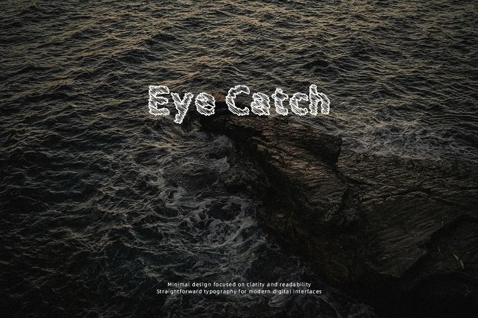
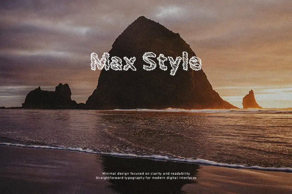
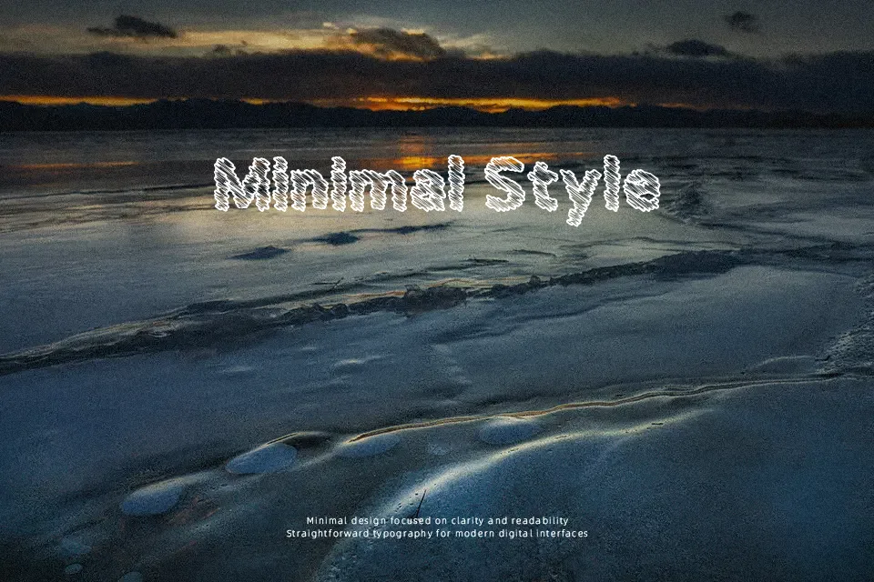
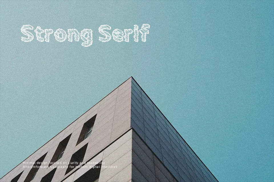
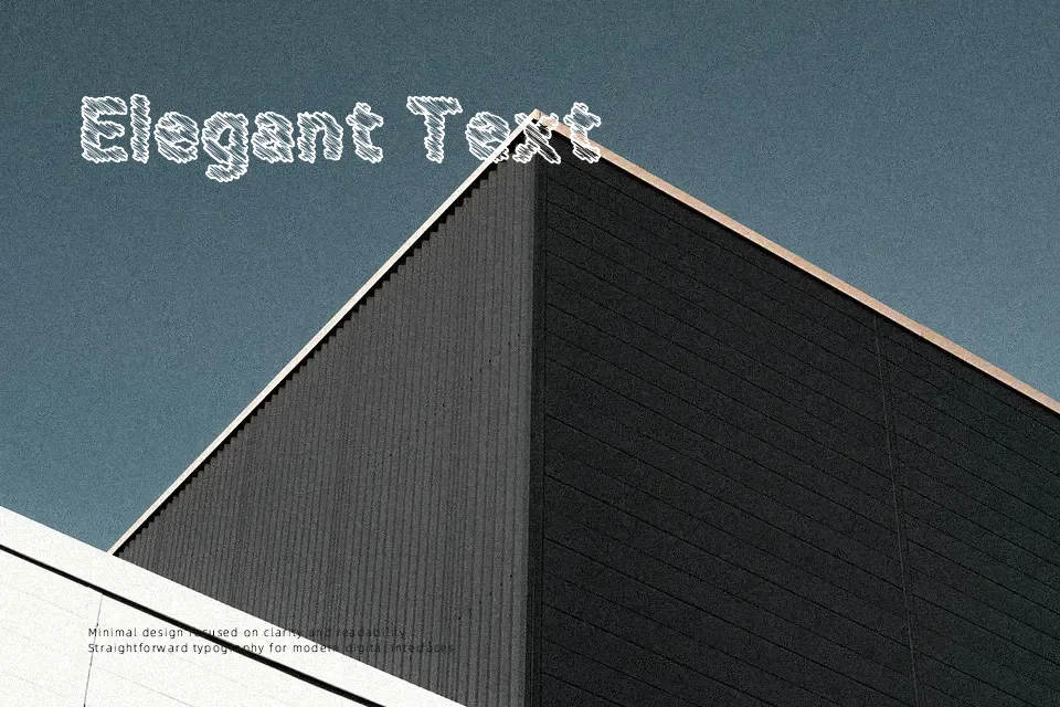
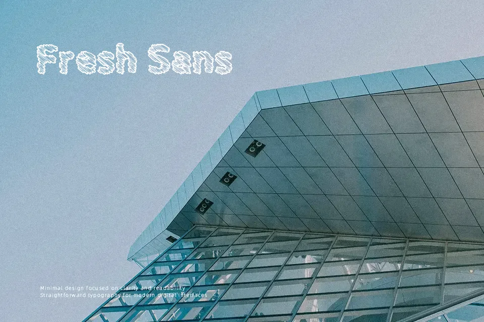
Evaluating Trap Music Font across practical layouts confirms that its expressive silhouette functions best when given substantial physical space. The typeface features heavy, irregular strokes with sharp angles and deliberate asymmetry across uppercase forms. Compact letter spacing reinforces the dense, blocky visual rhythm, giving titles an intense graphic presence. While these proportions maximize legibility at large display scales, smaller settings cause internal counters to close up rapidly. Consequently, the design excels on merchandise prints, bold event flyers, and digital track artwork, but the letterforms become completely unreadable in running body copy or detailed caption blocks.
Best For: music festival posters, streetwear apparel graphics, digital album cover art
Not Ideal For: long paragraph text, small interface labels, mobile application body copy
Perfect for headline, logo, and music, with a bold and decorative style.
License
Gallery