Transit Display Font
Free for personal useAbout
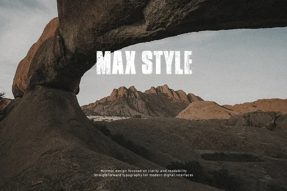
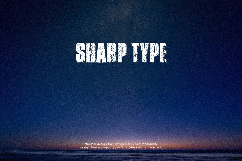
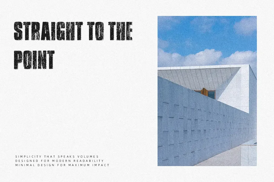
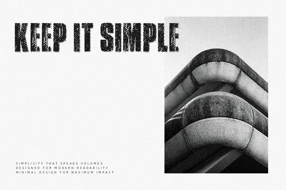
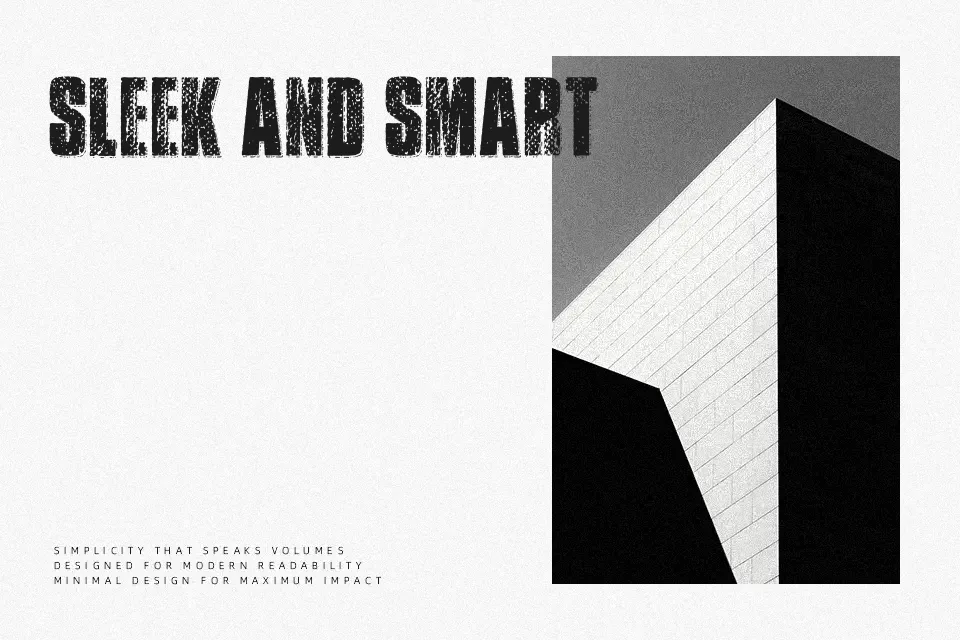
Transit Display Font showcases an all-caps structure built around thick, solid sans-serif strokes with rough, eroded exterior edges. Uniformly heavy proportions give the letterforms a grounded, industrial presence across horizontal headlines. Tight character spacing creates dense text arrangements, ensuring maximum graphic weight in headline treatments, album art, and stencil-styled apparel graphics. While the design delivers sharp visual punch at prominent sizes, the textured contours significantly diminish small-scale readability. Heavy wear patterns reduce character distinction within dense editorial layouts, making continuous body text impractical. Generous spacing adjustments help the typeface maintain distinct silhouettes in larger signage environments.
Best For: vintage product packaging, music festival posters, streetwear apparel graphics
Not Ideal For: continuous body text, mobile interface labels, dense editorial layouts
Perfect for headline, logo, and packaging, with a bold and decorative style.
License
Gallery