Train to Nevada Font
Free for personal useAbout
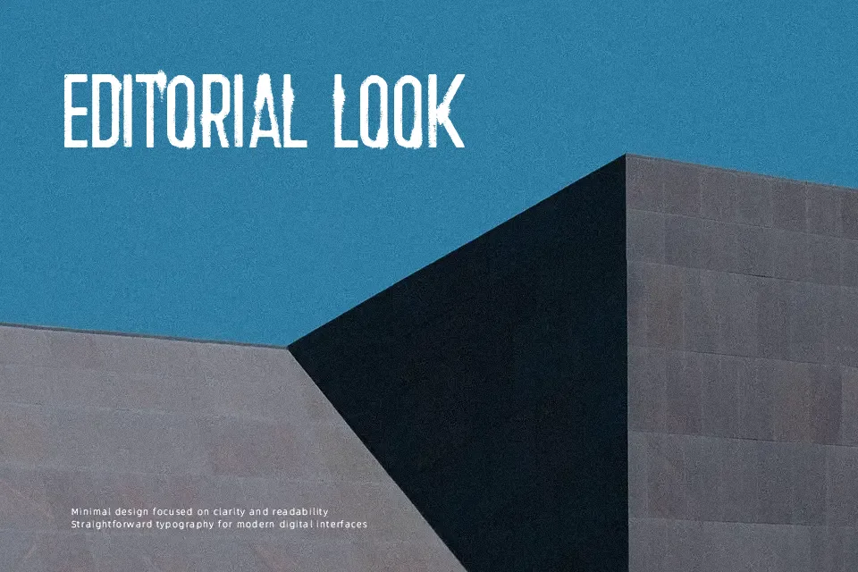
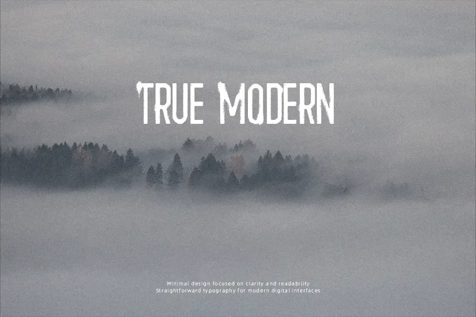
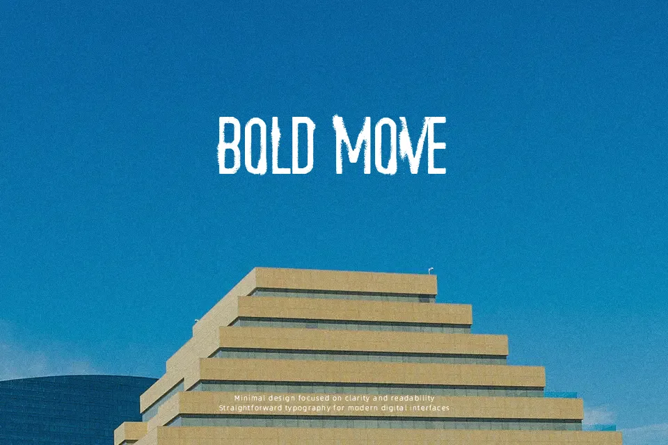
Train to Nevada Font showcases a rugged display structure built with heavily distressed strokes, compact letter widths, and prominent vertical proportions. The letterforms exhibit irregular surface wear and uneven contours that produce a gritty, weathered texture across every glyph. Character spacing remains fairly uniform, though the dense ornamentation and narrow architecture naturally restrict legibility at modest point sizes. While the typeface delivers commanding visual impact across oversized event signage, album artwork, and thematic merchandise, the fractured strokes compromise comfort in continuous reading environments. For optimal results, this design functions best when reserved for brief, punchy headlines rather than dense paragraphs.
Best For: vintage apparel graphics, grunge music album covers, western film title cards, craft brewery packaging
Not Ideal For: continuous body text, corporate annual reports, small mobile interface labels, dense technical documentation
Perfect for headline, logo, and packaging, with a grunge and condensed style.
License
Gallery