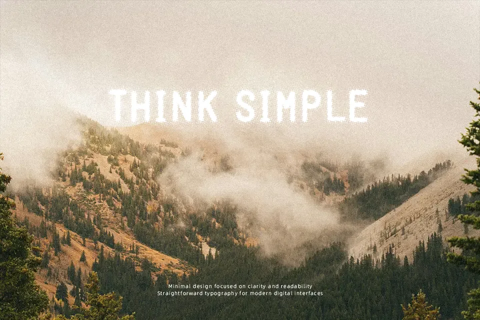
Tragic Blur Font
Free for personal useAbout
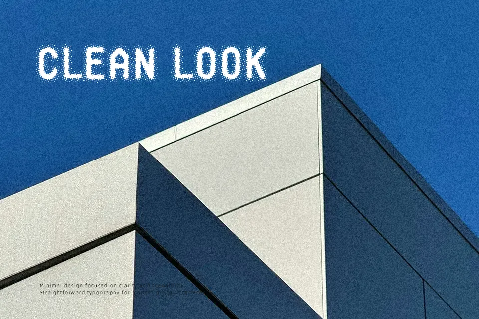
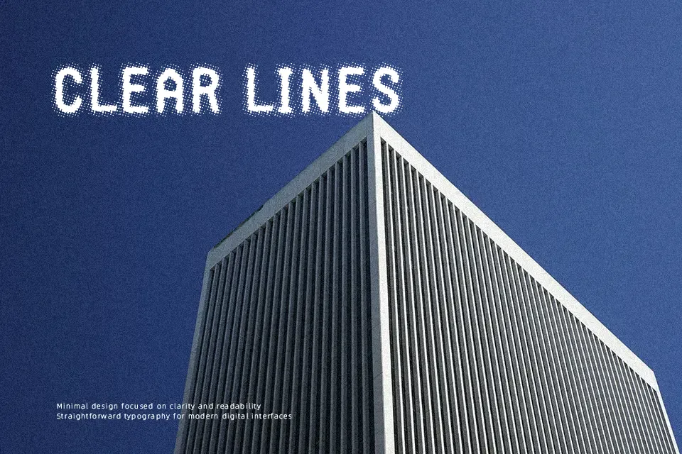
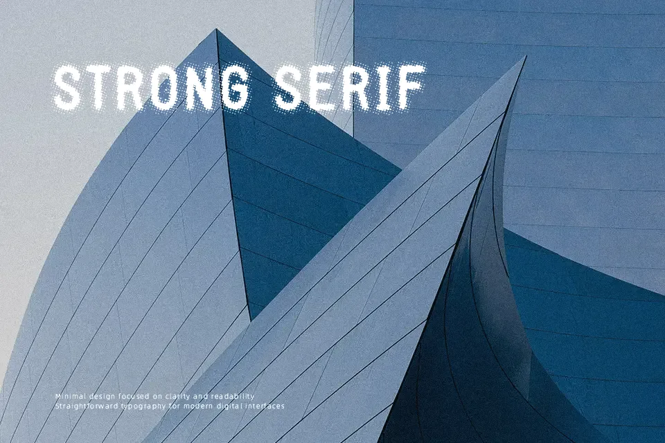
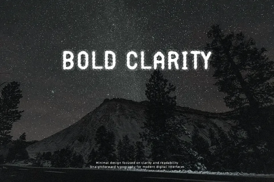
Tragic Blur Font delivers immediate visual presence in brief headline arrangements, though its heavily eroded letterforms demand careful scale management. The typeface features sturdy, low-contrast character proportions enveloped in a distinctive halftone dot texture that mimics vintage screen printing. Across both uppercase and lowercase sets, stroke thickness remains consistent, while the character spacing is set snugly to maintain cohesive word blocks. In large poster titles, album art, and retro apparel graphics, the design introduces authentic distressed character. However, the complex textured edges degrade rapidly at smaller sizes, making the letterforms illegible in continuous editorial paragraphs or compact user interfaces.
Best For: retro band posters, vintage apparel graphics, comic book cover titles, grunge event flyers
Not Ideal For: long body text, mobile interface labels, corporate annual reports, dense editorial layouts
Perfect for headline, music, and packaging, with a grunge and decorative style.
License
Gallery