Tops Again! Font
Free for personal useAbout
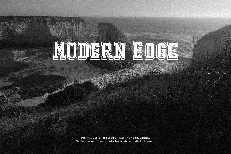
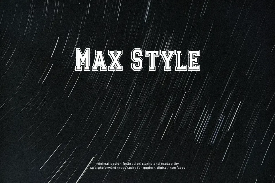
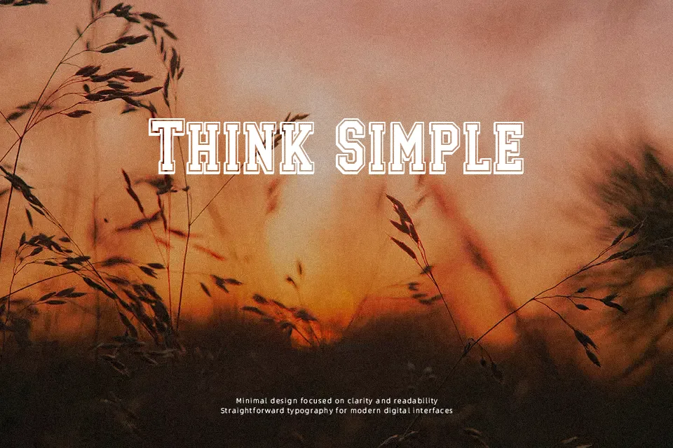
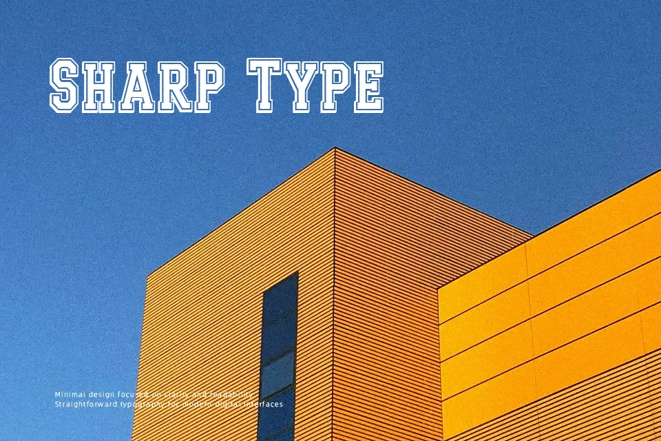
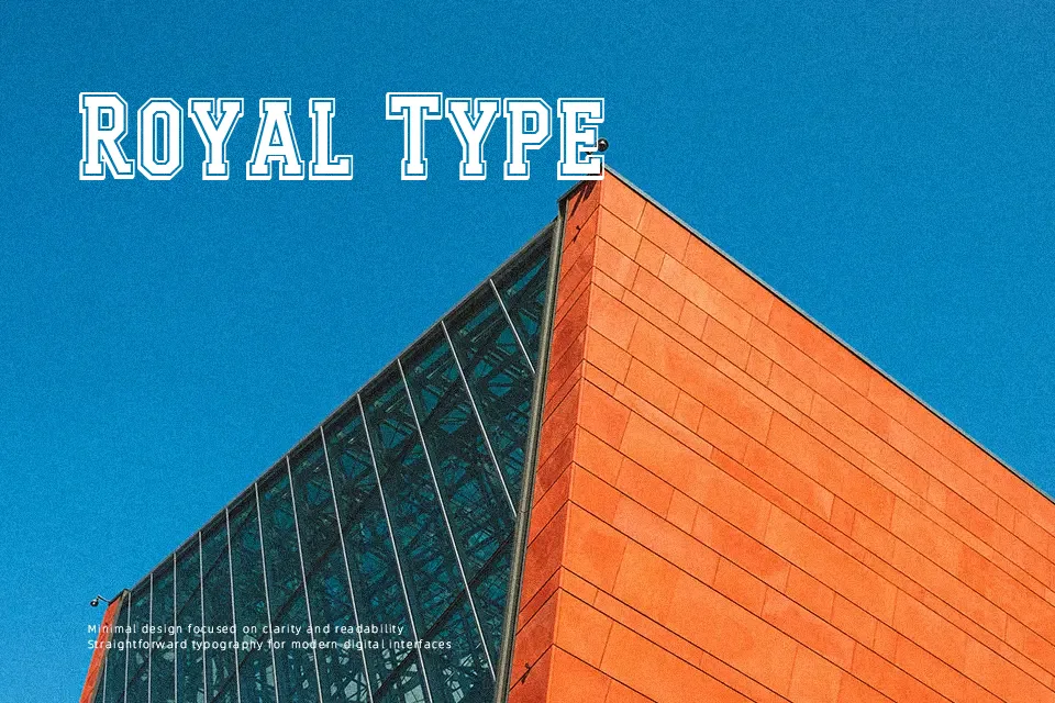
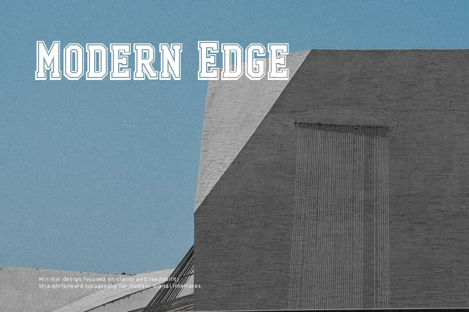
Tops Again! Font establishes an imposing athletic presence through thick geometric stems paired with dimensional drop shadows and layered perimeter outlines. Each uppercase character maintains uniform block proportions with consistent stroke weights, creating an assertive cadence across horizontal arrangements. Generous internal spacing prevents adjacent contours from colliding, which preserves strong glyph distinction at monumental scale. However, the heavy visual density and complex contour borders create severe crowding in continuous layouts, making the design ill-suited for dense body copy or small captions. In practical evaluation, the letterforms deliver exceptional legibility on stadium scoreboards and varsity posters where immediate recognition at distance is essential.
Best For: collegiate apparel graphics, athletic tournament posters, varsity merchandise headlines
Not Ideal For: extended editorial paragraphs, mobile application body copy, compact interface captions
Perfect for 3d, headline, and logo, with a bold and decorative style.
License
Gallery