Time to Dead Font
Free for personal useAbout
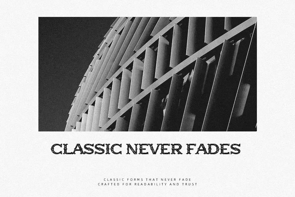
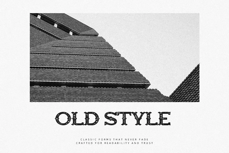
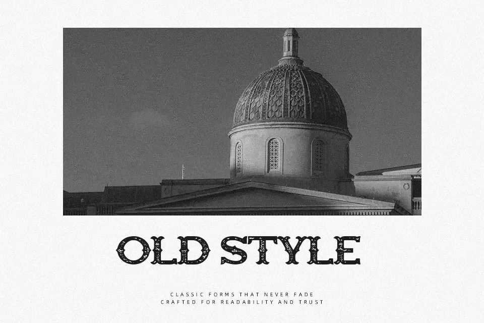
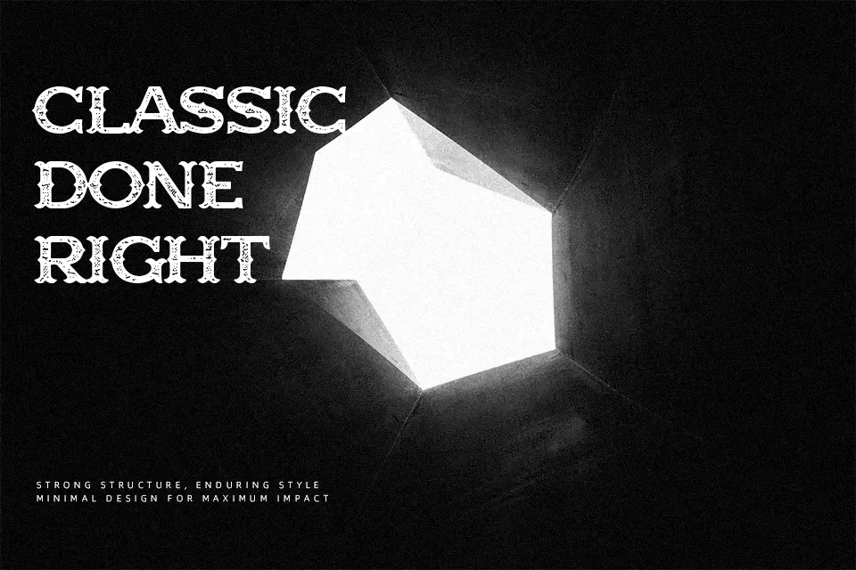
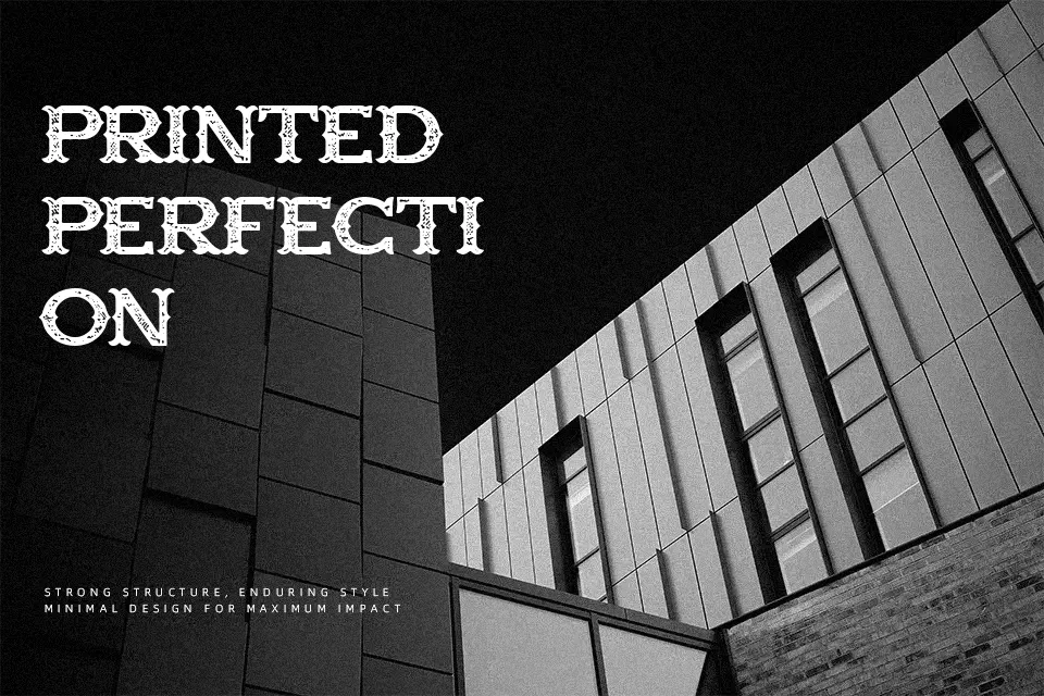
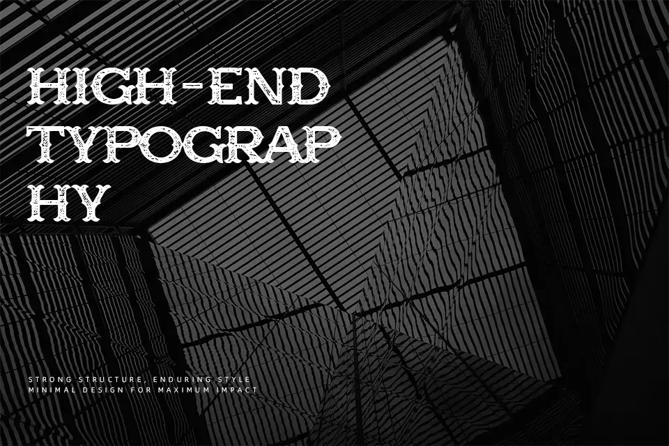
Time to Dead Font achieves its most striking results at expansive display scales where its weathered letterforms command viewer attention. Built with heavy strokes, prominent slab serifs, and wide structural proportions, the glyphs exhibit an eroded texture that evokes vintage printed documents. Character spacing remains moderately open, preventing the dense contours from colliding in prominent headline layouts. Readability remains dependable across banners, cinematic title cards, and apparel branding, yet the intricate distressing significantly degrades clarity at smaller dimensions. Consequently, this typeface is unsuited for multi-line body paragraphs or compact editorial captions. The eroded surface texture introduces distinctive personality without compromising structural balance.
Best For: rodeo event posters, rustic product packaging, western film title cards, themed apparel graphics
Not Ideal For: long paragraph text, small interface labels, mobile app navigation, dense editorial layouts
Perfect for film, headline, and logo, with a grunge and decorative style.
License
Gallery