Thorne Font
Free for Commercial UseAbout
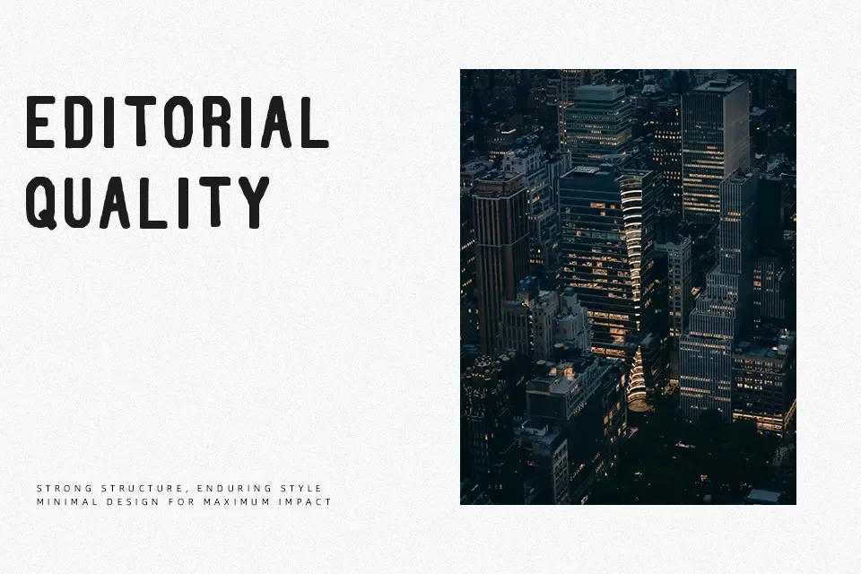
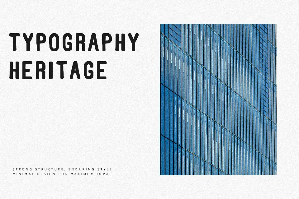
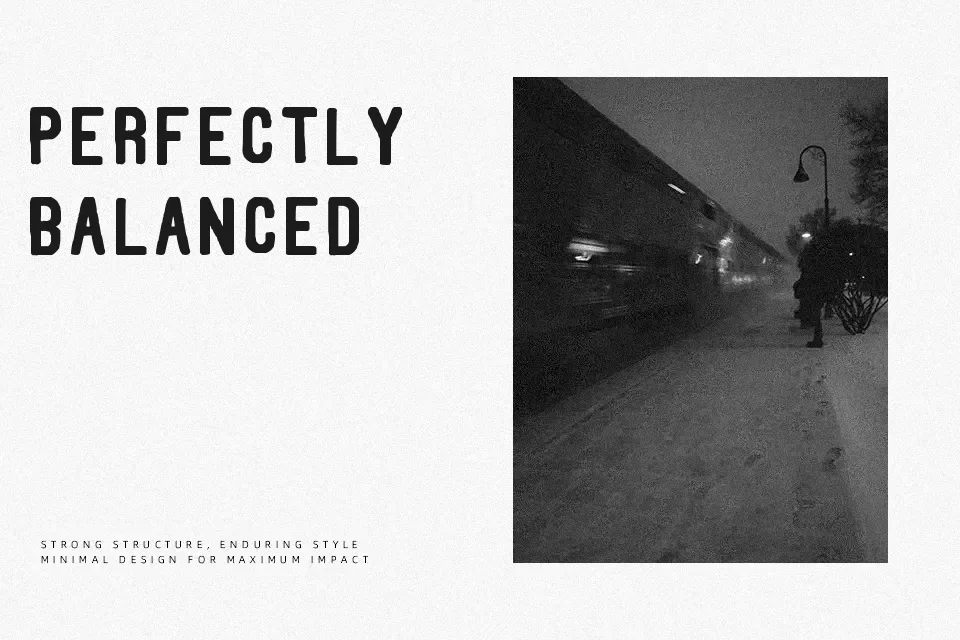
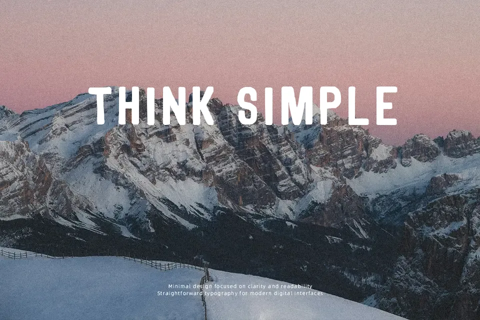
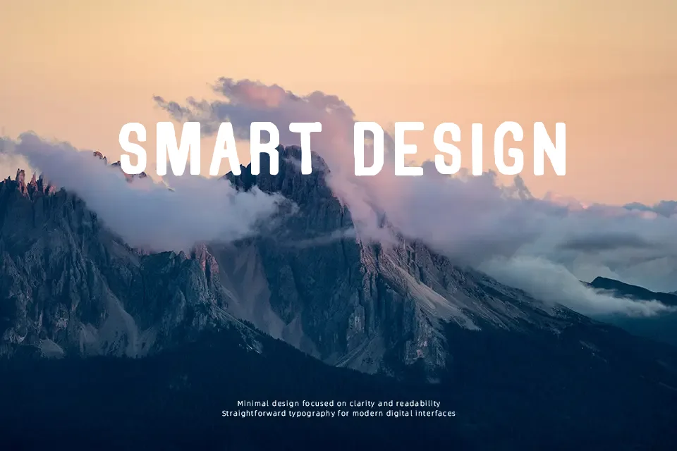
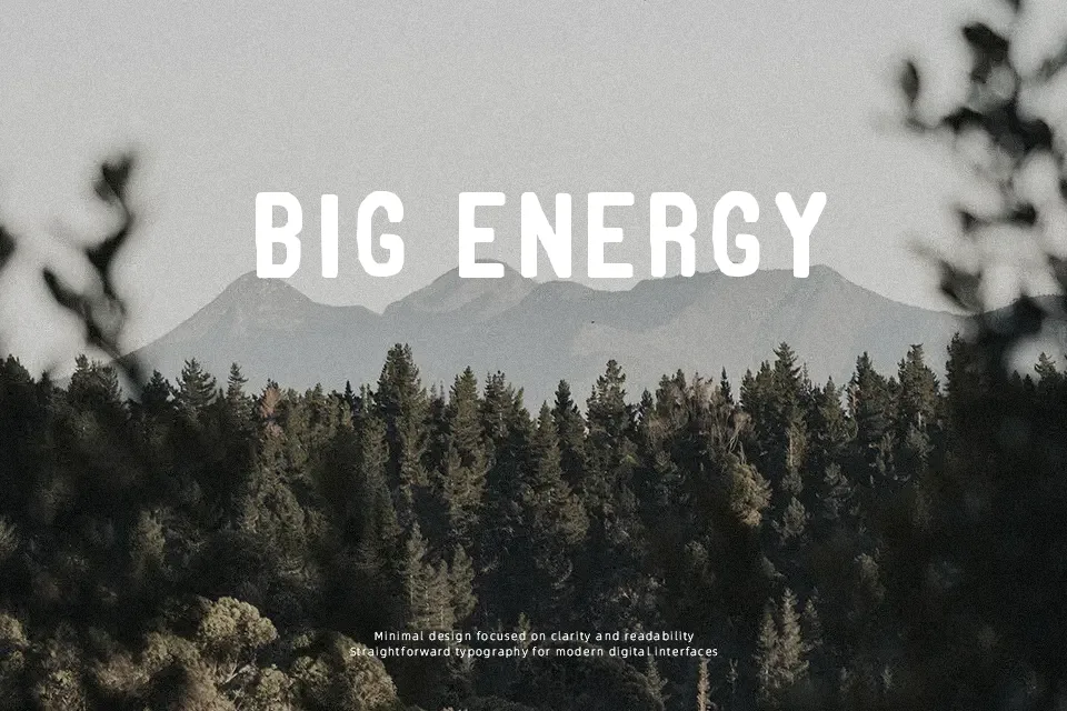
Thorne Font showcases an imposing display structure defined by robust character weights, blunt terminal cuts, and deeply corroded contours that emulate aged mechanical type. The letterforms exhibit uniform proportions paired with moderately compact spacing, which helps preserve graphic cohesion across large titles. In terms of legibility, the typeface functions effectively when rendered as prominent headlines on festival banners, horror media titles, or rustic product labels. However, the heavy distress and closed counters quickly degrade recognition at smaller scales, rendering the design unsuitable for multi-line body copy or intricate interface layouts. The rugged distressing generates immediate tactile atmosphere in oversized formats, though careful kerning remains essential to prevent dense clusters from merging visually.
Best For: music album packaging, festival poster headlines, vintage apparel graphics, horror film titles
Not Ideal For: continuous body text, mobile interface labels, corporate documents, small data tables
Perfect for film, headline, and music, with a bold and decorative style.
License
Gallery