The New Metropolitan Font
Free for personal useAbout
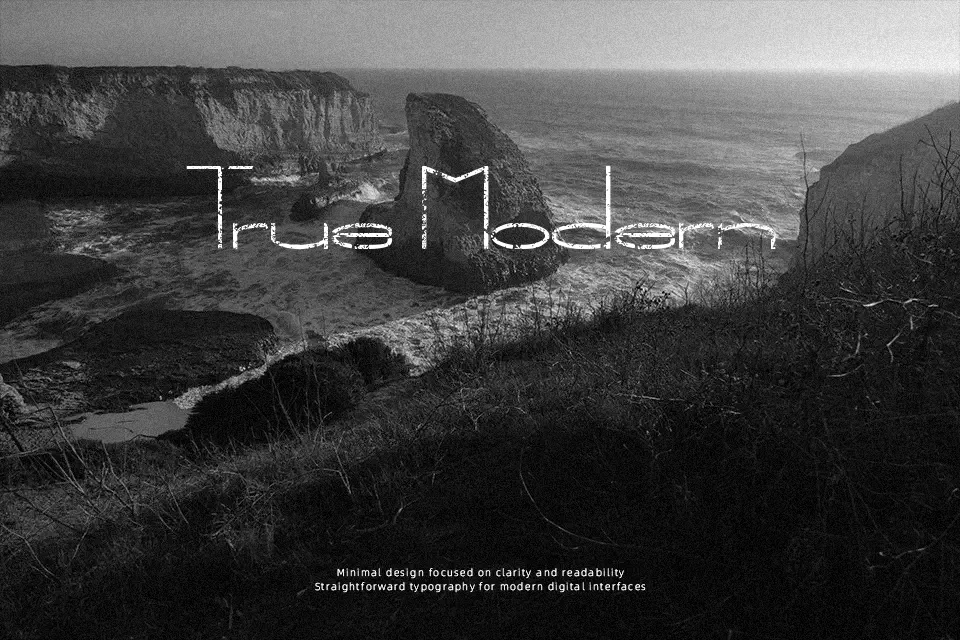
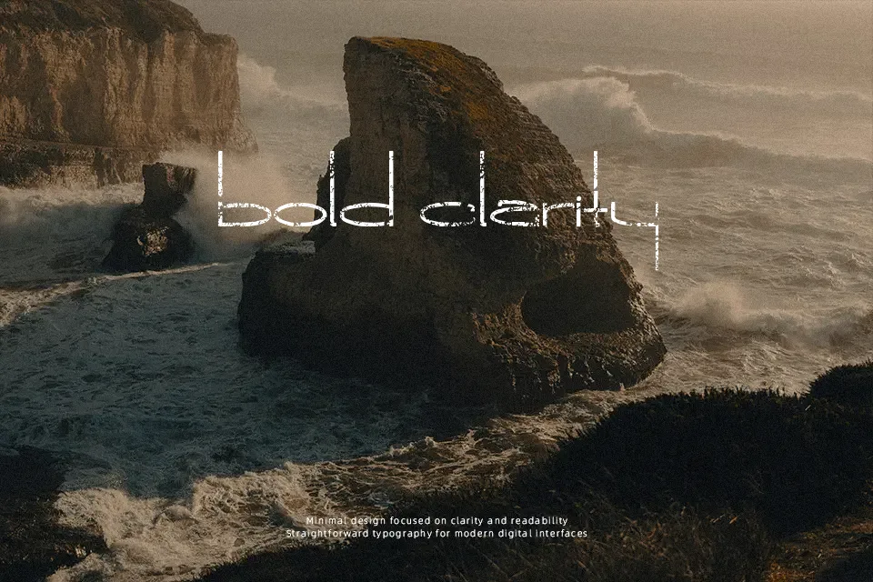
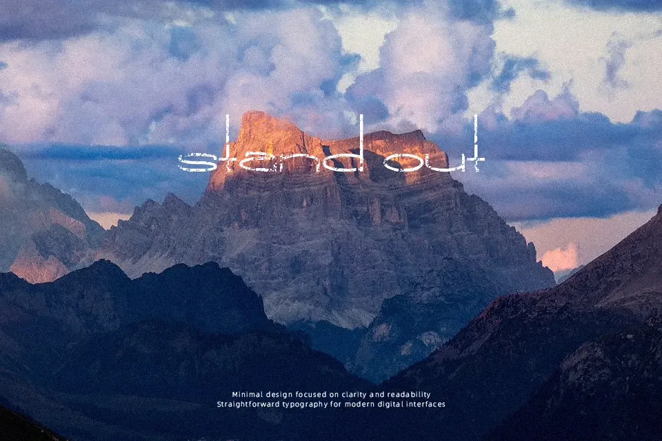
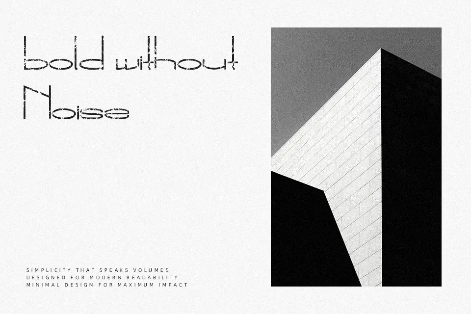
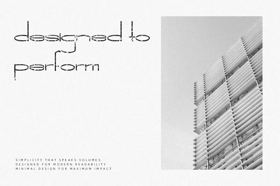
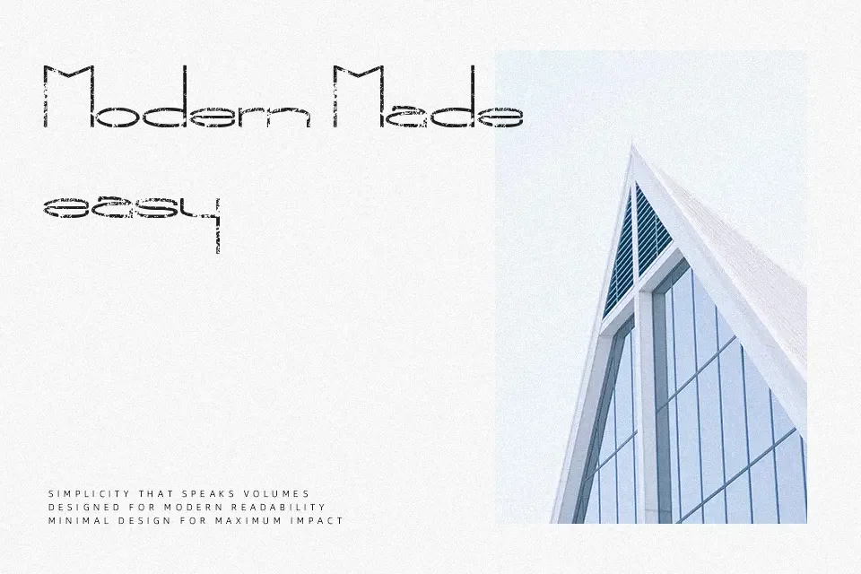
Structured around sturdy sans-serif proportions, The New Metropolitan Font exhibits heavily textured contours with chipped edges and uneven erosion throughout each glyph. Solid stroke widths maintain consistent structural integrity despite the degraded surface details, while open internal counters preserve letterform identity at prominent display scales. Character spacing remains moderately wide to prevent rough outer edges from clashing in compact titles. The design thrives in underground gig flyers, rugged packaging, and bold thematic signage. However, the irregular grit substantially hinders readability across extended body text and small user interface captions. As a practical judgment, the typeface delivers maximum atmospheric weight when deployed strictly for brief titling.
Best For: music festival posters, underground gig flyers, rugged product packaging, apparel graphics
Not Ideal For: long body text, mobile interface labels, corporate documentation, dense editorial layouts
Perfect for advertising, headline, and music, with a bold and decorative style.
License
Gallery